Tea Set Widgets is a large collection of reusable Java GUI components. The goal of this software is to help Java developers creating sophisticated user interfaces without the need to reinvent the wheel. It is also targetted to help common Web usage. Besides the widgets, which are primarily used in Java programming, a set of applets, corresponding to each widget, is provided. The applets can be used directly inside HTML pages, and can be combined and work together without any Java programming.
Currently, there are over two dozen widgets in the collection. More widgets and enhancements will be added to the collection in the future. This guide covers the use of applets and widgets. In the applet section, each applet is explained, and examples are given to show applets working together. In the widget section, we go through small sample applications, which show how the widgets are typically used. The examples can not possibly demostrate all of the features of a widget. For complete information on a particular widget, please read the manual pages.
Tea Set Widgets is a programmer's toolkit. It is intended to be used by Java application developers to build sophisticated business software. To help making this job easier, every effort was made to make the API as simple to learn and use as possible. Every widget provides a reasonable default behavior, which avoids forcing programmers to perform a lot of initialization. The Grid widget provides an excellent example of this. The default behavior of Grid allows programmers to simply add components to a Grid. The size of the Grid, including row and column sizes, are calculated automatically and all components are sized properly to fit the grid cells.
Tea Set Widgets is also a Web developer's toolkit. In addition to widgets, which are used in Java programs, the Tea Set Widgets also provides a set of applets, one for each widget, that can be used in HTML pages. Since HTML writers do not have the same level of control on the applets as the programmers have on the widgets, applet version is not as powerful or flexible as the widgets. However, we invented a very powerful mechanism for specifying applets behaviors. Instead of using individual applet in HTML pages, multiple applets can be used and combined in very flexible ways. The 'Base Applet' section covers the parameter passing mechanism in more details.
Most importantly, Tea Set Widgets is end users tool. Because the widgets and applets are used directly by end users, the user friendliness of the widgets is very high on our priority list. We took two approaches to achieve this goal. First, we tried to include as many useful features as possible, to make the interface robust and complete. Second, we tried to increase the efficiency and performance of the software, to overcome the disadvantages of dynamically code loading. The 'Design Primciples' section provides more detail on how these are achieved.
Tea Set Widgets is not a random collection of GUI components. From the very beginning, we tried to build the Tea Set Widgets as a consistent and well structured GUI component framework. Advanced design patterns and object oriented techniques are employed to make the components easy to use and easy to integrate. We also tried to use the same conventions and event model as the standard Java AWT package. Therefore, the learning curve for people who already know AWT is minimal.
Tea Set Widges is not a collection of all possible GUI components. While AWT provides the basic building blocks for the user interface, Tea Set Widgets provides higher level GUI components to make user interface building easier. However, it does not try to be a solution for all problems. The selection of widgets is targetted at GUI components commonly used in business applications. GUI components for other types of applications, such as multimedia and game, are not included in the collection.
The design goal of the Tea Set Widgets is functionality and efficiency. There is always a trade-off when deciding features and efficiency. This is especially true when designing Java software. In the traditional computing environment, the biggest impact of adding new features to software is storage space consumption. In contrast, since many Java programs are designed to be loaded across a network to be executed, the impact on code size translates directly into runtime efficiency. As a way to ensure the best usability of the components, we adopted the following approaches:
Only essential features are included in any component's interface. For any software component, there are always some 'nice' little features that would make the component a little bit 'nicer' for some applications. We take the approach that if a 'nice' feature can be accomplished in another reasonable way, the feature is not included in the component. For example, instead of building a few dozen resources into each grid cell, the Grid widget in the Tea Set Widgets avoids building redundent code for these resources, but lets programmers reuse the resources associated with each cell components, which are all based on the java.awt.Component. The only resources built into the grid are those that can not be supported by the individual cell component, or are too costly to be done through component. This design decision is one of the reasons why Tea Set Grid is up to five times smaller compared to some other commercial grid controls.
Another important design decision was to move commonly used features into separate components, therefore avoiding redundent code and promoting better reuse. For example, all border related functions are moved inside the Effect3D component. It can be used to add a border to any component, with many different styles to choose from. As a consequence, the Grid and other components in the collection do not need to support the border in their own code. When a border is needed for a component, the user can simply attach an Effect3D component to the other component to achieve this. By separating functionalities into flexible decorator classes, we not only made the components smaller thus more efficient; we also made the API simpler to use and more consistent.
We have set as our goal to fully conform to the Java standard, including standard API and common conventions. With Java still evolving, we are committed to keep our software up-to-date with the new Java standard. Since our code is written in pure Java, the Tea Set Widgets library is fully portable to any Java standard conforming platform. We also took the portability a step further by conforming to the JavaBeans component standard. With the standard rapidly maturing, the Tea Set Widgets will truly become universally reusable components.
In the Tea Set Widget , every component takes on two forms: widget and applet. A widget is a Java class derived indirectly from the java.awt.Component. It can be used in any Java program like any other AWT component. Since Tea Set widgets use the same event model as the AWT components, the widgets can easily be used together with existing AWT components or other third party components that follow the same convertion as AWT.
While the widgets are primarily for Java programmers, an applet version also exists for each widget in the Tea Set Widgets. They are intended to be used by both sophisticated Java programmers, as well as HTML writers who do not wish to write Java code. The applets are wrappers for the widgets. They provide a way to use the widgets without any Java programming, yet still enable the construction of advanced user interfaces. Instead of programming the widgets, the users of Tea Set applets can control the layout of the interface purely through applet tag parameters. Most examples shown on the Tea Set Widgets Web site are done by using the applet version of the components without any extra coding done. This shows the power of the Tea Set applets and how sophisticated the interface can be without writing a single line of Java code.
Both versions are included in the distribution. The applets source code are also included in the Professional Edition of the Tea Set Widgets package.
All of the Tea Set Widgets classes are in the tea.set package name space. The TeaSet.zip file in each distribution contains all of the .class files for the Tea Set Widgets. For download efficiency, the zip file is in compressed format. Therefore the zip file can not be used directly by the Java runtime environment.
To install the package, unzip the TeaSet.zip file in a directory (e.g. C:\). This will create a directory tree (C:\tea\set) with all .class files residing in the tea/set directory (C:\tea\set). For local access, add the directory where the tea/set directory tree resides into the CLASSPATH environment variable. For example, if TeaSet.zip is unziped at C:\ on NT or Win95, add C:\ to the CLASSPATH. If TeaSet.zip is unziped at $HOME on UNIX, add $HOME to the CLASSPATH.
Inside the program where Tea Set widgets are used, you need to import the classes from the Tea Set package by adding the following line at the beginning of your program:
import tea.set.*;
You should now be able to compile and execute you program using JDK tools.
If you want to use the applets in the Tea Set Widgets package, you can follow the same procedure as described above if the applets are accessed locally by a browser. However, if you want to serve the applets through a HTTP server, you need to follow a different procedure because CLASSPATH is not used by most HTTP servers to locate applet class files.
To add an applet to your HTML file, you need to include the tea/set path as part of the class file name. For example, to add the GraphA applet to your HTML page, you can write an applet tag as:
<applet code=tea/set/GraphA.class width=450 height=250>
<param ...>
</applet>
In the directory where the HTML file is located, unzip the TeaSet.zip file and create a tea/set directory tree. This way, the HTTP server can correctly find the class files specified in the HTML files. We will go into more detail on how parameters can be specified for Tea Set applets later.
* On Win32 platforms, make sure the unzip program can handle long file names.
The Tool class contains a set of commonly used static methods. The two most useful methods are Tool.tokenize() and Tool.toArray() methods. They are used to convert delimited string or vector into Java arrays.
Methods that expect a list of values are normally defined as accepting one or more arrays as parameters. If the values are stored as a delimited string or a vector, the Tool methods can be used to obtain an array suitable for the actual methods.
For example, to set the cells of one row in the TextGrid widget, you can store the cell content in an array, and pass it to TextGrid.setRow() method as,
String[] row1 = {"C++", "9",
"Senior"};
grid.setRow(0, row1);
or you can store the row content in a string, and use Tool.tokenize() method to parse the string and generate an array,
grid.setRow(0, Tool.tokenize("C++;9;Senior", ";"));
Tool.tokenize() takes a delimited string, and the delimitor, and generate an array of String, with each element in the array containing one token in the delimited string.
Tool.toArray() is similar to Tool.tokenize(), but instead of parsing a delimited string, it converts a java.util.Vector into a corresponding array. The type of the array is Object[]. Explicit type casting is necessary when Tool.toArray() is used in a method expecting a different array type.
Vector images = new Vector();
while(...) {
...
images.addElement(getImage(...));
}
add("Center", new Animator((Image[]) Tool.toArray(images)));
Widgets are categorized into six categories: container, presentation, calendar, text edit, decorator, and image controls.
Container widgets are used to manage other child widgets. There are currently two groups of container widgets: tabbed folder based and grid based.
The Grid widget is a flexible grid layout container. It can be used simply as a layout manager that lays out components in a grid format, or it can be used to build an advanced user interface such as a spreadsheet or data entry form. Although grid is inheritly a complex interface with many tunable options, we tried to make using a grid a very easy process. The default settings are chosen to be adequate for most situations. When an attribute needs to be changed, the API is designed to be very intuitive and simple.
The Grid widget is very powerful container, but it does not distinguish the type of components in each cell. If text data needs to be displayed or enterred in a Grid, text editing components, e.g. TextField, TextCell, need to be inserted to the cell explicitly. Alternatively, the TextGrid can be used. TextGrid is a specialized Grid with extra logic to handle text data, both displaying and data input. Since TextGrid is derived from Grid, and shares all features available in Grid, it is recommended to use TextGrid for most situations, as it provides easier way to handle text and setup cells. However, if only grid layout and simple grid functions are needed, Grid is slightly smaller and more efficient than the TextGrid widget.
The Grid widget provides very flexible cell layout options. It can calculate and distribute space for cells automatically, or let the user supply the layout information. By default, a grid is in auto spacing mode. In this mode, the sizes of row and column are calculated using the preferred size of the cells inside each row and column, and the space is distributed proportionaly to the preferred size of the cells. For example, for a two row grid where the largest cell in the first row has a preferred height of 20 and the largest cell in the second row has a preferred height of 40, the first row is assigned 1/3 of the total height of the grid, and the second row is assigned 2/3 of the total height of the grid. The same algorithm is used to assign column width.
As a side effect of this algorithm, empty rows or columns are not visible because their preferred sizes equal zero, and consequently are not assigned any space. To force rows and columns to be visible, or to override the automatic space assignment based on cell component preferred size, the user can supply size information explicitly by calling Grid.setRowHeight() or Grid.setColWidth(). The size supplied by the user becomes the new ratio Grid used to distribute space. In the previous example, suppose the user calls Grid.setRowHeight() with an integer array consist of {2, 1}. The rows will be layed out according to the new space ratio supplied by the user. The first row will be assigned 2/3 of the total height, and the second row will be assigned 1/3 of the total height.
In the auto layout mode, all cells are resized to fit the Grid area. This can be overriden by switching to absolute mode. If absolute mode is enabled, through Grid.setAbsolute(), the cells are not sized to fit into the Grid area. Instead, all cells will have their sizes equal to or larger than their preferred sizes. Using the same example, in absolute mode, the two row grid will have the first row height equal to 20 pixels, and the second row height equal to 40 pixels.
The meaning of user supplied size information changes in the absolute mode. In auto mode, the user supplied size is considered to be a ratio, so {1, 2} is the same as {10, 20}. In absolute mode, the user supplied size is regarded as the true pixel size. Therefore if Grid.setRowHeight() is called with {10,20} as the parameter, the first row will be set to 10 pixels and the second row set to 20 pixels height.
When a grid is created, the number of rows and number of columns can be specified, which will create a Grid with the specified dimension,
Grid grid = new Grid(5, 3);
// create a 5 row 3 column grid, default to horizontal
and vertical ruling
Alternatively, an empty Grid can be created using the default constructor, and the dimension can be set after the creation using the RowCount and ColCount property,
Grid grid = new Grid();
grid.setRowCount(5);
grid.setColCount(3);
When a grid is first created, all cells are empty. Because the grid is in auto space mode, none of the rows or columns will be visible because their preferred sizes are zero. If you need to make the rows/columns visible without adding components to cells, call Grid.setRowHeight() and Grid.setColWidth() to set explicit size assignment parameters. This will make the cells visible even though none of them contain anything. This is rarely done because the grid would not be of much use if it does not contain anything. One situation in which this is needed is when a grid is partially populated, but you want to make sure all cells are at least visible, including empty rows and columns. For this purpose, you have to supply the size assignment explicitly to force the empty row/column to be assigned space.
Once a grid is created, you can proceed to setup the content of the grid. the Grid widget provides an interface for adding components to each cell, and retrieving the component inside a particular cell. TextGrid offers a lot more options to help setting up the content, especially for text related content. To add a component to a cell, call
grid.setCell(0, 0, new TextField(15));
// add TextField to cell at (0, 0)
grid.setCell(0, 1, new TextCanvas("Text\nLabel"));
// add a text label to cell at (0, 1)
Alternatively, you can choose to create a spanning cell. A spanning cell is a cell that takes up more than one regular cell space. To create a spanning cell with 2 rows and 3 columns, use
grid.setCell(1, 0, new TextArea(2, 20), 2, 3); // create a spanning cell
The TextArea will occupy the space for (1, 0), (1, 1), (1, 2), (2, 0), (2, 1), and (2,2). The same effect can be achieved by setting the cell component first, then call Grid.setSpanning(),
grid.setCell(1, 0, new TextArea(2, 20));
grid.setSpanning(1, 0, 2, 3);
Grid supports both a row header and a column header. By default, no header is created for a grid. There are three ways to add headers. We will use column header as example. Row headers can be handled in the same way. To add a column header, the header information can be stored in a String array, and passed to the Grid.setColHeader() method:
String colHeader[] = {"Column1",
"Column2", "Column3"};
grid.setColHeader(colHeader);
The same can be done more easily by:
grid.setColHeader(Tool.tokenize("Column1|Column2|Column3", "|"));
The first parameter is a delimited string containing the header labels, and the second parameter is the delimiter string. Alternatively, the header labels can be set or changed individually. To set or change the header for the first column,
grid.setColHeader(0, "New Column1 Header");
Headers also serve as the row/column selectors. The row/column selection is covered later.
The Grid itself does not provide a scrolling function. Instead, it works together with the tea.set.Scroller widget to provide scrolling of rows and columns. To enable scrolling, simply attach a Scroller to a Grid,
add("Center", new Scroller(grid));
The Scroller will manage the scrollbar and automatically create them if necessary. When a Scroller is attached to a grid, the grid is automatically switched to absolute spacing mode. Grid implements the tea.set.Scrollable interface to customize the scrolling of grid. Instead of scrolling by pixels, the grid is scrolled by rows and columns.
The look and feel and the behavior of a Grid is controlled by a set of properties. The properties are categorized into three types:
Grid supports the following grid level properties:
| Property Name | Property Type | Description |
| RowCount | int | Number of rows. Setting the number other than the current number of rows causes the grid to expend or shrink. |
| ColCount | int | Number of columns. Setting the number other than the current number of columns causes the grid to expend or shrink. |
| Absolute | int | Absolute flag, NONE, VERTICAL, or HORIZONTAL. |
| Resizable | boolean | Allow user resizing of rows and columns. |
| Ruling | int | Grid wide ruling flag, NONE, VERTICAL, or HORIZONTAL. |
| 3D | boolean | Border line 3D style. |
| LineWidth | int | Border line width in pixels. |
| MultiSelect | boolean | Allow multiple rows or columns to be selected. |
| RowSelectable | boolean | Allow rows to be selected. |
| ColSelectable | boolean | Allow columns to be selected. |
| RegionSelectable | boolean | Allow grid region to be selected. |
| RowHeaderExist | boolean (Readonly) | True if row header column exists. |
| ColHeaderExist | boolean (Readonly) | True if column header row exists. |
| Alignment | int | Grid level alignment flag. |
| SelectedRow | int (Readonly) | The index of the first selected row. |
| SelectedRows | int (Indexed, Readonly) | Indexes of selected rows. |
| SelectedCol | int (Readonly) | The index of the first selected column. |
| SelectedCols | int (Indexed, Readonly) | Indexes of selected columns. |
| SelectedObjects | Object(Indexed, Readonly) | Row headers of selected rows. |
| SelectedRegion | Region (Readonly) | Current selected region, or null if no region is selected. |
| RowRoot | int | The topmost visible row. |
| ColRoot | int | The leftmost visible column. |
| RowLast | int (Readonly) | Index of last visible row on screen. |
| ColLast | int (Readonly) | Index of the last visible column on screen. |
| FrozenRow | int | The number of rows frozen from the top. |
| FrozenCol | int | The number of columns frozen from the left. |
| AutoRepaint | boolean | True if repaint requests are generated automatically whenever needed. |
Grid supports the following cell level properties:
| Property Name | Property Type | Description |
| Gap | Insets | Gap space around the child component. |
| Ruling | int | Per cell ruling flag, NONE, VERTICAL, or HORIZONTAL. |
| Cell | Component | Cell component. |
| Spanning | Dimension | Spanning cell dimension. |
| Alignment | int | Cell component alignment flagb. |
| Color | Color | Cell background filling color. |
| Selected | boolean (Readonly) | True if the cell is selected (as part of row, column, or region) |
| Bounds | Rectangle | Bounds of the cell, excluding gap space and aligned. |
Grid supports the following row level properties:
| Property Name | Property Type | Description |
| RowHeight | int (Indexed) | Preferred row height in pixels. |
| RowHeader | String (Indexed) | Row header text string. |
| VisibleRow | boolean (Readonly) | True if the row is not hiden and is not scrolled off screen. |
| SelectedRow | boolean | True if the row is selected. |
Grid supports the following column level properties:
| Property Name | Property Type | Description |
| ColWidth | int (Indexed) | Preferred column width in pixels. |
| ColHeader | String (Indexed) | Column header text string. |
| VisibleCol | boolean (Readonly) | True if the column is not hiden and is not scrolled off screen. |
| SelectedCol | boolean | True if the column is selected. |
All cell properties can be accessed using Grid.set{Property}(int row, int col, ...) and Grid.get{Property}(int row, int col) methods. The row and column numbers can be a number from 0 to the number of rows or columns minus one. In this case the property for the specified cell is changed.
Alternatively, the row and column number can be replaced by Grid.ALL_CELL. If Grid.ALL_CELL is used as a row number, it means all rows. If Grid.ALL_CELL is used as a column number, it means all columns. The Grid.ALL_CELL can be used in all cell, row, and column property methods.
For example to change the gap space for a cell,
grid.setGap(0, 1, new Insets(1, 0, 1, 0));
Or to change the gap space for the entire first row,
grid.setGap(0, Grid.ALL_CELL, new Insets(1, 0, 1, 0));
Or to change the gap space for the entire second column,
grid.setGap(Grid.ALL_CELL, 1, new Insets(1, 0, 1, 0));
Or to change the gap space for all cells in the grid,
grid.setGap(Grid.ALL_CELL, Grid.ALL_CELL, new Insets(1, 0, 1, 0));
Row/column properties are properties the applies to entire rows/columns. The Grid.ALL_CELL can be used in row/column property methods to apply a property to all rows or columns. Grid properties are global to the entire grid. If there is a corresponding cell property, the cell property overrides the grid property if it's set. The grid property serves as the default.
Another special row/column number is the Grid.HEADER constant. If Grid.HEADER is used as a row number, it refers to the header row (column header). If Grid.HEADER is used as a column number, it refers to the header column (row header). If Grid.HEADER is used but no corresponding header row/column exists in the grid, an exception will be thrown. Like Grid.ALL_CELL, Grid.HEADER can be used in all methods that accept row number or column number parameters.
The detail on how to access and change the properties are covered in subsequent sections.
Three styles of ruling lines are supported by Grid. The style of the line can be changed by calling Grid.set3D().
| Grid.PLAIN | Single pixel line in foreground color. |
| Grid.RAISED | 3D line looks like raised from the surface. (Default) |
| Grid.LOWERED | 3D line looks like carved into the surface. |
By default, lines are drawn between all rows and columns. To change the ruling option, pass one of the following flags into the Grid.setRuling() method.
| Grid.NONE | Do not draw any border lines |
| Grid.HORIZONTAL | Draw horizontal lines only between rows |
| Grid.VERTICAL | Draw vertical lines only between columns |
| Grid.ALL | Draw both horizontal and vertical lines (Default) |
The individual cell ruling option can be controlled too. The Per cell ruling option controls the lines to the right of and below the cell. It overrides the grid wise ruling property. Grid.ALL_CELL can be used to change the ruling property for all cells on a row or column. For example, to remove the vertical border between second column and third column,
// no vertical border for all cells
on the row
grid.setRuling(Grid.ALL_CELL, 1, Grid.HORIZONTAL);
When 3D mode is specified for the ruling option, the width of the 3D lines is set to 2 pixels by default. The line width can be changed by
grid.setLineWidth(4); // set 3D line width to 4 pixels
By default, row/column selection is disabled. They can be enabled by calling the Grid.setRowSelectable() and Grid.setColSelectable() methods. When rows are selectable, there are two methods for the user to select a row. If row is made selectable by calling:
grid.setRowSelectable(true); // enable row selection without using row selectors
User can click in any cell to select a row, provided the mouse click event is passed up from the cell component (some AWT components do not pass up the mouse events). If a row header exist, the user can also click in a row header cell to select a row. If row selection is enabled by calling:
grid.setRowSelectable(true, true); // enable row selection and using row selector to select row
A row can only be selected if the user clicks in a row header cell. If row header is not set, an empty row header is created just for row selection purpose. This mode is most appropriate when the cell components do not pass up mouse events and there is no row header.
The column selection is mostly the same as row selection, except that when both row and column are selectable, row selection takes a higher precedence over column selection. Therefore, if a user clicks inside a cell, the row where the cell resides is selected as opposed to the column.
The grid is in single selection mode by default. In this mode, only one row or column can be selected at a given time. A new row or column selection cancels the previous row or column selection automatically. To enable multiple rows/columns to be selected, you can switch to multi-select mode,
grid.setMultiSelect(true); // enable multiple row/column selection
When a row or a column is selected, a LIST_SELECT event is posted with Event.arg set to grid. When a row or a column is unselected, a LIST_DESELECT event is posted with Event.arg set to grid. To find out which rows or columns are selected, call
int[] selectedRows = grid.getSelectedRows();
Or to get one selected row,
int selectedRow = grid.getSelectedRow();
If no row is selected, this method returns -1. If more than one row is selected, the first selected row is returned.
A region of a Grid can be selected if the RegionSelectable property is true.
grid.setRegionSelectable(true);
When region is selectable, an user can press the mouse button in a grid cell, and drag the mouse pointer to select a grid region. You can check which region is selected by getting the SelectedRegion property,
Grid.Region selreg = grid.getSelectedRegion();
The Grid.Region class defines a region in a grid. It contains the upper-left cornor row/column number of a region, and the number of rows and columns in the region. If no region is currently selected, SelectedRegion property has a null value.
By default, all cell components are resized to fill the entire cell area. If the horizontal or vertical gap is set for the grid, the gap area is reserved and never used by the cell component. For example, to add 2 pixels below every cell, call:
grid.setGap(Grid.ALL_CELL, Grid.ALL_CELL, new Insets(0, 0, 2, 0)); // 2 pixel between rows
The gap space is added to a cell component's preferred size during preferred row height and preferred column width calculation. The gap spaces are reserved inside the cell area, and they can be different for cells.
Cell components can have other alignment in additional to the default Grid.FILL. There are three alignment flags for each direction, horizontal or vertical:
| Grid.H_LEFT | Horizontal left alignment | Grid.V_TOP | Vertical top alignment |
| Grid.H_CENTER | Horizontal center alignment | Grid.V_CENTER | Vertical center alignment |
| Grid.H_RIGHT | Horizontal right alignment | Grid.V_BOTTOM | Vertical bottom alignment |
Alignment is both a grid property and a cell property. If a grid alignment is specified, it serves as the default alignment. Cells without explicit alignment setting uses the grid alignment to align cell components. If the alignment only contains one direction, the other direction defaults to FILL, e.g.
grid.setAlignment(Grid.H_LEFT);
A cell component will be positioned at the leftmost position within a cell area, and it's width is set to the minimum of the preferred width of the cell component and the cell area width, and it's height set to the same as the cell area height. In another words, the component is aligned to the left along the horizontal direction, and the cell is filled along the vertical direction.
If both directions are specified, the alignment applies to both direction. To change an individual cells alignment without impacting other and subsequent cells, call:
grid.setAlignment(0, 1, Grid.H_LEFT | Grid.V_CENTER);
In this case, the cell component is set to the minimum of the preferred size and the cell area size. and it's positioned at the leftmost horizontal position, and centered at the vertical position. To change the alignment to the default fill mode, call
grid.setAlignment(0, 1, Grid.FILL);
For user convenience, the nine possible combination of the flags are supplied:
| OR(|) | Grid.H_LEFT | Grid.H_CENTER | Grid.H_RIGHT |
| Grid.V_TOP | Grid.LEFT_TOP | Grid.CENTER_TOP | Grid.RIGHT_TOP |
| Grid.V_CENTER | Grid.LEFT_CENTER | Grid.CENTER_CENTER | Grid.RIGHT_CENTER |
| Grid.V_BOTTOM | Grid.LEFT_BOTTOM | Grid.CENTER_BOTTOM | Grid.RIGHT_BOTTOM |
The font of cell components can be changed through the java.awt.Component interface. For example, to change the font at cell (2,3), call
grid.getCell(2, 3).setFont(font);
The color of cell components can also be modified through the java.awt.Component interface,
grid.getCell(2, 3).setForeground(Color.red);
grid.getCell(2, 3).setBackground(Color.green);
This will change the component foreground color to red and background color to green. One problem with changing the background color using the Component interface is that if there are gaps in the cell area, or a cell area is empty, the new background color only applies to the component, and consequently the empty areas will be filled with the same color like the grid background color. To handle this, methods are provided to change the cell color. So instead of the above calls, use
grid.getCell(2, 3).setForeground(Color.red);
grid.setColor(2, 3, Color.red);
In addition to changing the background color of the component, this also changes the color used to fill the empty areas in the cell. To change the color of an entire row or column, use the Grid.ALL_CELL value for row or column number, e.g.
grid.setColor(0, Grid.ALL_CELL, Color.red); // change first row to red
Rows and columns can be added to a grid after the grid is created. To add rows at the end of the grid, call
grid.addRow(2); // add two rows at the end of the grid.
Rows can also be inserted at the specified location,
grid.insertRow(1, 2); // insert two new rows after the first row
The new rows are empty when first added to a grid. If the grid is in auto spacing mode without the user supplied size information, the new rows will not be visible until some components are added to the row.
Rows can be deleted from the grid,
grid.removeRow(1, 2); // remove the second and third row
Once a row is removed, it can not be recovered. If you need to remove a row temporarily hide the row instead. The row/column hiding is covered later.
Rows can be moved from one location to another,
grid.moveRow(2, 0, 2); // move the third and forth rows to the first row
All information are carried with the moved row/column, such as the row/column selection, color, and size. Columns can be manipulated in exactly the same way. When inserting new rows, or remove or move the existing rows, be careful not to operate in the middle of the spanning cells. Otherwise unexpected errors can result from these operations.
If the ruling border lines exist, users can drag the lines to resize rows and columns. To do this, first position the cursor inside a line area, the cursor should change to a move cursor from the default (Arrow). If a cursor is positioned on top of a horizontal line, the cursor will change to south (or north-south) move cursor, then press down the mouse button and drag. The resize line changes the size of the row immediately above the line. If a cursor is positioned on top of a vertioncal line, the cursor will change to east (or west-east) move cursor, then press down the mouse button and drag. The resize line changes the size of the column immediately to the left of the line. If a cursor is positioned on the intersection of a horizontal line and a vertical line, the cursor will change to south-east move cursor, then press down the mouse button and drag. The two resize lines change the size of the row above the line and the column left of the line.
Once a user resize event occurs, the grid switches to the absolute spacing mode automatically. The current size of rows and columns after the resize event become the absolute size for each row and column. Adding new cells will not cause the layout to change. If the user resize is not desirable, this option can be disabled by calling Grid.setResizable(),
grid.setResizable(false); // disable user resize
Note: On Solaris platform, there is no consistent way to specify a component to stay on top of other components. Therefore the resize lines may be hidden or partially hidden by the cell compnents.
The row and column headers have their own properties. Some of the properties can be changed through the same method like those for body cells. This is done by supplying Grid.HEADER as the row or column number. For example, to change the second component in the column header to a new component from the default,
grid.setCell(Grid.HEADER, 1, new Label("new label"));
Or if you want to change the column header color to blue,
grid.setColor(Grid.HEADER, Grid.ALL_CELL, Color.blue);
The same rule is applied for the row headers. If a method expects a row number, replacing the row number with Grid.HEADER refers to the column header row. If a method expects a column number, replacing the column number with Grid.HEADER refers to the row header column. If a method accepts both row number and column number, only one of them can be set to Grid.HEADER.
Two other attributes are not for body nor headers, are used to control the layout of the body and headers. By default, the border lines are drawn between the headers and the body grid. To turn off the ruling border lines between the headers and the body, use
grid.setRuling(Grid.HEADER, Grid.ALL_CELL, Grid.NONE);
Or just draw a border line between the column header and the body, but ignore the line between the row header and the body,
grid.setRuling(Grid.HEADER, Grid.ALL_CELL, Grid.HORIZONTAL);
grid.setRuling(Grid.ALL_CELL, Grid.HEADER, Grid.NONE);
Rows and columns can be hidden. When a row or a column is hidden, it will be invisible in a grid.
grid.hideRow(1); // hide second row
Hidden rows and columns can be made visible again by
grid.showRow(1); // make second row visible
When a row or a column is hidden, it still can be accessed and modified. The same effect can be achieved by setting the size of a row or column to zero. But this approach forces size information to be supplied for all rows or columns. By using Grid.hideRow() or Grid.hideCol(), grid can remain in auto spacing mode.
When a Scroller is attached to a Grid, the rows/columns can be scrolled using the scrollbars. In some situations it may be desirable to freeze certain rows or columns on the screen, while still allow other rows and columns to be scrolled. This is possible in Grid by calling,
grid.setFrozenRow(2); // freeze two top rows
grid.setFrozenCol(2); // freeze two leftmost columns
Notice that only the rows on the top of the grid, and columns on the left of the grid, can be frozen. If other rows/columns need to be freezed, first move them to the top/left of the grid, then call Grid.setFrozenRow() or Grid.setFrozenCol(). Rows and columns can be unfrozen by,
grid.setFrozenRow(0); // unfreeze rows
grid.setFrozenCol(0); // unfreeze columns
Grid generates events for row, column, and region selection. An ItemEvent is generated for both select and deselect or row/column/region. To handle an action, add an item listener to the Grid,
grid.addItemListener(new ItemListener() {
public void itemStateChanged(ItemEvent
e) {
...
}
});
| Event Type | Event ID | Generated | Description |
| ItemEvent | ItemEvent.SELECTED | Row/Column/Region selection | For row/column selection, ItemEvent.getItem() contains an Integer with the row/column number value. For region selection, ItemEvent.getItem() is a reference to a Grid.Region object of the selected region. When mouse drags during region selection, an ItemEvent is generated for every new row/column the mouse moves across. The ItemEvent.getStateChange() contains 0 for the ItemEvents generated by mouse drag, and contains 1 when the ItemEvent is generated when the mouse is released. |
| ItemEvent | ItemEvent.DESELECTED | Row/Column/Region deselection. | ItemEvent.getItem() contains the deselected row/column number, or Grid.Region of the deselected region. ItemEvent.getStateChange() is 1. |
TextGrid is a widget derived from the Grid widget. It provides convenience routines for handling text and text edit type cell, as well as other common data types such as image, choice list, and checkboxes. TextGrid also supports importing data from a delimited text file. While the Grid widget is intended to be used to work with components directly, TextGrid is designed to work with data (objects) in addition to the components. Since TextGrid is derived from Grid, it is still possible to use the same interface provided by Grid to manipulate the grid. TextGrid provides an additional set of methods for accessing the cells as the objects instead of components.
TextGrid inherits all cell, row, column, and grid properties from the Grid widget. It defines a few additional properties for handling text type cells:
TextGrid supports the following grid level properties:
| Property Name | Property Type | Description |
| Editable | boolean | Allow editing in cells. |
TextGrid supports the following cell level properties:
| Property Name | Property Type | Description |
| Editable | boolean | Allow editing in the cells. |
| Font | Font | Text font. |
| CharSize | Dimension | Cell size in characters. |
| Foreground | Color | Text foreground color. |
| Background | Color | Text background color. |
| Object | Object | Cell content. |
TextGrid supports the following row level properties:
| Property Name | Property Type | Description |
| Row | Object[] (Indexed) | Row content. |
| RowCharHeight | int | Row height in characters. |
TextGrid supports the following column level properties:
| Property Name | Property Type | Description |
| Col | Object[] (Indexed) | Column content. |
| ColCharWidth | int | Column width in characters. |
The properties can be accessed and modified using set{Property}() methods as in the Grid widget. The properties apply to all cells, either cells containing components, or cells containing text. For component cells, the properties, Font, Foreground, and Background, are the same properties as the Component itself. Therefore,
grid.setForeground(0, 0, Color.red);
is equivalent to,
grid.getCell(0, 0).setForeground(Color.red);
However for text cells, there is no component inside the cells, so TextGrid.set{Property}() is the only way to change to property of the cells.
TextGrid allows the row and column sizes to be set as character sizes. To set the size of a cell, use the CharSize property. To set the size of a column, use ColCharWidth property, and similarly RowCharHeight for row height.
grid.setColCharWidth(1, 15);
grid.setRowCharHeight(Grid.ALL_CELL, 2);
To create an empty TextGrid, we can use the same constructor as the Grid,
TextGrid grid = new TextGrid(4, 3); // create an empty 4 row 3 column TextGrid
A TextGrid is not editable by default. To enable editing for the entire grid,
grid.setEditable(true);
Alternatively, a TextGrid can be automatically initialized at construction time.
TextGrid grid = new TextGrid(4, 3, 15, 1);
This creates a 4 row 3 column TextGrid, with each cell initialized to have a preferred size of 15 character width and 1 character line height.
Another way to initialize a TextGrid is to create a TextGrid from a delimited text data file.
URL url = new URL("...");
// exception handling is not shown
TextGrid grid = new TextGrid(url.openStream(), "|");
This creates a TextGrid from the data in the file pointed to by the URL. Each line in the file should be a list of fields delimited by the delimiter specified in the constructor. The number of rows and the number of columns are derived from the data file. Each of the fields in the data file can either be a plain string, or an encoded string which is described later.
In addition to the Grid.setCell() method, TextGrid provides another method for setting the content of a cell: TextGrid.setObject(). TextGrid.setObject() method is the preferred way to populate the content of a TextGrid, especially for the text cells. It accepts an object as an argument, and either creates an appropriate component or a text cell depending on the type of the argument, or the encoding of the argument. To set a cell to a string,
grid.setObject(0, 1, "Cell 0, 1");
If a cell is already set to a TextEdit(TextCell, MaskText, ListText), TextCanvas, or any java.awt.TextComponent class, the component is set to this text string. Otherwise the cell is initialized to a text cell, but no component is created for the cell.
A text cell is a cell without a component. The displaying of text and editing of text are handled by TextGrid, not by a component inside the text cell. Therefore, if we set the cell (0, 1) to a text cell, grid.getCell(0, 1) returns a null reference because no component is created for the cell. To change the properties of text cells, TextGrid.set{Property}() methods have to be used, instead of the Component. If a text cell is editable, a mouse click inside the cell switch the cell to editing mode. When a text cell is in editing mode, a TextField or a TextArea is placed on top of the cell to handle the actual editing of text. When user finishes, the text is copied from the TextFied/TextArea to the text cell. To add multi-line text to a cell, simply use \n to separate the lines.
To add an image to a cell, simply call,
Image image = ...;
grid.setObject(0, 1, image);
An ImageCanvas will be created in the cell to hold the image. Alternatively, you can use the cell content encoding to create AWT components in a cell,
grid.setObject(0, 1, "<BUTTON>Button Label");
This creates a java.awt.Button and place it in the cell at the first row and the second column. The possible parameters for TextGrid.setObject() are:
| Object Type | Encoding | Component |
| java.lang.String | None | No component. A plain text cell. |
| <EDIT[:row,col]>text | No component, a text cell with specified number of text rows and columns, initialized by the text. This overrides the TextGrid editable flag. If row, col are not specified, their values are derived from the initial text string. | |
| <TEXTFIELD[:col]>text | java.awt.TextField with specified column (optional) and initial text. | |
| <TEXTAREA[:row,col]>text | java.awt.TextArea with specified row and column (optional) and initial text. | |
| <LABEL[:row,col]>text | No component, a text cell with specified row and column (optional) and initial text. If row and column are not specified, their values are derived from the initial text. | |
| <BUTTON>text | java.awt.Button with supplied text as button label. | |
| <MASK>text | tea.set.MaskText with supplied text as edit mask. | |
| <STATE>text | java.awt.Checkbox with supplied text as checkbox label. | |
| <IMAGE>url | tea.set.ImageCanvas containing the image pointed to by the URL. The url can either be a full URL specification, e.g. http://..., or it can be a partial URL if TextGrid is used inside an applet (The applet does not have to be the immediate parent of TextGrid). In this case, the Applet.getDocumentBase() is prepended to the partial url to get the exact location. | |
| <LIST[:delim]>text | java.awt.List. The text is a delimited string containing list items. The delimited can be specified in the tag. If omitted, it defaults to ','. | |
| <CHOICE[:delim]>text | java.awt.Choice. The text is a delimited string containing choice items. The delimiter can be specified in the tag. If omitted, it defaults to ','. | |
| <COMBO[:delim]>text | tea.set.ComboBox. The text is a delimited string containing ComboBox items. The delimiter can be specified in the tag. If omitted, it defaults to ','. | |
| <SPIN[:d]>text | tea.set.Spinner. The text is a delimited string containing spinner items. The delimiter can be specified in the tag. If omitted, it defaults to ','. | |
| <RANGE>low-high | tea.set.Spinner in numeric mode, where low and high defines the range. | |
| java.awt.Image | tea.set.ImageCanvas. | |
| java.lang.String[] | tea.set.Spinner with the string array as the item list. This may be changed to a tea.set.ListText when window placement incompatibility problem is solved in Java. | |
| int[] | Array.length must be 2 | tea.set.Spinner with int[0] equals to the lower bound and int[1] equals to the upper bound. |
There are two convenient methods provided to setup the rows and columns: TextGrid.setRow() and TextGrid.setCol().
grid.setRow(1, Tool.tokenize("Column1,<BUTTON>Column2,<STATE>Column3", ","));
This set the second row to the content specified by the delimited text string. Each field in the delimited list can either be a plain text string, or an encoded string. Similar call can be used to setup the columns:
grid.setCol(1, Tool.tokenize("Row1|<CHOICE>item1,item2,|<IMAGE>images/Duke/T1.gif", "|"));
The Cell content of TextGrid can be retrieved using TextGrid.getObject(). The content returned is not the same as the data used to setup the cell. The following is a mapping of the cell component type which mapped to the type returned by TextGrid.getObject():
| Cell/Component Type | Return from TextGrid.getObject() |
| text cell (both editable and non-editable) | String, text cell content |
| tea.set.TextCanvas | String, TextCanvas content |
| tea.set.MaskText | String, current text in MaskText |
| tea.set.ListText | String, current text in ListText |
| java.awt.TextComponent (TextField, TextArea) |
String, current text in TextComponent |
| java.awt.Button | String, button label |
| java.awt.List | String, selected item in list |
| java.awt.Choice | String, current choice selection |
| java.awt.Checkbox | boolean, current state of checkbox |
| tea.set.ImageCanvas | Image, image displayed by ImageCanvas |
!!!TextCanvas and TextCell are obsolete. TextGrid has been rewritten to handle text cells directly without any external components.
A TextCanvas is a simple component for displaying text strings. TextCell contains two components: TextCanvas is used by TextCell to display text when TextCell is not in the edit mode; TextField or TextArea is used by TextCell to edit text when TextCell is in the edit mode. If TextCell is created with one row, TextField is created. If TextCell is created with more than one row, TextArea is created.
TextCell is in the non editting mode initially, therefore it looks the same as a TextCanvas. When an user clicks on a TextCell, or tabs into a TextCell from another cell inside TextGrid, TextCell switches to the edit mode. It switches back to the non-edit mode when the user clicks outside of the TextCell area, or tabs away from this TextCell.
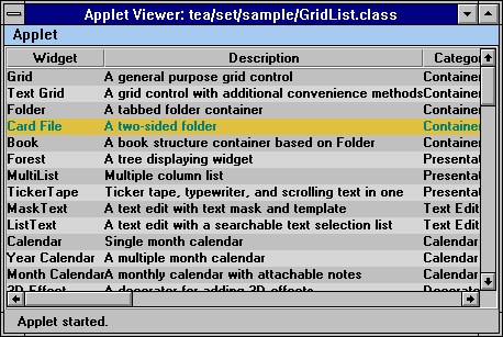
This is a simple TextGrid widget importing data from a text data file. The color of each row is changed so that each row alternates in the background color. Users can select a row or a column, and use the arrow keys to move the row/column selection up/down or left/right. Since the content is larger than the display area, Scrollbars are created automatically.
To setup a grid list, we first create an InputStream for the data source we want to import into the TextGrid.
URL url = new URL(getDocumentBase(), "GridList.txt");
InputStream input = url.openStream();
Then this input stream is passed to the TextGrid constructor to create a TextGrid object.
grid = new TextGrid(input, "|");
The delimiter used in the data file is a pipe character. The text file is parsed by TextGrid to extract the grid cell data. In our case, the cells contain the plain text strings. For more advanced user, the encoding schemes described earlier can be used to inform TextGrid to create other types of components for the cells, such as Choice, Checkbox, Button, and more.
The third parameter of the constructor is set to false to disable the editing of the grid cell data. After the TextGrid is created, we proceed to add the row headers to the grid.
grid.setColHeader(Tool.tokenize("Widget,Description,Category", ","));
The column headers are passed in as a delimited string, with the second parameter set to the delimited string. Alternatively, the headers also can be passed in as an array of Strings, or a Vector of Strings. Next we enable the selection of rows and columns.
grid.setRowSelectable(true, false);
grid.setColSelectable(true, false);
The first parameter of these methods enables the selection of row and column respectively. The second parameter tells TextGrid whether to create the selector headers for row/column. In our case, no selector headers will be created. If the second parameter is true, a header row or column will be created with empty header string to serve purely as the row/column selectors. The users can click on the selector to select a row or column. If there are no selectors created, the users can click inside of a cell to select a row or column, with the row selection that has higher priority than the column selection. Notice that since some of the AWT components do not pass mouse events up, click on those components will not cause a row or a column being selected.
grid.setGap(Grid.ALL_CELL, Grid.ALL_CELL, new Insets(1, 0, 1, 0));
Next we add 2 pixel gaps between the rows to make the layout more sparse. The gaps between the columns are not changed but remains zero.
By default, the ruling border lines are drawn between every row and every column. To disable the border lines in the body grid, we call:
grid.setRuling(Grid.NONE);
The ruling line options for the headers are separate from the body ruling option. Therefore, to properly setup the headers to have only one horizontal line between the column header and the body, we add:
grid.setRuling(Grid.HEADER, Grid.ALL_CELL, Grid.HORIZONTAL);
After all layout options are correctly set, we proceed to change the alternate row columns to a slightly different color from the default background color.
Color c = getBackground();
c = new Color(c.getRed()+25, c.getGreen()+25, c.getBlue()+25);
for(int i = 1; i < grid.countRows(); i+= 2) {
grid.setColor(i, Grid.ALL_CELL, c);
}
Grid.countRows() returns the total number of rows inside the current grid. Then for every alternate row, we call Grid.setRowColor to change the background color of all the cells on the row. Since there are gaps between the rows, we need to call Grid.setColor() instead of calling Component.setBackground() for each cell. If the colors are changed via Component.setBackground(), the color of the cell components are changed, but the gap area, which is not occupied by any component, will remain the default background color. By using Grid.setColor(), we ensures all areas in a cell, whether covered by a component or empty, will be painted in the specified color.
Finally we are ready to add the TextGrid to our main window.
add("Center", new Effect3D(new Scroller(grid), Effect3D.RAISED_BORDER));
Instead of adding the TextGrid directly to the window, we take two additional steps: adding a 3D border and a Scroller to the TextGrid.
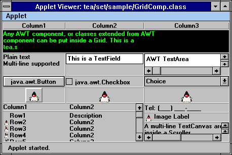
We use a Grid to manage the AWT and other (tea.set) components in this example. We first setup an empty Grid with 8 rows and 3 columns, and set the column headers.
grid = new Grid(8, 3); // create an empty grid
grid.setColHeader(Tool.tokenize("Column1;Column2;Column3",
";"));
Then we enable the row and column selections, without creating the selector headers,
grid.setRowSelectable(true, false);
grid.setColSelectable(true, false);
Since the row is selectable and no row selector header is created, click in any cell will select the row. Note that this event is true if you click on the image button, because the mouse event is passed up by the button, so a single mouse click causes the image button to be pushed, and the row where the image button is on to be selected. The columns can be selected by click on the column headers.
grid.setCell(0, 0, ticker = new TickerTape(message,
4), 1, 3);
ticker.setBackground(Color.black);
ticker.setForeground(Color.green);
A TickerTape widget is created for the first row. It is placed in a spanning cell that takes one row and three columns. For better visual effect, we proceed to change the foreground and background color of the ticker tape by changing the colors of TickerTape component itself.
grid.setCell(1, 0, new TextCanvas("Plain text\nMulti-line supported"));
To add a text to a cell, simply create a TextCanvas and add it to the Cell (This is handled automatically by TextGrid.setObject()). Or to create editable text fields, either create a TextField for single line text, or a TextArea for multi-line text.
grid.setCell(1, 1, new TextField("This is a TextField"));
grid.setAlignment(1, 1, Grid.V_TOP);
grid.setCell(1, 2, new TextArea("AWT TextArea\nWidget",
2, 18));
When creating TextField, the TextField component does not take the entire area. We set its alignment to Grid.V_TOP. This positions the TextField to the top of the area while stretch it to fill the horizontal direction. Other types of components can be added to the grid cells too,
grid.setCell(2, 0, new Button("java.awt.Button"));
grid.setCell(2, 1, new Checkbox("java.awt.Checkbox"));
Choice choice = new Choice();
choice.addItem("Choice");
choice.addItem("Component");
grid.setCell(2, 2, choice);
Here we create a Button, Checkbox, and a Choice components and add them
to the third row. Any component derived from the java.awt.Component can
be added to a grid cell in the same manner.
images = new Image[10];
for(int i = 0; i < images.length; i++) {
try {
URL url = new URL(getDocumentBase(),
"images/Duke/T"+(i+1)+".gif");
images[i] = getImage(url);
}
catch(Exception e) {
e.printStackTrace();
}
}
grid.setCell(3, 0, new ImageButton(images[0]));
grid.setCell(3, 1, new ImageCanvas(images[0]));
grid.setCell(3, 2, anim = new Animator(images));
grid.setAlignment(3, Grid.ALL_CELL, Grid.CENTER_CENTER);
Through the same mechanism, images, image buttons, and animations can
be added to the grid cells by using the appropriate components and add
them to the cells.
MultiList mlist = new MultiList(2, 10);
mlist.setHeader(Tool.tokenize("Column1,Column2",
","));
mlist.addRow(Tool.tokenize("Row1;Description",
";"));
...
grid.setCell(4, 0, mlist, 4, 2);
There are more sophisticated components, like the MultiList widget, can be added to a cell. Here we create a MultiList and add it to cell (4, 0), and specify it with 4 rows and 2 columns space. This creates a spanning cell that takes more than one cell's space.
grid.setCell(4, 2, new MaskText("Tel: ([999])
[999]-[9999]"));
grid.setCell(5, 2, new ImageLabel(images[0], "Image
Label"));
On the right side of the MultiList widget, we place two other widgets, one for text editting and the other is a simple label with an image icon. Next, we create a multi-line TextCanvas. Since the TextCanvas is larger than the space available in the cell, we further attach a Scroller to the TextCanvas to handle the scrolling.
TextCanvas text = new TextCanvas("A multi-line
TextCanvas area\n"+
"inside
a Scroller.\n" +
"Scroller
handles the scrolling\n"+
"of
the text automatically");
grid.setCell(6, 2, new Scroller(text, false, 100, 30),
2, 1);
A Grid itself does not have an outside border. To add an outside border, we use an Effect3D widget to decorate the grid, and add them to the grid cell.
add(new Effect3D(grid, Effect3D.RAISED_BORDER), "Center");
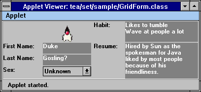
The Grid widget can be used to build a form type interface. This example uses TextCell to hold the text information. If an user needs to edit the content of a field, a mouse click inside a field will switch the cell into the edit mode:
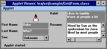
After the editing is done, simply tab to the next field, or click outside of the field area to switch this field to the display mode.
grid = new TextGrid(5, 4);
add(new Effect3D(grid, Effect3D.RAISED_BORDER),
"Center");
First we create a 5 row 4 column TextGrid and add it to the applet with a border attached to it. Then we turn off the ruling border lines between the cells, and add 2 pixels gap between the columns and 2 pixels gap between the rows,
grid.setRuling(Grid.NONE);
grid.setGap(Grid.ALL_CELL, Grid.ALL_CELL,
new Insets(2, 2, 2, 2));
Next, we fetch the duke image, and create an ImageCanvas to hold it in a grid cell.
try {
Image img = getImage(new URL(getDocumentBase(),"images/Duke/T1.gif"));
grid.setCell(0, 1, new ImageCanvas(img), 2, 1);
grid.setAlignment(0, 1, Grid.H_CENTER);
}
catch(Exception e) {
e.printStackTrace();
}
Then we setup the fields by adding a TextCanvas for the field label, and a TextCell for the text editing area. To make the text area stand out, we can change the foreground and background of the component.
grid.setObject(2, 0, "First Name:");
grid.setObject(2, 1, "Duke");
grid.setEditable(2, 1, true);
grid.setObject(3, 0, "Last Name:");
grid.setObject(3, 1, "Gosling?");
grid.setEditable(3, 1, true);
grid.setObject(4, 0, "Sex:");
grid.setObject(4, 1, "<CHOICE>Unkown,Male,Female")
grid.setObject(0, 2, "Habit:");
grid.setObject(0, 3, "Likes to
tumble\nWave at people a lot");
grid.setSpanning(0, 3, 2, 1);
grid.setEditable(0, 3, true);
grid.setObject(2, 2, "Resume:");
grid.setObject(2, 3, "Hired by
Sun as the\nspokesman for Java\n"+ "liked by most people\nbecause
of "+
"his\nfriendliness.");
grid.setSpanning(2, 3, 3, 1);
grid.setEditable(2, 3, true);
We can change all editable cells to have a gray background and white
foreground. When the Background property is set for a cell, the cell text
area is fill with the background color if there is text in the cell, or
the cell is editable. Therefore when we set the color properties using
Grid.ALL_CELL, empty non-editable cells will not show up.
grid.setForeground(Grid.ALL_CELL, 1,
Color.white);
grid.setBackground(Grid.ALL_CELL, 1,
Color.gray);
grid.setForeground(Grid.ALL_CELL, 3,
Color.white);
grid.setBackground(Grid.ALL_CELL, 3,
Color.gray);
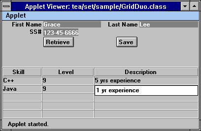
This applet consists of two grids. The top grid is used to set up a form for user input. The bottom grid is a table that can be used to display detailed information for the user. The example itself does not tie the two grids together, but just provide a screen layout.
We first create two TextGrids to be used for the top and bottom grid,
private TextGrid form = new TextGrid(3, 4);
private TextGrid list = new TextGrid(5, 3);
The layout of the form is stored in a String array, which will be passed to TextGrid.setRow() to setup all fields in the form,
private String[] layout = {"First Name;<EDIT:1,15>;Last
Name;<EDIT:1,15>",
"SS#;<MASK>[999]-[99]-[9999]",
" ;<BUTTON>Retrieve;<BUTTON>Save;" };
To create the form grid, we simply pass the layout strings to the TextGrid.setRow() method,
for(int i = 0; i < layout.length; i++) {
form.setRow(i, Tool.tokenize(layout[i],
";"));
}
We also need to set the color and alignment properties to make the form look the way we want,
form.setRuling(Grid.NONE);
form.setAlignment(Grid.ALL_CELL, 0, Grid.H_RIGHT);
form.setForeground(Grid.ALL_CELL, 1, Color.white);
form.setBackground(Grid.ALL_CELL, 1, Color.gray);
form.setAlignment(Grid.ALL_CELL, 1, Grid.H_LEFT);
form.setAlignment(Grid.ALL_CELL, 2, Grid.H_RIGHT);
form.setForeground(Grid.ALL_CELL, 3, Color.white);
form.setBackground(Grid.ALL_CELL, 3, Color.gray);
form.setGap(Grid.ALL_CELL, Grid.ALL_CELL, new Insets(1,2,1,2));
Next we proceed to setup the bottom grid to display and input tabular data. For the bottom grid, because we want to use it to handle text data, we do not set the cells to any component. Instead, we define the size of the cells explicitly,
list.setEditable(true);
list.setCharSize(Grid.ALL_CELL, 0, new Dimension(15,
1));
list.setCharSize(Grid.ALL_CELL, 1, new Dimension(20,
1));
list.setCharSize(Grid.ALL_CELL, 2, new Dimension(40,
1));
list.setColHeader(Tool.tokenize("Skill;Level;Description",
";"));
If the cell sizes are not set, they will have a default size of zero. Therefore it's always necessary to set the sizes explicitly when using TextGrid without components. If cells contain components, the preferred sizes are obtained from the cell components, and the explicit size specification is not necessary.
The Form Widget is based on the TextGrid customized for input form interface. Unlike a grid, which has a two dimensional indexing of child components, Form provides an one dimensional indexing of the input fields. So instead of accessing a field using row and column, fields on a Form can be accessed by a field index. The fields are layed out according to a layout policy automatically.
There are two advantages of this approach versus using TextGrid directly. First, the one dimensional indexing is more nature to programmers. When an input form is used, an user normally don't care where a particular field is placed. Instead it's which field to set a value or get a value. By flatting out the indexing of fields, users are freed from the particular placement of fields. Secondly, the layout of fields may change depending on the user preference. By accessing fields using field index instead of field position, the user is shielded from the layout detail.
An empty form can be created using a default constructor,
Form form = new Form(); // create an empty form
After a form is created, two form properties must be set in order to setup the input fields in a form: field labels and field width. The two properties are defined as String array and int array.
String[] labels = {"Field 1",
"Field 2", "Field 3"};
form.setField(labels); // set the field labels
int[] widths = {5, 8, 4};
form.setColumns(widths); // set the field width
Additional properties can be used to control the layout of the fields and look-and-feel of the form. By default, form fields are layed out in row major order. In this mode, the number of column is controlled by the RowColCount property. The fields are layed out from left to right on each row until the number of the column reaches the RowColCount value, and a new row is created. To change the default layout, set the LayoutPolicy property to Form.COL_MAJOR. If column major mode is used, the RowColCount value refers to the number of rows, and the fields are layed out from top to bottom for each column.
form.setRowColCount(3); // max
3 rows
form.setLayoutPolicy(Form.COL_MAJOR); // column major
layout mode
The field values can be accessed using the field index. The field index is translated to the field position in the Grid. Therefore,
String val = form.getObject(0);
is equivalent to (support the input field of the first field is placed at [0, 1])
String val = form.getObject(0, 1);
If the field is moved to another position, e.g. due to change of layout policy, the field index will remain the same but the field coordinate will change.
By default, every form field actual contains two grid cells, one for the field label, which is static text, and one for the field input, which is an editable cell. There are two style of editable cells, Form.EDIT_LINE and Form.TEXT_FIELD. The EDIT_LINE style, which is the default, displays field value in a shaded area, and pops up an editable cell when user presses mouse in the cell or tabs into the cell. This is similar to the default editable TextGrid behavior. Alternatively, a Form can be switched to TEXT_FIELD mode. In this mode every editable cell is set to a TextField component. The editing mode can be changed by setting the Style property,
form.setStyle(Form.TEXT_FIELD);
All field labes are right and center aligned by default, and editable cells of fields are left center aligned. The alignment of the label and text edit can be changed using LabelAlignment and TextAlignment properties.
| Property Name | Property Type | Description |
| RowColCount | int | Row (Column major) or column count (Row major) depending on the layout policy. |
| Field | String (Indexed) | Form field names. |
| Object | Object (Indexed) | Field value. |
| Columns | int (Indexed) | Field edit area size in characters. |
| FieldCount | int (Readonly) | Number of fields. |
| Position | Point (Indexed, Readonly) | Row and column position of the field in the grid. |
| Style | int | Style flag, EDIT_LINE or TEXT_FIELD. |
| LayoutPolicy | int | Layout policy, ROW_MAJOR or COL_MAJOR. |
| LabelAlignment | int | Field label alignment flag, same values as in Grid. Default to Grid.H_RIGHT | Grid.V_CENTER. |
| TextAlignment | int | Field text alignment flag, same values as in Grid. Default to Grid.H_LEFT | Grid.V_CENTER. |
Form itslef goes not generates any events. It inherites the events from Grid and TextGrid. For action events, which are caused by user editing a text cell in a TextGrid, Form captures the event and changes the event parameter. In the original action event generated by TextGrid, the ObjActionEvent.getObject() points to a Point which identifies the location of the cell where the action occured. Form modifies the object to Integer which contains the value of the field index of the cell.
| Event Type | Event ID | Generated | Description |
| ObjActionEvent | ActionEvent.ACTION_PERFORMED | Text cell content changed (exclude setObject()). | ActionEvent.getActionCommand() is the new text. ObjActionEvent.getObject() points to an Integer, which is the field index of the field where the action happened. If the action does not happen in an field, the object points to a Point, where the Point.x is the column number of the modified cell, and Point.y is the row number of the modified cell. |
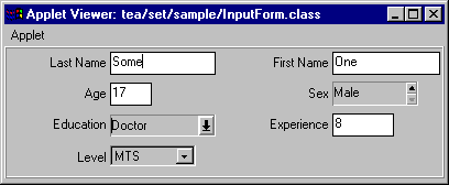
In this example, we create a simple input form using the Form widget. First, we define the field labels and field width as arrays,
String[] fields = {"Last Name", "First
Name", "Age", "Sex", "Education", "Experience",
"Level"};
int[] fwidth = {15, 15, 3, 3, 15, 6, 15}
Then we create an empty form using the default constructor,
form = new Form();
We choose to use TextField as the default edit field. To do this, we change the Style property to the desired value,
form.setStyle(Form.TEXT_FIELD);
We stay with the default row major layout policy, and set the number of columns to two. Notice the number of columns is not strictly the number of grid columns, but number of field columns. Since each field has two cells, there are actually four grid columns.
form.setLayoutPolicy(Form.ROW_MAJOR); // this call
is not necessary, for demo's purpose only
form.setRowColCount(2);
In order for the Form to know which fields to populate, we setup the Field and Columns property,
form.setField(fields);
form.setColumns(fwidth);
Next we decide to use some other widgets for certain field to replace the default TextField. We can do this by passing the encoded string to the Object property. Notice when we set the Object property, we do not specify the exact location of the cell, but use the field index. This insulate use from the possible position changes of cells.
form.setObject(3, "<SPIN>Male,Female");
form.setObject(4, "<COMBO>Bachelor,Master,Doctor");
form.setObject(6, "<CHOICE>MTS,DMTS,Superviser,DH")
The Folder widget provides a very simple way to build a tabbed folder type interface. Each folder page is associated with a tab, and contains a subcomponent. The position of the tabs can be controlled by the programmer. There are two constructors can be used to create a folder,
folder = new Folder(); // tab is placed on top
this creates an empty folder with the tab position defaults to top. The look-and-feel of a Folder is highly customizable. It's controlled by a set of properties,
| Property Name | Property Type | Description |
| Style | int | Folder tab position style flag. |
| Border | Insets | Border space around the content component. |
| PageCount | int(Readonly) | Number of pages in the CardFile. |
| TabForeground | Color(Indexed, Writeonly) | Tab foreground color. |
| TabBackground | Color(Indexed, Writeonly) | Tab background color. |
| TabFont | Font(Indexed, Writeonly) | Tab text font. |
| 3D | boolean | 3D or plain apparence. |
| Visible | boolean (Indexed) | Visibility of individual tabbed pages. |
A tab position flag can be explicitly specified when creating a folder,
folder = new Folder(Folder.RIGHT); // tab is placed at right
There are four possible positions,
| Folder.TOP | Tabs placed at top of folder |
| Folder.LEFT | Tabs placed at left of folder |
| Folder.BOTTOM | Tabs placed at bottom of folder |
| Folder.RIGHT | Tabs placed at right of folder |
The position of the tabs can be changed after a folder is created. This is done by calling the Folder.setStyle() method with one of the position flags as parameter. By default, the folder will be drawn in 3D mode. To override this and make the folder appear plain, set the 3D mode to false by,
folder.set3D(false);
After a folder is created, the components can be added to the folder using the add(String,Component) method like the regular panel. The string is used as the tab string for the component, and the component is the content of the folder page.
folder.add(new Calendar(), "Tab 1"); // add a calendar to folder, with 'Tab 1' as tab string
The tab strings must be unique in a folder. If Folder.add() is called multiple times with the same tab string, the last call overwrites all the previous calls. A component is managed by the Folder and takes all the available space inside a folder page. It is possible to add border space around the component,
folder.setBorder(new Insets(1,2,3,4)); // 1 pixel top border, 2 left, 3 bottom, 4 right
To further customize the look and feel of the Folder, individual tab's color and font can be changed. To turn a tab color to red on green, call
folder.setTabForeground("Tab 1",
Color.red);
folder.setTabBackground("Tab 1", Color.green);
When setting the color of tabs, keep in mind that some color do not look good in 3D mode, especially those that are very dark or very bright.
It is also possible to control which folder page should be shown from the program. To select a folder page to show, call,
folder.toFront("Tab 1");
or if the exact index of the tab is known,
folder.toFront(0);
A folder page can be removed from a folder at runtime,
folder.remove("Tab 1");
If a page is removed, all tabs are re-arranged to reflect the new tab layout. If the removed page is the current displaying page, the folder changes the current content to be blank, in another word, no pages is displayed.
The tab string of a folder page can be changed at runtime too,
folder.rename("Tab 1", "Page 1");
This only affects the tab string for the specified page. The page has to be referred to using the new name after it's renamed, the old name is no longer valid.
When a folder is selected by the user, an action event is generated by the Folder,
| Event Type | Event ID | Generated | Description |
| ActionEvent | ActionEvent.ACTION_PERFORMED | Tabbed page selected | ActionEvent.getActionCommand() contains the tab name. |
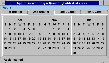
This is a very simple folder that contains a yearly calendar. The months are grouped into quarters, with each quarter displayed in a folder page. First, we create an empty folder, and set the border values to 4 pixels for all four sides.
folder = new Folder();
folder.setBorder(new Insets(4, 4, 4, 4));
Next, we simply add the four quarters, each quarter is a YearCal widget with a 3D border wrapped around it.
cal = new YearCal(96, 0, 96, 2, 1, 3);
folder.add(new Effect3D(cal, Effect3D.RAISED_BORDER),
"1st Quarter");
cal = new YearCal(96, 3, 96, 5, 1, 3);
folder.add(new Effect3D(cal, Effect3D.RAISED_BORDER),
"2nd Quarter");
cal = new YearCal(96, 6, 96, 8, 1, 3);
folder.add(new Effect3D(cal, Effect3D.RAISED_BORDER),
"3rd Quarter");
cal = new YearCal(96, 9, 96, 11, 1, 3);
folder.add(new Effect3D(cal, Effect3D.RAISED_BORDER),
"4th Quarter");
After the folder pages are setup, simply add the folder to the applet, and we are done.
add(folder, "Center");
A CardFile is very similar to a Folder, it provides a tabbed folder look and feel. Except that each folder page in a CardFile has two sides instead of one side, similar to a two-sided cardfile or personal organizer. The functionality provided by a CardFile are almost identical to the Folder widget other than the look and feel. It also has very similar properties as Folder,
| Property Name | Property Type | Description |
| Style | int | CardFile tab position style flag. |
| Border | Insets | Border space around the content component. |
| PageCount | int(Readonly) | Number of pages in the CardFile. |
| TabForeground | Color(Indexed, Writeonly) | Tab foreground color. |
| TabBackground | Color(Indexed, Writeonly) | Tab background color. |
| TabFont | Font(Indexed, Writeonly) | Tab text font. |
| 3D | boolean | 3D or plain apparence. |
Since a folder page in a CardFile widget has two sides, there can be two tab names associated with a page, one for each side. This is done by calling CardFile.add(String, Component) method. Each CardFile.add(String, Component) method call adds one side to the CardFile. It adds to the first side of first page, second side of first page, first side of second page, and so on. Different tab strings can be used for two sides of same page.
Alternatively, content can be added to CardFile suing CardFile.add(String, Component, Component) method. If this method is used, both sides of a page are added at the same time. Therefore the two sides always share the same tab name.
When removing a page from a CardFile using CardFile.remove(String), the entire page is always removed. Even if the two sides of a page have different tab names, and the parameter to the remove() method is the tab name of one side of the page, the page (both sides) will be removed from the CardFile nonetheless.
Changing tab string of folder pages works on all pages and all sides of pages. If the parameter to CardFile.rename() method is for one side of a page, the tab string for that side of the page will be changed. If both sides of a page share the same tab name, the tab names of both sides are changed to the new name.
Similarly, when an user clicks on a tabbed page and flips the CardFile pages, an action event is generated,
| Event Type | Event ID | Generated | Description |
| ActionEvent | ActionEvent.ACTION_PERFORMED | Tabbed page selected | ActionEvent.getActionCommand() contains the tab name. |
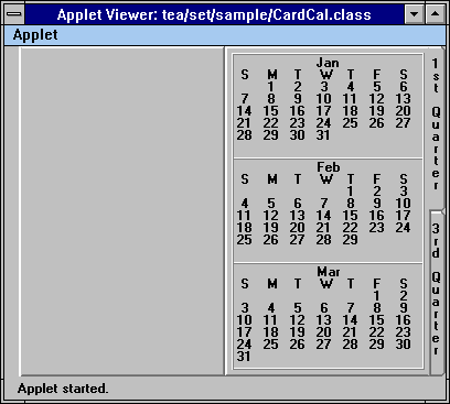
When a CardFile is first created, it shows the first side of the first folder page. The users can flip through the pages by clicking in the tab. After a mouse click in the "1st Quarter" tab, the calendar looks like:
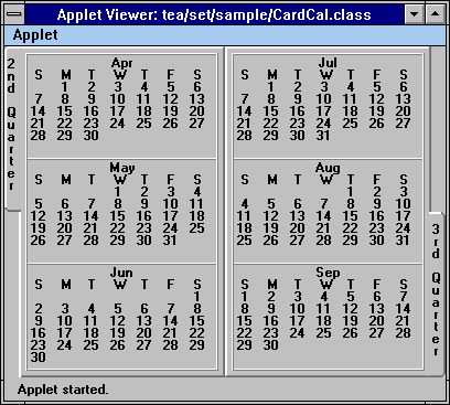
To create a calendar inside a CardFile, we use almost the same code like the Folder example. A CardFile has slightly different tab position flags for its constructor.
| CardFile.LEFT_RIGHT | Folder pages are divided in left and right halves. This is similar to a open book look and feel. |
| CardFile.TOP_BOTTOM | Folder pages are divided in top and bottom halves. This is similar to a card file look and feel. |
Here we create a left-right layout for the CardFile widget, and set the borders to 4 pixels for all four sides,
folder = new CardFile(CardFile.LEFT_RIGHT);
folder.setBorder(new Insets(4, 4, 4, 4));
After the empty CardFile is created, we proceed to add calendars to each side of the CardFile. Notice these code are almost identical to the code for the Folder example, but they have a slightly different effect,
cal = new YearCal(96, 0, 96, 2, 3, 1);
folder.add(new Effect3D(cal, Effect3D.RAISED_BORDER),
"1st Quarter");
cal = new YearCal(96, 3, 96, 5, 3, 1);
folder.add(new Effect3D(cal, Effect3D.RAISED_BORDER),
"2nd Quarter");
cal = new YearCal(96, 6, 96, 8, 3, 1);
folder.add(new Effect3D(cal, Effect3D.RAISED_BORDER),
"3rd Quarter", );
cal = new YearCal(96, 9, 96, 11, 3, 1);
folder.add(new Effect3D(cal, Effect3D.RAISED_BORDER),
"4th Quarter");
After the pages are setup, we call CardFile.flush() to make sure the pages are properly setup. This call is only necessary if the odd number of calls to CardFile(String, Component) were made, in which case the two sides have different number of pages. It's a good practice to always call this method at the end of all add() method invocations to make sure the odd pages are properly handled.
folder.flush();
add(folder, "Center");
The Book widget is slightly different from the Folder widget. Each folder page is capable of containing multiple components, and the users can flip through the folder pages as well as the components in side a folder page. Its API is almost exactly identical to the Folder widget. Please refer to the section on Folder for help.
The Presentation widgets are GUI components whose primary use is to present information to the end users, though some of the widgets do support certain user interaction. There are currently five widgets in this category:
Graph supports many common business type charts. It has a very simple API, which only requires the user to supply charting data. The layout and coordinate information are generated automatically by the widget. Alternatively, the user can choose to control the axis values and layout explicit, and this can be done throught setting the Graph property values.
| Property Name | Property Type | Description |
| X | Vector | X axis labels. |
| YAxisMinimum | double | Y axis label minimum (starting) value. |
| YAxisIncrement | double | Y axis label increment value. |
| YCount | int | Number of datasets in this graph. |
| Style | int | Graph styles. |
| Colors | Color (Indexed) | Graph drawing colors. |
| SelectedObjects | Object (Indexed, Readonly) | Index of the clicked data element. |
The types of charts supported by Graph is specified by the Style property, and it can has one of the following values:
| Graph Type | Description |
| Graph.LINE | Line chart with points |
| Graph.POINT | Point chart |
| Graph.BAR | Plain bar chart |
| Graph.STACKBAR | Plain stacked bar chart |
| Graph.PIE | Plain pie chart |
| Graph.BAR3D | 3D bar chart in 2D coordinate |
| Graph.STACKBAR3D | 3D stacked bar chart |
| Graph.PIE3D | 3D pie chart |
| Graph.BAR3D3D | 3D bar chart in 3D coordinate |
For all the chart types, except pie charts, multiple datasets can be handled automatically. For pie charts, only one dataset can be displayed at one time. To display multiple datasets, the user has to create multiple pie charts.
Mouse clicks are detected by the graph. If a mouse click happens inside a graph area, an ItemEvent is generated by the Graph.
| Event Type | Event ID | Generated | Description |
| ActionEvent | ActionEvent.ACTION_PERFORMED | Mouse click in a data point area | ActionEvent.getActionCommand() contains the x label of the data area. |
| ItemEvent | ItemEvent.SELECTED | Mouse click in a data point area. | ItemEvent.getItem() contains a Point object, where Point.x is the x index of the data point, and Point.y is the index of the dataset where this data point belongs to. ItemEvent.getStateChange() is 1. |
For example, if a mouse click happens inside the bar representing the third data point in the second dataset, the item points to Point(2,1). An action event is also generated with the same parameter as the mouse event. This is used to support the drill down graphs, which we will show next.
To view the monthly data for a particular year, click inside the bar area for the year. After we click in the bar for year 1995, the graph changes to show the monthly data for 1995,
To return to the yearly chart, simply click on the area outside of the bars.
To create a graph, we first need to setup a dataset for displaying by the graph. The datasets are passed into the graph as a Vector. If multiple datasets need to be passed, the vector parameter can be a Vector of Vectors, with each vector containing a Number as elements. If a single dataset needs to be passed in, the vector should be a vector of Numbers. The vector can be manually setup, or it can be created by using DataSet class.
A DataSet class can be used to easily construct a vector suitable for using with a Graph. There are two types of DataSet. If a DataSet is designated as numeric, which is the default, it treats everything as a number. A DataSet can be marked as non-numeric at creation time. If a DataSet is not numeric, it will not attempt to convert the elements to Number. The actual data can be stored in one of the following forms:
* For the numeric DataSet, Object must be a Number or one of its subclasses.
One of the above mentioned type can be passed into the DataSet constructor, or DataSet.setData() method. The data is parsed by the DataSet, and can be retrieve as a Vector using the DataSet.getData() method. The vector returned by DataSet.getData() can be used directly by the Graph widget.
In our case, we need to first setup the X axis labels. Since X lables are also passed to Graph as a Vector, we take the advantage of DataSet to create the vector from String[]. The labels are defined as data member,
private DataSet yx; // yearly chart x label dataset
private DataSet mx; // monthly chart x label dataset
private String[] yearX = {"1994", "1995",
"1996"};
private String[] monthX = {"Jan", "Feb",
"Mar", "Apr", "May", "Jun",
"Jul",
"Aug", "Sep", "Oct", "Nov", "Dec"};
Inside the init() routine, we set the two label datasets to the non-numeric mode, and pass in the label data,
yx = new DataSet(false);
yx.setData(yearX);
mx = new DataSet(false);
mx.setData(monthX);
Next we proceed to create a graph using the yearly chart x label, and the yearly chart data. Again, the DataSet class is used to setup the dataset for the chart data,
graph = new Graph(yx.getData(), (new DataSet(yearY)).getData());
add(graph, "Center");
Finally we change the type of the chart to 3D bar chart from the default line chart,
graph.setStyle(Graph.BAR3D);
Although a graph's primary purpose is to present information in a graphical format. It's possible for the user to interact with a graph. The most common type of graph user interaction is to drill down a graph when the user clicks on a data point. To support this interaction, we define a mouseDown() event handler to process the user mouse event.
When a mouse click happens inside a data point area, an item event is generated with the item point to a Point object, where Point.x is the sequence number of the data point within the dataset, and Point.y is the sequence number of the dataset within the datasets.
We add an item listener to the graph to handle the item event,
class GraphItemListener implements ItemListener {
public void itemStateChanged(ItemEvent
e) { // drill down if in yearly chart and user clicked inside a bar
if(dsIdx == 0) {
Point
p = (Point) e.getItem();
graph.setValues(mx.getData(),
(new DataSet(y[p.x])).getData());
dsIdx
= p.x + 1;
}
}
}
We use dsIdx to keep track which dataset is currently displayed. It's initialized to 0, which means the yearly data is displayed. If the yearly data is displayed, and the user clicked inside a data point area, we change the dataset of the graph to display the monthly data for the clicked year. The monthly data is stored in a two dimensional array y,
private int y[][] = { {12, 18, 15, 16, 8, 22, 25, 46, 8, 15, 11, 14},
{19,
18, 17, 16, 20, 22, 25, 36, 17, 25, 16, 13},
{29,
21, 19, 23, 15, 18, 33, 40, 52, 21, 11, 23} };
We determine the year by checking the Point.x value of the item parameter. When the dataset is switched, we set dsIdx to the non-zero new value so we know we are currently displaying the monthly data.
We also add a mouse event listener to listen for mouse event. If the mouse click is outside of any data point area, and we are not currently displaying the yearly data, we switch the dataset back to the yearly data, and set the dsIdx accordingly.
class GraphMouseListener extends MouseAdapter {
public void mousePressed(MouseEvent
e) { // return to yearly chart if clicked outside of any bar
if(dsIdx != 0) {
dsIdx
= 0;
graph.setValues(yx.getData(),
(new DataSet(yearY)).getData());
}
}
}
The Forest widget provides an interface for displaying the hierarchical data in a tree format. It has a very easy to use API and supports a simple tree node naming scheme. There are two classes involved in a Forest, Forest class and Node class. Forest class is the main class where most properties and events originate. The properties supported by Forest are,
| Property Name | Property Type | Description |
| Separator | char | Separator character used to separate nodes in a tree path. |
| IconOnly | boolean | True if only expend or collapse subtrees when mouse click happens inside the node icon. |
| Style | int | Forest style flag. |
| SelectedLabel | String (Readonly) | Label of the currently selected node. |
| SelectedPath | String (Readonly) | Path of the currently selected node. |
| SelectedObjects | Object[] (Readonly) | List of selected node paths. |
| MultiSelect | boolean | Multiple selection flag. |
When creating a Forest, two options can be specified,
forest = new Forest(Forest.LINE, true);
The first parameter specifies whether to draw lines to connect the parent and child nodes in the trees. Forest.LINE style draws lines connecting parent nodes and children nodes. Forest.LINE_BOX style draws a small rectange with + or - in addition to the lines, and the rectange serve the same purpose as the node icon for controlling subtree expension. The second parameter specifies whether to use the icon-only mode or not. If the icon-only mode is true, the subtree of a node is only openned/closed if the mouse click is inside the node icon. Otherwise, the subtree of a node is openned/closed if the mouse click is inside the node, including the text label.
Forest can be created with the default setting for the two options:
forest = new Forest(); // default: Forest.NO_LINE,
icon-only is false
or
forest = new Forest(Forest.LINE); // default icon-only
is false
The two options can also be controlled by calling Forest.setStyle() and Forest.setIconOnly() after a Forest is created.
The tree nodes are named in a way similar to the file system. Each node has a name, which can be any text string. A node is further uniquely identified by its full path, which is the concatination of all the node names from the root of the tree to the node, separated by a delimiter. The default delimiter is a dot '.'. It can be changed by calling Forest.setSeparator().
For example, if there is a tree branch, with root 'TeaSet", and nodes on the branchs are "Widget", "Grid". The full path for the "Grid" node would be "TeaSet.Widget.Grid".
By default, an image icon is created for each node. If a node is a leaf node, it has a page icon on the left of the node. If a node is a non-leaf node, it has a folder icon by default. The images can be changed by using the Forest.setImage() method,
forest.setImage(image, Forest.FOLDER_OPEN); // set the open folder image
There are three types of images:
| Flag | Description |
| Forest.FOLDER_OPEN | Open folder image for non-leaf node |
| Forest.FOLDER_CLOSE | Close folder image for non-leaf node |
| Forest.FOLDER_LEAF | Leaf node image |
If the image supplied in setImage is null, it disables the displaying of icon for the specified node type. The images set using Forest.setImage() is used by all nodes on the forest with the specified type. Forest also allows individual node's image being changed. To do this,
forest.setImage("root.child1", image);
The image is used by the specified node, regardless of the current state of the node. Other nodes are not affected by this call.
The preferred size of a Forest is the size for a fully expended tree. If the trees are collapsed, there will be large blank space left. The scrolling of Forest is not handled by the Forest widget itself. Instead, to add the scrolling support, you need to add the Forest to a Scroller decorator,
add("Center", new Scroller(forest, true, 200, 200));
Since the Forest does not implement the Scrollable interface, no customization is done for scrolling. The scroll is done at pixel level. As a consequence, the line-up and line-down scrolls one pixel at a time instead of one node at a time. The line increment can be changed through the Scroller.setLineIncrement() method. See Scroller for more detail.
When a mouse click happens in a node, the node is selected or deselected. An item event is also generated by the Forest. If mouse is double clicked, an action event is generated in addition to the item event. The item in the item event points to the node where the selection happened. To check if the selected node is open, use Node.isOpen() method.
| Event Type | Event ID | Generated | Description |
| ObjActionEvent | ActionEvent.ACTION_PERFORMED | Mouse double click on a node. | ActionEvent.getActionCommand() is the path of the node. ObjActionEvent.getObject() points to the node. |
| ItemEvent | ItemEvent.SELECTED | Node selected | ItemEvent.getItem() points to the selected node. |
| ItemEvent | ItemEvent.DESELECTED | Node deselected. | ItemEvent.getItem() points to the deselected node. |
User can interact with a forest by click on a node(or node icon) to open and close a subtree. More flexible control is available from the programming side. Nodes, subtrees, and partial subtrees can be hidden, shown, or forced open by a program.
To show a node, simply call,
forest.show("root.child1.grandchild1");
To show the same node, as well as the next 2 levels of the subtree of the node,
forest.show("root.child1.grandchild1", 2);
To show all nodes in the next 2 levels from the roots,
forest.show(2);
To fully expend the entire tree,
forest.showAll();
In some situations, it may be desirable to force a node to be always open. When a node is forced to be open, it will always show the next level nodes on its subtree. To force the root to be open,
forest.forceOpen("root");
It's equally easy to hide the nodes (collapse a subtree). To hide (collaps) a node and it's subtree,
forest.hide("root.child1.grandchild1");
Or you can hide only the nodes below certain levels in the subtree,
forest.hide("root.child1.grandchild1", 2);
This call hides all the nodes 2 levels below the specified node on its subtree. The specified node and the nodes on the first two levels of its subtree are not affected.
A Forest can contain more than one tree. Therefore, when traversing a forest, you first need to decide which tree you want to traverse. The number of trees in a Forest can be retrieved by calling the Forest.countRoots() method. To get the root of a tree,
Node root = forest.getRoot(2); // get the root node of the third tree in this forest
The Node class only has fivepublic methods,
The Node class is intended to be used for traversing the forest and its subtree only. Once the root node of a tree is retrieved from a forest, you can traverse the tree using any standard tree traversing algorithm (width-first or depth-first).
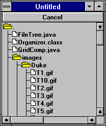
* Live Demo is not availabe, because this is an application and not an applet.
Since the naming scheme of the forest nodes are very similar to the regular file system, it's very easy to create a file system directory tree using the Forest widget. This example is a standalone application. It takes a path name, and generates a directory tree from the path, and display the tree using a Forest widget.
In the constructor of FileTree, we setup the Forest with proper options,
forest = new Forest(Forest.LINE); // empty forest
with line option
forest.setSeparator(File.separatorChar); // change the
separator to the same as the file system
forest.setIconOnly(true); // only open/close if mouse
click is in icon
Notice that since we changed the forest separator to the same separator used by the file system, file path can be used directly as the tree node path. After the forest is setup, we can use populateTree() to traverse the directory tree, and populate the nodes with the file names.
FileTree.populateTree() is a recursive method. It first add the current directory/file to the forest,
forest.add(rootPath);
If the rootPath points to a directory, it calls populateTree() recursively for all the directories/files in this directory,
.... // other code
for(int i = 0; i < files.length; i++) {
populateTree(rootPath + File.separator
+ files[i]);
}
After the populateTree() method is done, we return to the constructor, and finish up the forest setup, and add the forest to the applet,
forest.forceOpen(rootPath, true); // this must be
called after the tree is populated
add("Center", new Scroller(forest, true, 200,
200)); // attach a Scroller
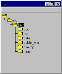
A Forest does not have to be fully populated at creation time. In many situations, it's desirable to delay the population of the nodes on a as needed basis. Our second example modifies the first example slightly by adding dynamic loading of the tree. When the Forest is first created, it only loads the nodes in the first level of the tree.
for(int i = 0; i < files.length; i++) {
String path = rootPath + File.separator
+ files[i];
forest.findNode(path, true);
}
Notice two things that's different in this loop. First, we do not call populateTree() recursively. Instead, we simply add on level of the tree. Second, instead of using Forest.add() method to add the nodes, we use the Forst.findNode() method. Forst.findNode() adds the specified node to the tree, but does not do a layout or repaint. We explicitly call the layout and repaint after the loop as a way to optimize the dynamic loading.
forest.doLayout();
forest.repaint();
To dynamically expend the subtrees, we need to know when to populate the subtress. We do this by handle the item event. We first check if the selected node is a directory, if true, we populate all nodes under the directory.
forest.addItemListener(new ItemListener() {
public void itemStateChanged(ItemEvent
e) {
Node node = (Node)
e.getItem();
String path = node.getPath();
File root = new File(path);
if(root.isDirectory()
&& node.isLeaf()) {
populateTree(path);
scroller.notifyUpdate();
}
}
});
After a node is clicked, it's children are populated and the subtree expended.

Notice after we populate the tree, we have to notify the scroller that the preferred size of the forest changed. Otherwise the forest will remain the old size, and new nodes may be outside of the displaying area.
The MultiList widget is used to display the multiple column list type information. A very similar interface and functionality can be achieved using the tea.set.Grid widget, as shown earlier in this guide. But MultiList is a much lighter version, and provides some nice features specifically built for the multi-column list presentation. The properties supported by MultiLIst are,
| Property Name | Property Type | Description |
| Row | String[] | MultiList row content. |
| SelectedObjects | Object[] | A list of column items of the selected row. |
| Header | String[] | Column headers. |
| RowCount | int (Readonly) | Number of rows. |
A MultiList can be created in several ways. To create a MultiList with 4 columns, and each column has a character width of 10, use
mlist = new MultiList(4, 10);
If each column needs to have a different width, the column width can be passed as an array. To create a MultiList with 4 columns, and each column has a width of 8, 5, 6, 9 character width,
int cwidth[] = {8, 5, 6, 9};
mlist = new MultiList(4, cwidth);
The preferred height of a MultiList depend on the number of rows you wish to be visible on screen. The default number of the visible screen rows is 5. It can be changed to another value using,
mlist = new MultiList(10, 4, cwidth); // 10 row 4 column list
There is a similar constructor for the MultiList with identical column widths.
When a MultiList widget is first created, it contains zero rows and no header. To add a header to the MultiList,
String title[] = {"Column 1",
"Column 2", "Column 3", "Column 4"};
mlist.setHeader(title);
or the equivalent command,
mlist.setHeader(Tool.tokenize("Column 1,Column 2,Column
3, Column 4", ","));
Where the first parameter is a delimited text field list, and the second parameter is the delimiter string. Alternatively a vector containing the title strings can also be passed to MultiList.setTitle using Tool.toArray().
To setup the content rows, you can use MultiList.addRow() to add a new row, or use MultiList.setRow() to change an existing row. The parameters for MultiList.addRow() and MultiList.setRow() are very similar. The following is a list of all possible parameter combinations for MultiList.addRow(). The MultiList.setRow() method has an additional int row number at the end of the parameter list to identify the existing row to change.
| Parameters | Description |
| (String[]) | Each element in the string array is a value for the respective column. |
| (String[], Image) | Same as (String[]) except a row image is specified, which will be displayed at the left side of the row. |
To add a new row,
mlist.addRow(Tool.tokenize("Tea Set|Widgets|Java|Good", "|", dukeImage));
or to change the first row,
mlist.setRow(Tool.tokenize("Tea Set|Widgets|Java|Good", "|", dukeImage));
There are three new events generated by MultiList. When an user selects a row, an item event is generated, with itempointing to the current MultiList. If the user double clicked on a row, in addition to the item event, an action event is also generated with the ObjActionEvent.getObject() pointing to an Integer of the row number. When a row is deselected, an ItemEvent.DESELECTED event is generated, with the item pointing to an Integer object containing the row number just deselected.
| Event Type | Event ID | Generated | Description |
| ObjActionEvent | ActionEvent.ACTION_PERFORMED | Mouse double click on a row. | ActionEvent.getActionCommand() contains the string representation of the row number. ObjActionEvent.getObject() contains an Integer of the row number. |
| ItemEvent | ItemEvent.SELECTED | Row selected | ItemEvent.getItem() and ItemEvent.getStateChange() contain an Integer and actual value of the row number. |
| ItemEvent | ItemEvent.DESELECTED | Row deselected. | ItemEvent.getItem() and ItemEvent.getStateChange() contain an Integer and actual value of the row number. |
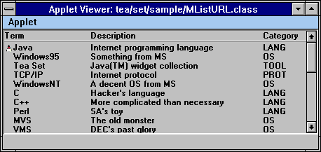
This example extends the MultiListA applet, and allows an URL to be attached to each row. When a user double clicks in a row, the associated URL is displayed. When the mouse pointer moves inside a row with attached URL, the URL string is displayed on the browser status line.
To extend the MultiListA applet, we define a new class as:
public class MListURL extends MultiListA {
Inside the init() method of the MListURL, we first call the init() method of MultiListA to initialize all the parameters supported by MultiListA,
super.init();
Then we look for the URL parameters, which is not supported by MultiListA. The URL parameter values are saved in a vector for later use.
for(int i = 0; (str = getParameter("ROW"+i))
!= null; i++) {
if((str = getParameter("URL"+i))
== null) {
urls.addElement(null);
}
else {
try {
urls.addElement(new
URL(getDocumentBase(), str));
}
catch(Exception e)
{
e.printStackTrace();
}
}
}
To handle user double click, we define an action handler. First we get the selected row number,
int r = list.getSelectedRow();
Then if the row has an URL attached, we display the URL,
if(r >= 0 && urls.elementAt(r) !=
null) {
getAppletContext().showDocument((URL) urls.elementAt(r));
}
In order to avoid surprises and make the user aware of the URL for each row, we want to display the URL string at the bottom of the browser whenever the mouse pointer moves inside a row. To do this, we add a mouseMove handle to capture the mouse movement event. First, we use MultiList.locateRow() to determine which row the mouse pointer is currently in,
int row = list.locateRow(x, y);
If the pointer is inside a row, and the row has an URL attached to it, we display the URL string at the browser status line,
if(row >= 0 && urls.elementAt(row) !=
null) {
showStatus(urls.elementAt(row).toString());
}
The TickerTape widget supports three styles of scrolling text:
They are controller by the following properties,
| Property Name | Property Type | Description |
| Width | int (Writeonly) | The character width of the ticker tape. |
| Message | URL/String | Ticker tape text message. |
There are two possible sources of the text input for a TickerTape: URL input stream or message string. To create a traditional single line ticker tape,
ticker = new TickerTape(message);
To create a typewriter style multi-line scrolling text, from an URL stream,
ticker = new TickerTape(url, 5); // 5 line typewriter display
To create a multi-line scrolling text with line scroll (one line at a time),
ticker = new TickerTape(url, 5, TickerTape.LINE_SCROLL);
After a TickerTape is created, the user of the object does not need to know which displaying style is chosen. They all behave identically.
TickerTape uses a new thread for controlling text scrolling. After a TickerTape is created, the ticker thread must be explicitly started by the program. To start a TickerTape, call the TickerTape.start() method. To stop the TickerTape, call the TickerTape.stop() method. Since a new thread is created in the TickerTape.start() method, it does not block the calling thread.
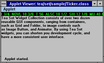
This screen consists of two TickerTape, a traditional ticker at the top, and a multi-line line-scroll ticker at the center. After a few iteration, the window looks like,
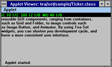
First we create the single line ticker, and change it's foreground and background colors to make it stand out from the background,
ticker1 = new TickerTape(mess, 1);
ticker1.setForeground(Color.green);
ticker1.setBackground(Color.black);
Next we setup the multi-line line-scroll ticker,
ticker2 = new TickerTape(url, 5, TickerTape.LINE_SCROLL);
ticker2.setWidth(20); // set the preferred width of this
ticker to 20 characters
The only thing we need to do is to start the tickers in the Applet.start() method, and stop the tickers in the Applet.stop() method.
A Meter widget is used to show progress data.
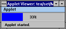
Meter can be either horizontal, in which case it grows from left to right, or it can be vertical, in which case it grows from bottom to top. To create a Meter,
meter = new Meter(1, 200); // create a horizontal
meter with bound [1, 200]
or
meter = new Meter(1, 200, Meter.VERTICAL); // create
a vertical meter
The current value of the meter can be changed by calling the Meter.setValue() method. When the value of a meter is changed, it's reflected in the colored bar in the meter. The current value of the meter can be displayed as part of the meter. The properties are,
| Property Name | Property Type | Description |
| Value | int | Current meter value. |
| Low | int | The lower end of the range. |
| High | int | The higher end of the range. |
| Display | int | Label display flag. |
| Color | Color | Meter fill color. |
There are three possible options for the Label property,
| Meter.NONE | Value label is not displayed |
| Meter.PERCENT | Value is displayed as a percentage of the range (Default) |
| Meter.ABSOLUTE | Value is displayed as an integer value as is |
The color of the bar can be changed using Meter.setColor(). The default color is blue.
Slider provides an interface to allow end users to interactively adjustment a numeric value in a pre-specified range. It's quite similar to the Scrollbar, but has more appealing look-and-feel. It has the following properties,
| Property Name | Property Type | Description | |
| Orientation | int | Orientation flag, Adjustable.VERTICAL or Adjustable.HORIZONTAL. | |
| Style | int | Style flag, Slider.SLIDE_BAR or Slider.SCALE_BAR. | |
| Minimum | int | Minimum value of the slider. | |
| Maximum | int | Maximum value of the slider. | |
| UnitIncrement | int | Unit increment value of the slider. | |
| BlockIncrement | int | Block increment value of the slider. The default block increment is one tenth of the total range. | |
| VisibleAmout | int | Not used. | |
| Value | int | Current slider value. |
When creating a Slider, you must decide whether to create a horizontal or vertical slider. A horizontal slider grows from left to right. A vertical slider grows from bottom upward.
Slider slider = new Slider(); // default horizontal
The default range of a slider is from 0 to 100. You can explicitly override this by supplying the range in the constructor,
Slider slider = new Slider(0, 50, Adjustable.VERTICAL); // min = 0, max = 50
The Slider widget supports two styles of slider: Slider.SCALE_BAR and Slider.SLIDE_BAR.
To adjust the value of a slider, pressed down the mouse on the sliding bar and drag. Or clear on the track for page increment/decrement. When the value of a Slider is adjustmented, either through dragging or clicking, the following events are generated.
| Event Type | Event ID | Generated | Type | Description |
| AdjustmentEvent | ActionEvent.ADJUSTMENT_VALUE_CHANGED | UNIT_INCREMENT | Mouse click on top/right box. | AdjustmentEvent.getValue() is the slider value. |
| AdjustmentEvent | ActionEvent.ADJUSTMENT_VALUE_CHANGED | UNIT_DECREMENT | Mouse click on left/bottom box. | AdjustmentEvent.getValue() is the slider value. |
| AdjustmentEvent | ActionEvent.ADJUSTMENT_VALUE_CHANGED | BLOCK_INCREMENT | Mouse click on top/right of slider bar. | AdjustmentEvent.getValue() is the slider value. |
| AdjustmentEvent | ActionEvent.ADJUSTMENT_VALUE_CHANGED | BLOCK_DECREMENT | Mouse click on below/left of slider bar. | AdjustmentEvent.getValue() is the slider value. |
| AdjustmentEvent | ActionEvent.ADJUSTMENT_VALUE_CHANGED | TRACK | Slider bar dragged. | AdjustmentEvent.getValue() is the slider value. |
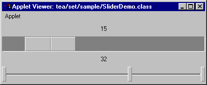
In this example program we create two sliders, with different style. The slider value is tied to the text label. Whenever the value of the Slider changes, it's reflected in the text labels.
We first create the upper slider. It's created with a default constructor,
sld1 = new Slider();
Then we setup the event handler to display the changing slider value,
lb1.setText(Integer.toString(sld1.getValue()));
We create the second slider with an explicit range,
sld2 = new Slider(0, 50, Adjustable.HORIZONTAL);
and we seup the event handling similarly to the first one.
Calendar related widgets are high level application components. They are intended to handle most common types of the calendar interfaces.
MCalendar widget displays one month calendar in a simple row/column format. It can be used by its own for simple calendar support, or used as building block to build more advanced interfaces. In addition to managing a GUI interface, the MCalendar widget also provides a set of calendar related static functions that can be used by other components to calculate the calendar related parameters.
MCalendar has the following properties,
| Property Name | Property Type | Description |
| Title | int | Calendar title option flag. |
| Year | int | Calendar year. |
| Month | int | Calendar month. |
| Highlighted | boolean (Indexed, Readonly) | True if the day is highlighted. |
| Highlight | Color | Highlight color. |
| StartDay | int (Readonly) | Starting day of a selected day range. |
| EndDay | int (Readonly) | Ending day of a selected day range. |
Depending on the context where MCalendar is used, it may or may not be desirable to display titles along with the days. Therefore, MCalendar provides flexible control on which titles are displayed. There are a total of four possibilities:
| MCalendar.NO_TITLE | No title displayed. |
| MCalendar.WEEK | Week day names are displayed in addition to days. |
| MCalendar.MONTH_WEEK | Month name and week day names are displayed (Default). |
| MCalendar.ALL | Year, month name, and week day names are displayed. |
The weekday names are the first letter of the full weekday names. The month names are the first three letters of the full month names.
To create a calendar for the current month, simply use the default constructor,
calendar = new MCalendar(); // current month
To create a calendar for other dates, pass the year and month to the constructor,
calendar = new MCalendar(96, 9); // Oct 1996
All calendar related components use the same convention as java.util.Date for the year, month, and day numbering.
The day or day range can be selected by the user. To select a range of days, press down the mouse button and drag the mouse over the selected days. When a day or a day range is selected, an action event is generated.
| Event Type | Event ID | Generated | Description |
| ActionEvent | ActionEvent.ACTION_PERFORMED | Day range selected. | ActionEvent.getActionCommand() contains "select". |
To get the selected day or day range, use MCalendar.getStartDay() and MCalendar.getEndDay(). If a day is selected, the return value of MCalendar.getStartDay() is the same as the return value of MCalendar.getEndDay(). For the day range selection, the MCalendar.getEndDay() points to the last day of the range, inclusively.
The day and day range can also be selected/deselected from a program using MCalendar.select() and MCalendar.clear().
A MCalendar contains a set of utility function for the calendar related calculation. They are defined as static and can be used independently of the MCalendar object.
int daysInMonth(int year, int month)
Returns the number of days in the specified month.
int dayOfWeek(int year, int month, int day)
Returns the day of week of the specified day, 0 for sunday, 1 for monday, and so on.
String getMonthName(int month)
Returns the three letter month name for the specified month.
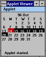
This is a simple one month calendar demostrating the functionality of the MCalendar widget. We first create a MCalendar widget for Oct, 1996-1997,
MCalendar cal = new MCalendar(96, 9);
Next we set the title option of the MCalendar to display the year, month, and weekday titles,
cal.setTitle(MCalendar.ALL);
Then we highlight the 14th day of the month, and select the 14th to the 20th days.
cal.highlight(14);
cal.select(14, 20);
To detect a day selection, we define an action handler. When an action event is posted, we get the starting and ending days, and print them to the standard output,
System.out.println(cal.getStartDay());
System.out.println(cal.getEndDay());
The monthly calendar widget, MonthCal, provides an interface similar to a personal organizer. The days of the month are layed out in a grid format. MonthCal is derived from the Grid widget. Therefore all the Grid features are available to control the layout of the day cells. MonthCal has the following properties,
| Property Name | Property Type | Description |
| Year | int | Calendar year. |
| Month | int | Calendar month. |
| Notes | String (Indexed) | Notes for a day. |
MonthCal can be created similarly to the Calendar widget. To create a monthly calendar for the current month, simply use the default constructor of MonthCal,
cal = new MonthCal();
To create a MonthCal widget for a specific month, pass the year and month number to the constructor,
cal = new MonthCal(96, 9);
The year, month, and day in MonthCal follows the same convention as the Calendar widget.
Each of the day cells can contain a text notes. The notes can be changed from a program, or by an end user. To change the notes from MonthCal, double click in a day cell, a notes entry window will popup. Then enter the text notes and press OK.
| Event Type | Event ID | Generated | Description |
| ObjActionEvent | ActionEvent.ACTION_PERFORMED | Notes changed. | ActionEvent.getActionCommand() is the new notes text, and ObjActionEvent.getObject() is an Integer containing the day number of the notes. |
When the notes is changed inside MonthCal, an action event is generated by MonthCal. The ObjActionEvent.getObject() of the Event object points to an Integer object containing the day number where the notes changed.
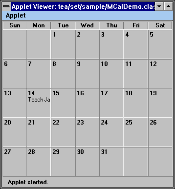
When the user double clicks in the 14th day cell, a notes entry window pops up. The notes can be changed from the entry window.
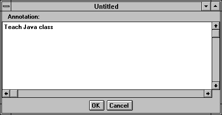
To create this applet, we first create a MonthCal widget,
MonthCal cal = new MonthCal(96, 9);
Then we add a notes to the 14th day of the month,
cal.setNotes("Teach Java class");
MonthCal does not have an outer border surrounding the widget, similar to the Grid widget. To add a border, we attach an Effect3D decorator to the MonthCal widget,
add("Center", new Effect3D(cal, Effect3D.RAISED_BORDER));
To capture the change of notes, we define an action handler. When a notes is changed, the new text is printed out on the standard output. The new notes is retrieved by getting the day number where the notes changed from the Event.arg object.
int day = Integer.parseInt(e.getActionCommand());
System.out.println(cal.getNotes(day));
YearCal is not strictly an yearly calendar. It is a multi-month calendar, possibly across different years. YearCal is also derived from the Grid widget, and shares all the features provided by the Grid widget for managing layout. It has following properties,
| Property Name | Property Type | Description |
| Title | int | Title option, same as MCalendar. |
| Year | int | Calendar year. |
| StartYear | int | Starting Year of the selected days. |
| startMonth | int | Starting month of the selected days. |
| StartDay | int | Starting day of the selected days. |
| EndYear | int | Ending Year of the selected days. |
| startMonth | int | Ending month of the selected days. |
| EndDay | int | Ending day of the selected days. |
| Highlight | Color (Writeonly) | Highlighting color. |
The default constructor of YearCal creates a yearly calendar for the current year in 4 row and 3 column layout.
cal = new YearCal(); // create a yearly calendar for current year
The year can be supplied to the YearCal constructor to create an yearly calendar for the year,
cal = new YearCal(97); // create a yearly calendar for 1997
Furthermore, the layout of the calendar can be controlled from the constructor,
cal = new YearCal(2, 6); // currently
calendar in 2 rows and 6 columns layout
or
cal = new YearCal(97, 2, 6); // create a yearly calendar
for 1997, layout in 2 rows and 6 columns
A more general use for YearCal is to create a multi-month calendar, without requiring all of the months to be in the same year,
cal = new YearCal(96, 9, 97, 2, 3, 3); // 10/96 to 2/97, in 3 row & 3 column layout
The day or day range can be selected by the user. To select a range of days, press down the mouse button and drag the mouse over the selected days. When a day or a day range is selected, an action event is generated. The day range selection can cross multiple months.
| Event Type | Event ID | Generated | Description |
| ActionEvent | ActionEvent.ACTION_PERFORMED | Day range selected. | ActionEvent.getActionCommand() contains "select". |
To get the selected day or day range, use YearCal.getStartDay(), YearCal.getStartMonth(), YearCal.getStartYear, and YearCal.getEndDay(), YearCal.getEndMonth(), YearCal.getEndYear(). If a day is selected, the return values of the start methods are identical to the return values of the end methods, respectively. For the day range selection, the return values of the end methods point to the last day of the range, inclusively.
The day and day range can also be selected/deselected from a program using YearCal.select() and YearCal.clear().
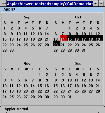
YearCal has an API very similar to the Calendar widget. We first create a YearCal widget for months from 9/96 to 12/96, in 2 rows and 2 columns.
YearCal cal = new YearCal(96, 8, 96, 11, 2, 2);
Next we set the title option of the YearCal to display both month and weekday titles,
cal.setTitle(Calendar.MONTH_WEEK);
The title options are the same as the Calendar widget title options. Then we highlight the 14th day of the 10/96, and select the 14th to the 20th days.
cal.highlight(96, 9, 14);
cal.select(96, 9, 14, 96, 9, 20);
To detect a day selection, we define an action handler. When an action event is posted, we get the starting and ending day, and print them to the standard output,
System.out.println(cal.getStartYear() + "-" + cal.getStartMonth() + "-" + cal.getStartDay());
System.out.println(cal.getEndYear() + "-" + cal.getEndMonth() + "-" + cal.getEndDay());
The TextEdit widgets are widgets that support the editing of text. All of the text edit widgets implements the TextEdit interface.
The TextEdit interface is similar to the java.awt.TextComponent class but provides more control over the behavior of the text edit component. Other than getting and setting of text, it also allows control of the cursor position, which is a very important feature that can be used for the extension of the text edit widgets.
The Cell widget implements all of the methods defined in the TextEdit interface. It is a very plain widget, without any external border or color, and it is generally not used in programming directly, but serves as the base of the text edit widget to support the actual text editing. There are two reasons why we need a Cell widget instead of using TextField or TextArea:
The Cell widget has following properties,
| Property Name | Property Type | Description |
| InsertMode | boolean | True for insert mode, and false for overwrite mode. |
| Text | String | Text in the cell. |
| SelectedText | String (Readonly) | Selected (highlighted) Text in the cell. |
| Editable | boolean | Allow editing or not. |
| SelectionStart | int (Readonly) | Starting index of selected text. |
| SelectionEnd | int (Readonly) | End index of selected text. |
| Columns | int | Text columns in the cell. |
| CursorPos | int | Cursor position in the cell. |
| Template | String | Editing template for the cell. |
The Cell widget posts an action event when the return key or the tab key is pressed.
| Event Type | Event ID | Generated | Description |
| ActionEvent | ActionEvent.ACTION_PERFORMED | Return or Tab key, or text changed through setText(). | ActionEvent.getActionCommand() contains the text. |
| TextEvent | TextEvent.TEXT_VALUE_CHANGED | Text changed by user. | Generated for every key stroke. |
MaskText supports text editing with a text mask. The mask serves two purposes:
The MaskText widget has following properties,
| Property Name | Property Type | Description |
| Mask | String | Editing mask. |
| Text | String | Editing text. |
MaskText can be created by supplying a text mask to the constructor,
text = new MaskText("[999]-[999]-[9999]");
The width of the MaskText is the same as the mask length. Each picture character is replaced with an underscore '_' when displayed in MaskText.
The mask/template is very similar to the PL/I picture. A mask is a mix of static text and picture specification. Written like plain text, static text is not editable, and will be skipped by MaskText during cursor movement. It's there purely as a template.
The picture specifications are in square brackets. The following characters can be used in a picture specification:
| c | Lowercase alphabet |
| C | Uppercase alphabet |
| A | Any alphabet (upper and lower cases), and space |
| , | Puntuation (, . ' " ; : / ? !) |
| 9 | Digits or decimal point |
| S | Digit, space, or punctuation |
| X | Any character |
Backslash can be used to escape an open square bracket to remove the special meaning.
When the user click in a MaskText, the cursor is positioned at the editable portion of the MaskText (non-static text). As the user types, the underscores that are used to hold the space for picture characters are replaced with the typed characters. When the end of an editable region is reached, the cursor jumps to the next editable region, skipping the static text.
Every keystroke is checked against the edit mask to ensure the character does not violate the picture specification. If an incorrect character is entered, a dialog window pops up with a message informing the expected character type.
The text of MaskText can be retrieved using MaskText.getText(). The space holding the underscores are replaced by the space in the returned text. The static text are returned as part of the text.
When the return key or the tab key is pressed, an action event is generated as in the Cell widget.
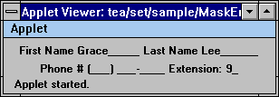
It's very simple to create the MaskText fields. Simply pass the correct text mask to MaskText, and add the MaskText to the applet,
add(new MaskText("First Name [CAAAAAAAAA] Last
Name [CAAAAAAAA]"));
add(new MaskText("Phone # ([999]) [999]-[9999] Extension:
[99]"));
The ListText widget provides two main functions:
The ListText widget has following properties,
| Property Name | Property Type | Description |
| CaseSensitive | boolean | Case sensitive when matching text. |
| Force | boolean | True if only items in the item list are allowed. |
| Auto | boolean | Item list window popping mode. |
| Popuped | boolean | True if item list window is popped up. |
| SelectedObjects | Object (Indexed) | List of selected items. |
| SelectedIndexes | int (Indexed) | List of selected item indexes. |
ListText can be created by first creating an empty ListText, and add ListText.addItem() to populate the list,
text = new ListText(15); // 15 columns
text.addItem("NY");
...
As stated before, ListText can check user input against the item list to ensure the user input is in the item list. This can be enabled by setting ListText to the force mode,
text.setForce(true);
By default, ListText ignores case when varifying user input and searching user input in the list. To make the verification and searching case sensitive, call
text.setCaseSensitive(true);
Initially, a ListText displays an editing area, without border. When the user types in the first character, or clicks inside the ListText, a list window is popped up and place below the ListText (see known bugs). As the user types, the list scrolls to place the best matching item on the top of the list. Clicking on a list item place the item in the ListText. When a list item is selected, an ItemEvent is generated. When the return or tab key is pressed, an action event is generated.
| Event Type | Event ID | Generated | Description |
| ActionEvent | ActionEvent.ACTION_PERFORMED | Return or Tab key, or text changed through setText(). | ActionEvent.getActionCommand() contains the text. |
| ItemEvent | ItemEvent.SELECTED | Item selected from list. | ItemEvent.getItem() contains the selected item, and ItemEvent.getStateChange() is 0. |
If the ListText is in the force mode and the user input is not part of the list, a dialog window popup informing the error. The keystroke causing this error is ignored.
The placement of the popup windows is not consistant in the current AWT implementation. The meaning of the location of a window varies depending on the platforms, implementations of Java environment, and versions of JDK. ListText behaves correctly under JDK 1.02 on WindowsNT.
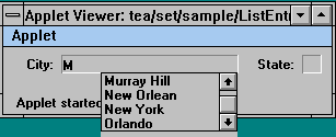
We create two ListText in this example. First we create a city list,
lt = new ListText(20);
lt.addItem("New York");
...
Then we create a state list, and switch it to the force mode,
lt = new ListText(2);
lt.setForce(true);
lt.addItem("NY");
...
A ComboBox is an editable field with an attached item list menu. It is derived from ListText, so all properties are inherited from the ListText. The properties are,
| Property Name | Property Type | Description |
| CaseSensitive | boolean | True if case sensitive when match text. |
| Force | boolean | True if user only allowed to enter text in the item list. |
| SelectedObjects | Object[] (Readonly) | list of selected items in the item list. |
| InsertMode | boolean | True for insert mode, and false for overwrite mode. |
| Text | String | Text in the cell. |
| SelectedText | String (Readonly) | Selected (highlighted) Text in the cell. |
| Editable | boolean | Allow editing or not. |
| SelectionStart | int (Readonly) | Starting index of selected text. |
| SelectionEnd | int (Readonly) | End index of selected text. |
| Columns | int | Text columns in the cell. |
| CursorPos | int | Cursor position in the cell. |
A ComboBox can be created using its default constructor,
ComboBox box = new ComboBox();
Then the items can be added to the ComboBox using ComboBox.add(),
box.add("item1");
box.add("item2");
The item list menu pops up when the menu button is pressed. When the menu button is pressed again, the menu is popped down. There are three events associated with the ComboBox:
| Event Type | Event ID | Generated | Description |
| ActionEvent | ActionEvent.ACTION_PERFORMED | Return or Tab key, or text changed through setText(). | ActionEvent.getActionCommand() contains the text. |
| ItemEvent | ItemEvent.SELECTED | Item selected from list. | ItemEvent.getItem() contains the selected item, and ItemEvent.getStateChange() is 0. |
| TextEvent | TextEvent.TEXT_VALUE_CHANGED | Text changed by user. | Generated for every key stroke. |
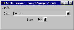
In this example, we create a simple form using the ComboBox. We first create an empty ComboBox,
cb = new ComboBox(20); // initial width 20 characters
Then we add all items to the ComboBox,
cb.add("New York");
cb.add("Boston");
cb.add("Orlando");
cb.add("Chicago");
...
And we setup the second ComboBox in a similar sequence.
A Spinner widget has two distinct modes of operation,
The Spinner widget has following properties,
| Property Name | Property Type | Description |
| Numeric | boolean (Readonly) | True if Spinner is in numeric mode. |
| RangeLow | int | Lower bound of the numeric range. |
| RangeHigh | int | Higher bound of the numeric range. |
| Items | String[] (Readonly) | Items list of the spinner. |
| Current | int | The current value or index. |
| InsertMode | boolean | Text insert (overwrite) mode. |
| Text | String | Current text. |
| SelectedText | String (Readonly) | Selected text string. |
| Editable | boolean | Editable flag. |
| SelectionStart | int (Readonly) | Starting index of select substring. |
| SelectionEnd | int (Readonly) | Ending index of selected substring. |
| Columns | int (Readonly) | Width in characters. |
| CursorPos | int | Cursor position. |
To create a numeric Spinner, pass the numeric range to the Spinner constructor,
spinner = new Spinner(1, 100); // [1, 100] range
To create a list item Spinner, pass the itme list to the Spinner constructor,
spinner = new Spinner(Tool.tokenize("NY,NJ,PA", ","), true);
The last parameter informs the Spinner to create a border around the editing area. Otherwise no border is created.
The two arrow buttons inside the Spinner can be used to scroll the spinner value. If the Spinner is in the numeric mode, editing of the Spinner value is disabled. The user can only change the value by scrolling. It can be explicitly enabled by calling Spinner.setEditable(true). In this case the user can enter any thing, even non-digits.
In the list item mode, Spinner is editable by default. If the user enters a new text and press the return key, the new text is added to the item list. The editing can be explicitly disabled by calling Spinner.setEditable(false). In this case the only way to change the Spinner value is by picking an item from the item list.
When the value of a Spinner changes, an action event is generated.
| Event Type | Event ID | Generated | Description |
| ActionEvent | ActionEvent.ACTION_PERFORMED | Return or Tab key, or text changed through setText(). | ActionEvent.getActionCommand() contains the text. |
| TextEvent | TextEvent.TEXT_VALUE_CHANGED | Text changed by user. | Generated for every key stroke. |
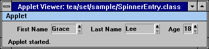
In this example, we create two list item Spinner and one numeric Spinner. We first create a first name field,
String[] names = {"Grace", "John",
"Karen", "Eillen", "Christ"};
add(new Spinner(names, true)); // create border
Then we create the last name field using Tool.tokenize() to parse a delimited string and pass it to Spinner constructor,
add(new Spinner(Tool.tokenize("Lee,Clinton,Rich,King", ",")));
Finally we create the numeric Spinner for the age field,
add(new Spinner(18, 65));
Decorators are components which in general do not provide a complete interface by themselves, but have to be used together with other components. When used with other components, decorators add additional look and feel or behavior to the components.
A Scroller decorator is a decorator for adding the scrolling support to other components. There are two types of scrolling supported by the Scroller:
The Scroller widget has following properties,
| Property Name | Property Type | Description |
| Component | Component | Managed component of scroller. |
| ScrollOption | int | Scrolling option flag, H_SCROLL and/or V_SCROLL. |
| UnitIncrement | int (Indexed) | Increment value for unit increment. |
| BlockIncrement | int (Indexed) | Increment value for block increment. |
By default, scrollbars are created only if necessary. For the pixel scroll mode, a scrollbar is deemed necessary for a direction if the preferred size of the component is larger than the size of the Scroller, along that direction. In the customized scroll mode, a scrollbar is deemed necessary for a direction if the maximum value is greater than the sum of the minimum and visible values, for that direction.
Alternatively, you can force the Scroller to always create scrollbars. This can be simply accomplished by specifying the auto mode to false in the constructor,
scroll = new Scroller(comp, false); // auto mode false, force scrollbars to be created
By default, if a component does not implement the tea.set.Scrollable interface, it will be scrolled by pixels. This means the page increment will be equal to the size of the Scroller viewport, and the line increment will be one pixel at a time. The scrollbar values, including whether scrollbars are needed, are calculated based on the preferred size of the managed component, and the size of the Scroller.
The page and line increment of scrollbars can be changed from their default values. To change the page increment, call
scroll.setBlockIncrement(Scrollbar.VERTICAL, 50); // set page increment to 50 pixels
or to change the line increment, use
scroll.setUnitIncrement(Scrollbar.HORIZONTAL, 5); // set line increment to 5 pixels
The increment values must be changed after the scrollbars are created. Otherwise they are ignored. This means that the Scroller.validate() method must be called before calling one of the increment methods.
For some component types, pixel scroll mode is not appropriate. For example, for the Grid component, it's more desirable to scroll by the rows and columns than by pixel. In which case, the rows or columns may be partially visible and not aligned with the top or left of the grid. To support customized scrolling, the managed component can implement the tea.set.Scrollable interface.
A Scrollable interface contains methods for returning the scrollbar parameters. These parameters are used to determine if the scrollbars are needed, and to set the scrollbar parameters. Unlike the default pixel scroll mode, the preferred size of the component is not consulted. This means the size of the managed component is always set to the size of the Scroller, minus the space taken by the scrollbars if they are present. The managed component is responsible for performing the actual scrolling and providing the scrolling parameters defined in the Scrollable interface.
To attach a Scroller to a component, simply pass the component to the Scroller's constructor,
add("Center", new Scroller(comp));
In this case the preferred size of the Scroller is the same as its managed component. To specify a size for the Scroller, use,
add("Center", new Scroller(comp, true, 200, 100)); // Scroller size is (200, 100)
The size specified in the Scroller constructor is the preferred size of the Scroller. Whether it will be that size depends on the context where the Scroller is used. After a Scroller is attached to a component, it manages the scrolling of the component automatically.
The parameters of a Scroller, as well as the need for scrollbars, are calculated and set at initialization time of a Scroller. It's sometimes necessary to recalculate the parameters after the initialization. For example, a component's preferred size may change (for pixel scroll mode), or the scrolling parameters may change (for customized scroll mode), in which case the Scroller need to recalculate its values.This can be done by calling the notifyUpdate() method of Scroller, which forces a recalculation of all parameters related to the managed component.
A Scrollable interface is used to customize the scrolling of a component. To manage the scrolling by a component itself, simply implement the Scrollable interface in the component,
public class Grid extends Panel implements Scrollable
The component needs to further supply the values needed by the Scroller to initialize the scrollbars. This can be done by implementing the following methods,
If the parameter values may change dynamically, the component should also save a reference to the Scroller by implementing the Scrollable.registerScroller() method,
public void registerScroller(Scroller
scroller) {
this.scroller = scroller;
}
The reference can be used later to notify the Scroller the parameter changes,
scroller.notifyUpdate();
This call forces the Scroller to recalculate all the scrollbar related parameter values, and set the values for the scrollbars accordingly.
For the components that do not implement the Scrollable interface, the preferred size are satisfied in the default mode. Sometimes it's desiable to scroll only at one direction, vertical or horizontal. This can be controlled by setting the scroll options of Scroller,
scroll.setScrollOption(Scroller.H_FILL | Scroller.V_SCROLL);
This will force the width of the managed component to be set to the same width as the Scroller, minus the space possibly taken by the scrollbars. The height of the component will be set to the same as its preferred height. The effect of this is that the horizontal bar will never be created, because the width of the component will never exceed the width of the Scroller, but the vertical scrollbar may be created depending on the preferred height of the component, and the height of the Scroller, the same as the default scrolling option. Available options are:
| Scroller.H_SCROLL | Set component width to its preferred width |
Scroller.V_SCROLL | Set component height to its preferred height |
| Scroller.H_FILL | Set component width to the width of Scroller minus the vertical scrollbar if it exists. |
Scroller.V_FILL | Set component height to the height of Scroller minus the horizontal scrollbar if it exists. |
The option should be a bitwise or of the horizontal option and the vertical option.
This example uses a panel (with FlowLayout) to layout components in the vertical direction instead of horizontal direction. When the Scroller is in the H_SCROLL and V_SCROLL mode (default), the width of the panel is the maximum width of the individual components. If we change the scrolling option to H_FILL|V_SCROLL, the width of the panel is set to the Scroller width, minus the width of the vertical scrollbar. As a result, the two buttons are fitted to each row,
The new panel, VPanel, is created by extending the Panel class and override the preferredSize() method of the Panel class. Inside the preferredSize() method, we find the maximum width of the components, and use it as the preferred width of the panel. We find the sum of the heights of the compnents and use it as the preferred height of the panel.
Dimension d = new Dimension(0, 0);
for(int i = 0; i < countComponents(); i++) {
Component comp = getComponent(i);
Point loc = comp.location();
Dimension siz = comp.size();
if(siz.width > d.width) {
d.width = siz.width;
}
if(siz.height + loc.y > d.height)
{
d.height = siz.height
+ loc.y;
}
}
return d;
In the ScrollPanel applet init() method, we create a VPanel container, and add buttons and checkboxes to it as normal,
Panel pnl = new VPanel();
pnl.add(new Button("Button 1"));
...
Then we create a Scroller, and attach it to the panel,
add("Center", scroll = new Scroller(pnl));
The VPanel does not implement the Scrollabe interface. Therefore it's scrolled by pixels. To make the line scrolling fast (default is one pixel at a time), we change the line increment of the Scroller,
validate();
scroll.setUnitIncrement(Scrollbar.VERTICAL, 5);
By calling the validate() method before the setUnitIncrement() method, we make sure all the scrollbars are created by the time the setUnitIncrement() is called. Otherwise setUnitIncrement() will be quietly ignored by the Scroller.
Finally, we define an action event handler to handle the checkbox events. When the checkbox states are changed, we set the scroll option of the Scroller to the appropriate values,
Checkbox box = (Checkbox) e.getSource();
if(box.getState()) {
if(box.getLabel().equals("Horizontal
Scroll")) {
scroll.setScrollOption(Scroller.H_SCROLL
| Scroller.V_SCROLL);
}
else if(box.getLabel().equals("Horizontal
Fill")) {
scroll.setScrollOption(Scroller.H_FILL
| Scroller.V_SCROLL);
}
}
The Grid widget does not support scrolling of grid rows and columns directly. Instead, it implements the Scrollable interface, and provides customized scrolling control through the Scroller widget. Instead of scrolling by pixels, the Grid widget scrolls by rows or columns. To add scrolling support to a Grid, simply decorate the Grid widget with a Scroller,
add("Center", new Scroller(grid));
All scrolling of the grid, including creation and management of scrollbars, are automatically done by the Scroller decorator. The scrollbars are created as needed, if the scrollbar is in the default auto mode. The scrollbar parameters are populated with the values supplied by the Grid widget.
An Effect3D decorator addes a border to a component. It can optionally contain a caption to be displayed at the top left cornor of the border. It has following properties,
| Property Name | Property Type | Description |
| Component | Component | Managed component of this Effect3D. |
| Style | int | 3D border style. |
| Border | int | Border width in pixels. |
| Caption | String | Caption text. |
| CaptionPos | int | Caption text position flag, Effect3D.LEFT, Effect3D.CENTER, or Effect3D.RIGHT. |
Four styles of border are supported,
| Effect3D.RAISED | Border has a raised surface look and feel |
| Effect3D.LOWERED | Border has a lowered (inset) surface look and feel |
| Effect3D.RAISED_BORDER | Border is a raised 3D line |
| Effect3D.LOWERED_BORDER | Border is a lowered (inset) 3D line |
The default border width is 2 pixels. It can be changed by calling
box.setBorder(3); // set border width to 3 pixels
To add a border to a component, simply pass it to the Effect3D constructor,
box = new Effect3D(comp);
If a caption title is needed, it can also be passed to the constructor as,
box = new Effect3D(comp, "Caption Box", Effect3D.RAISED_BORDER);
The caption can also be set by
box.setCaption("Caption Box");
The style of the border can also be set after the Effect3D component has be created,
box.setStyle(Effect3D.RAISED_BORDER);
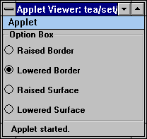
We first create a panel to contain the radio buttons,
Panel pnl = new Panel();
pnl.setLayout(new GridLayout(4, 1));
CheckboxGroup cg = new CheckboxGroup();
pnl.add(new Checkbox("Raised Border", cg, true);
...
Then we attach an Effect3D decorator to the panel,
add("Center", box = new Effect3D(pnl, "Option Box", Effect3D.RAISED_BORDER));
When the radio button states are changed, we want to change the style of the border accordingly. To do this, we define an action event handler to handle the radio button events,
if(cb.getLabel().equals("Raised Border"))
{
box.setStyle(Effect3D.RAISED_BORDER);
}
else if(cb.getLabel().equals("Lowered Border"))
{
box.setStyle(Effect3D.LOWERED_BORDER);
}
else if(cb.getLabel().equals("Raised Surface"))
{
box.setStyle(Effect3D.RAISED);
}
else if(cb.getLabel().equals("Lowered Surface"))
{
box.setStyle(Effect3D.LOWERED);
}
Shade is a very simple decorator. It adds a shadow to a component. The default shadow width is 5 pixels. This can be changed using the Shade.setShadeWidth(int) method. The Shade widget also draws a light one pixel border around the managed component by default. This avoids the component to blend into the background if they are the same color. The feature can be disabled by
add("Center", new Shade(comp,
false)); // don't draw border
or after the shade has been created,
shade.setBorder(false);
Here is a complete list of properties,
| Property Name | Property Type | Description |
| Component | Component | The shaded component. |
| Border | boolean | True to draw a border around child component. |
| ShadeWidth | int | The width of the shade in pixels. |
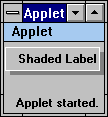
Although image processing and multi-media are not the main focus of Tea Set Widgets, we do provide a few widgets for image displaying and animation. Some of the widgets are also used by other components to handle image related functions. For example, ImageCanvas is used by TextGrid for displaying images in the grid cells.
An ImageButton displays an image in a button like look and feel, by adding a 3D border to the image, and reversing the 3D border when the button is pushed down. It's properties are,
| Property Name | Property Type | Description |
| Toggle | boolean | Toggle button mode flag. |
| State | boolean | Toggle button state. |
| Label | String | Button text label. |
| LabelPos | int | Button label position flag. |
| Image | Image | Button image. |
An optional label can be added to an ImageButton. The placement of the label can be spcified in one of the following position flags,
| ImageButton.TOP | Place label at top of image |
| ImageButton.LEFT | Place label at left of image |
| ImageButton.BOTTOM | Place label at bottom of image (Default) |
| ImageButton.RIGHT | Place label at right of image |
These position flags are also used by an AnimatedButton described in the next section. If the size of an ImageButton is different from the size of an image, the image is automatically scaled to fit the button area.
When the button is pushed, an action event is generated.
| Event Type | Event ID | Generated | Description |
| ActionEvent | ActionEvent.ACTION_PERFORMED | Button pressed, or state changed if toggle button. | ActionEvent.getActionCommand() contains the button label. |
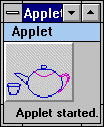
To create an ImageButton, pass the image to its constructor,
ImageButton ib = new ImageButton(image, "label");
The label can also be set after the button is created,
ib.setLabel("label", ImageButton.RIGHT);
ImageCanvas can be used to hold an image, It's properties are,
| Property Name | Property Type | Description |
| Image | Image | Canvas image object. |
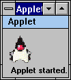
It can be created by passing an image to the ImageCanvas constructor,
ImageCanvas ic = new ImageCanvas(image);
ImageLabel is similar to a plain label except that an image can be added to the label. The image is displayed at the left-hand side of the label. It's properties are,
| Property Name | Property Type | Description |
| Label | String | text label. |
| Image | Image | Label image. |
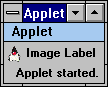
ImageLabel can be created by,
ImageLabel il = new ImageLabel(image, "label");
The label can be dynamically changed,
il.setLabel("new label");
An AnimatedButton is similar to an ImageButton except that it supports the image animation. Both of them support the optional text labels and the automatic image scaling. It's properties are,
| Property Name | Property Type | Description |
| Delay | int | Time delay in miniseconds between animation frames. |
| Images | Image (Indexed) | Animation frames for the AnimatedButton. |
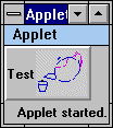
When creating an AnimatedButton, pass in the animation frames as an array of images.
Image[] images = ...;
AnimatedButton ab = new AnimatedButton(images);
When the button is pushed, an action event is generated. The Event.arg is set to point to the current AnimatedButton object.
Animator widget is a very simple widget that does image animation. Like ImageButton and AnimatedButton, it supports automatic image scaling. It's properties are,
| Property Name | Property Type | Description |
| Delay | int | Time delay in miniseconds between animation frames. |
| Images | Image (Indexed) | Animation frames for the Animator. |
To create an Animator, pass in the animation frames as an array of images.
Image[] images = ...;
Animator an = new Animator(images);
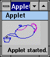
Every widget in the Tea Set Widgets has a corresponding applet. The applets are intended to be used directly by the Web page creator inside a HTML page without any additional coding. For the widgets whose function is primarily for presentation of information, such as the Graph widget, this is true. But if the user actions need to be handled by the server, the applets need to be extended to add the action handling routines to communicate information back to the server.
The name of the applet version of widgets are the name of the widgets appended with an 'A'. For example, the Grid applet is GridA, Graph applet is GraphA, and so on.
All of the applets in Tea Set Widgets are derived from the BaseA base applet. The base applet serves two main purposes: handle general applet parameters, and handle applet parameter naming hierarchy. Since all other Tea Set applets are derived from the BaseA applet, the parameters supported by BaseA are also available to all of the Tea Set applets.
The applet parameters in Tea Set Widgets are
named using a hierarchical structure. There are three components to every
parameter name, ID, widget name, and parameter name. The ID fields are
only used in the container widgets, and they will be explained in more
detail in each container applet section. The widget name is the name of
the corresponding widget of an applet, and the parameter name is the real
name of the parameter. ID field may be null depending on whether this
applet is inside a container applet. If the ID field is null, the
full name for a parameter is the widget name plus the parameter name, separated
by '.'. For example, the foreground color parameter for the GraphA applet
would be:
<param name=Graph.FOREGROUND value=black>
If the ID field is not null, for example if GraphA is
placed in the cell [2,3] inside a GridA. The foreground color parameter
for that particular graph applet is:
<param name=2.3.Graph.FOREGROUND value=...>
If an applet has its ID field set, such as the example above, when it asks for a parameter, e.g. FOREGROUND, BaseA will first look to see if the exact parameter, 2.3.Graph.FOREGROUND, exists. If not, it looks for a parameter without the ID specification, Graph.FOREGROUND. Therefore, to supply the parameters to an applet, a fully qualified name can be used, in which case the parameter can only be accessed by the specified applet. Or an applet parameter can be used without the ID information, in which case the parameter is shared by all the applets of the same type. All these naming scheme is handled by the BaseA applet automatically without the user intervention. The users of the applets only need to know the ID value of the child applets, and specify parameters accordingly.
As a last resort, if the parameter names with the widget name is not found, nor is the parameter fully qualified with the id and widget name, then BaseA would look for a parameter name without any qualification. So if the FOREGROUND parameter is specified without any qualification, it will be accessed by all the applets without their own parameter. This is also the way that the applet parameters can be passed to applets other than those inside the Tea Set Widgets package.
There are two resources controlled by the base applet, and are common to all the Tea Set applets, color and font. For the color resource, either the foreground color, or the background color can be specified in the applet tag:
<param name=Graph.FOREGROUND value=red>
<param name=Graph.BACKGROUND value=green>
would make all the Graph applet to have red as foreground color and green as background color. Or more generally,
<param name=FOREGROUND value=black>
<param name=BACKGROUND value=lightGray>
would set all the Tea Set applets to have black foreground and light gray background, provided with a qualified parameter which does not exist for the applet. E.g. If both set of parameters exist above, the Graph applet would still have red foreground and green background, but other Tea Set applet would have black foreground and light gray background since they don't have their corresponding qualified color parameter specified.
The font parameter is also handled by the BaseA applet. You can either specify a font name, or you can specify a font by name, style, and size.
<param name=Grid.FONTNAME value=Courier>
<param name=Grid.FONTSTYLE value=BOLD>
<param name=Grid.FONTSIZE value=12>
The attributes supported by BaseA, and therefore available to ALL Tea Set applets, are:
| FOREGROUND | Foreground color, either one of the color names defined in Color class, or a RGB value in integer format RRR:GGG:BBB, or hexdecimal format 0xRRGGBB. |
| BACKGROUND | Foreground color, either one of the color names defined in Color class, or a RGB value in integer format RRR:GGG:BBB, or hexdecimal format 0xRRGGBB. |
| FONT | A font name defined in the property file. |
| FONTNAME | Font name: Courier, Dialog, Helvetica, TimesRoman, Symbol. |
| FONTSTYLE | PLAIN, BOLD, or ITALIC. |
| FONTSIZE | Font point size, e.g. 10 |
All Tea Set applets can be used directly in HTML pages standalone or together. They can also serves as the basis for extending new applets. For applet writters who wishes to extend an existing Tea Set applet, BaseA provides a getWidget() method. This method returns the enclosed widget of an applet. For example, GridA applet's getWidget method returns the Grid widget wrapped in the GridA, and so on.
There are two major groups of containers in Tea Set Widgets, folder based and grid based. The folder based applets are: Folder itself, CardFile, and Book. The grid based applets are: Grid itself, and TextGrid.
There are two major differences between the applet version of the containers and the widgets. The container widgets can hold any types of component, the container applet can only hold the child applets. This is because the child components of the container applets are specified through the applet tags. There is no way to know what kind of constructor is needed for a random component. Although we can build the specific code to handle the default AWT components, it does not solve the problem for the random, third party or user supplied, components. Therefore, in the current version, we only support applets inside the container applets, since the applets have a well defined initialization and other behavior. In the future versions of Java, the dynamic invocation of the abitrary class constructor and methods without prior knowledge of the parameter types will be supported through reflection. When that happens, we will reconsider supporting all the component types in the container applets.
Another major different is also caused by the way the child components are created in the container applets versus the container widgets. Because the container applets contain multiple applets, which can be the same type or different types. Either case, if the child applets use the same applet parameter names, there will be a name collision. To avoid this, we created a hierarchical naming scheme for the applet parameters. When an applet is placed inside a container applet, in addition to the widget name, we add another qualifier to the parameter name, an applet ID. The applet ID is different in different containers, but they all serve to uniquely identifies a child applet inside a container applet, event if multiple applets of the same type exist in the container applet.
Note: This naming scheme is only used for the Tea Set applets. For other applets that does not follow the same convention and do not extend the tea.set.BaseA applet, parameters can be passed in the regular way. Therefore there is still a potential name clash problem.
The Grid applet provides the same functionality as the Grid widget, and can serve as a container applet to manage other child applets. If a child applet is derived from the BaseA applet, which is the case for all of the Tea Set Widgets applets, the applet ID of the child applet is set to the row and column number, concatenated by a dot '.'. Therefore, for an applet at row 2 column 3, the applet ID for the applet is 1.2, with the row and column number starting at 0.
For example, if GraphA is at row 2 and column 3, and if we need to change the background color of the graph applet to gray, add
<param name=1.2.Graph.BACKGROUND value=gray>
This way only the targetted graph applet is changed. If the applet ID is omitted,
<param name=Graph.BACKGROUND value=gray>
All the GraphA applet, regardless of the position, will have a background color of gray. The supported parameters are:
| Grid.SCROLLABLE | Attach a Scroller to the Grid widget if TRUE, don't attach Scroller
if FALSE. e.g. <param name=Grid.SCROLLABLE value=TRUE> |
| Grid.ROWS | Number of grid rows. e.g. <param name=Grid.ROWS value=5> |
| Grid.COLS | Number of grid columns. e.g. <param name=Grid.COLS value=3> |
| Grid.CELL[$row,$col] | $row is a row number, starting from 0. $col is a column number, starting
from 0. The value of this parameter is an applet name, which will be created
and placed at the cell specified by $row, $col. e.g. <param name=Grid.CELL[2,3] value=tea.set.GraphA> |
| Grid.SPAN[$row,$col] | Spanning cell specification in the form of RxC, where R is the
number of rows the spanning cell should occupy, and C is the number
of columns the spanning cell should occupy. The $row and $col are the same
as in Grid.CELL[$row,$col]. e.g. <param name=Grid.SPAN[2,3] value=1x2> |
| Grid.FREEZEROW | The number of rows to freeze from the top of the grid. The frozen rows
are not scrolled. e.g. <param name=Grid.FREEZEROW value=2> |
| Grid.FREEZECOL | The number of columns to freeze from the left of the grid. The frozen
columns are not scrolled. e.g. <param name=Grid.FREEZECOL value=2> |
| Grid.COLOR[$row,$col] | Cell background color for the specified cell. The format of the color
specification is the same as the BaseA applet FOREGROUND parameter. e.g. <param name=Grid.COLOR[2,3] value=0x0F0F0F> |
| Grid.ALIGN[$row,$col] | The alignment flag for the specified cell. It can either be one of
the ten convenience alignment flags,
Or a combination of the alignment flags for the individual direction,
H_LEFT, H_CENTER, H_RIGHT, and V_TOP, V_CENTER, V_BOTTOM. |
| Grid.COLWIDTH | A comma separated list of column width, in pixels. If the number of
elements is less than the number of columns, the rest of the column width
is taken from the last column width number from the column width list. e.g. <param name=Grid.COLWIDTH value="20,15,15,10"> |
| Grid.ROWHEIGHT | A comma separated list of row height, in pixels. If the number of elements
is less than the number of rows, the rest of the row height is taken from
the last row height number from the row height list. e.g. <param name=Grid.ROWHEIGHT value="20,15,15,10"> |
| Grid.RULING | Grid ruling option. It can be one of more of VERTICAL, HORIZONTAL,
or ALL. If VERTICAL is specified, the vertical border lines are drawn
between the columns. If HORIZONTAL is specified, the horizontal border
lines are drawn between the rows. e.g. <param name=Grid.RULING value=HORIZONTA|VERTICAL> |
| Grid.HEADERRULING | Grid header ruling option. It can contain the same value as the Grid.RULING
parameter. If VERTICAL is specified, the border line between the row header
and the body grid is drawn. If HORIZONTAL is specified, the border line
between the column header and the body grid is drawn. e.g. <param name=Grid.HEADERRULING value=HORIZONTAL> |
| Grid.RESIZABLE | If TRUE, the user can interactively change the size of row/column by
dragging the border lines. e.g. <param name=Grid.RESIZABLE value=FALSE> |
| Grid.ABSOLUTE | If TRUE, the grid will be switched to absolute mode. For a detailed
discussion of the different modes of space assignment, please refer to
the section on Grid widget. e.g. <param name=Grid.ABSOLUTE value=FALSE> |
| Grid.3D | Specifies the border line style. It can be one of the following: RAISED,
LOWERED, and PLAIN. e.g. <param name=Grid.3D value=LOWERED> |
| Grid.LINEWIDTH | Specifies the border line width. It defaults to 2 pixels. e.g. <param name=Grid.LINEWIDTH value=3> |
| Grid.ROWSELECTABLE | This parameter control whether a row is selectable, and if the row
selector should be created. If TRUE, the row can be selected, and the row
selectors will be created by default if the row header does not exist.
To turn the row selectable but disable the row selector, use TRUE-FALSE. e.g. <param name=Grid.ROWSELECTABLE value=TRUE-FALSE> |
| Grid.COLSELECTABLE | This parameter control whether a column is selectable, and if the column
selector should be created. If TRUE, the column can be selected, and the
column selectors will be created by default if column header does not exist.
To turn the column selectable but disable the column selector, use TRUE-FALSE. e.g. <param name=Grid.COLSELECTABLE value=TRUE-FALSE> |
| Grid.MULTISELECT | If TRUE, multiple row/column can be selected. Otherwise only one row
or column can be selected at a given time. e.g. <param name=Grid.MULTISELECT value=TRUE> |
| Grid.VGAP | Gaps between the rows in pixels. The space is between the cell component
and the ruling border line below if the horizontal ruling is true. e.g. <param name=Grid.VGAP value=3> |
| Grid.HGAP | Gaps between the columns in pixels. The space is between the cell component
and the ruling border line to the right of the component if the vertical
ruling is true. e.g. <param name=Grid.HGAP value=3> |
| Grid.COLHEADER | A comma separated list of column header strings. e.g. <param name=Grid.COLHEADER value="C1,C2,C3,C4"> |
| Grid.ROWHEADER | A comma separated list of row header strings. e.g. <param name=Grid.ROWHEADER value="C1,C2,C3,C4"> |
Some of the attributes or actions available in the Grid widget are not supported through the Grid applet. They are mostly not applicable at initialization time, e.g. insert/remove/move row and column. Some of the convenient routines, such as Grid.setRowColor(), are not available in the Grid applet since they can be achieved through other parameters.
TextGrid provides an applet wrapper for the TextGrid widget. Like TextGrid which is a super set of the Grid widget, the TextGrid applet is a super set of Grid applet functionality. It supports all parameters that the Grid applet supports, with some parameters having slightly different meaning, and with a few extra parameters.
The identical parameters supported by both the Grid and TextGrid applets are not covered in the following table. Only those that have a different meaning and the new parameters are described.
| TextGrid.URL | URL of a text file for importing data into a TextGrid. The text
file should have the same format as requried by the TextGrid(InputStream,String,boolean)
constructor. e.g. <param name=TextGrid.URL value=data/employee.dat> |
| TextGrid.DELIMITER | The delimiter string used in the text file specified in TextGrid.URL
parameter. e.g. <param name=TextGrid.DELIMITER value="|"> |
| TextGrid.OBJECT[$row,$col] | In addition to the TextGrid.CELL[$row,$col] parameter, the cell contents
can be specified using TextGrid.OBJECT[$row,$col]. The value of this parameter
can either be a plain text, in which case a TextCell or TextCanvas will
be created in the cell to hold the text, depending on the edit mode of
the TextGrid. Any encoded string supported by TextGrid.setObject() are
allowed. The encoding can be used to create other AWT and Tea Set
widgets for the specified cell. e.g. <param name=TextGrid.OBJECT[2,3] value="<BUTTON>Button"> |
| TextGrid.TEXTWIDTH | A comma separated list of column width, in characters. This is similar
to the Grid.COLWIDTH parameter except the width is specified in characters
instead of pixels. e.g. <param name=TextGrid.TEXTWIDTH value="5,10,2,6"> |
| TextGrid.TEXTHEIGHT | A comma separated list of row height, in characters. This is similar
to the Grid.ROWHEIGHT parameter except the height is specified in characters
instead of pixels. e.g. <param name=TextGrid.TEXTHEIGHT value="1,2,1,1"> |
| TextGrid.EDITABLE | If TRUE, a TextCell will be created for text content. Otherwise TextCanvas
will be created for text content. e.g. <param name=TextGrid.EDITABLE value=FALSE> |
Since the TextGrid applet allows the AWT components being created for cells through the use of encoding, it's more flexible than the plain Grid applet, which can only contain applets.
The Form applet wraps the Form widget in an applet for using in HTML pages. It has a very similar set of parameters as the TextGrid applet, with a few important differences. The differences stem mostly from the way cells are addressed by the two widgets. In TextGrid, a cell is identified by its row and column number. In contrast, the Form identifies fields by field index and not physical location. The following just list the different parameters Form applet provides.
| Form.FIELD$idx | $idx is a number between 0 and numOfFields-1. It specifies the field names of the form. |
| Form.OBJECT$idx | $idx is a number between 0 and numOfFields-1. It specifies the object for the field. If it's not present, the object is determined by the Form.STYLE parameter. |
| Form.STYLE | editing style, EDIT_LINE or EDIT_FIELD. |
| Form.LAUOUTPOLICY | layout policy, ROW_MAJOR or COL_MAJOR. |
| Form.LABELALIGN | label alignment flag, same available values as Form.ALIGN. |
| Form.TEXTALIGN | label alignment flag, same available values as Form.ALIGN. |
| Form.ROWCOLCOUNT | row or column count. |
To setup a Form applet, the Form.FIELD$idx and Form.TEXTWIDTH parameters must be present.
The folder applet can be used inside a HTML page as a
container. It can hold other applets inside the folder. Each applet to
be placed inside a folder can have a tab string specified, which will be
displayed inside the tab of the folder. To place an applet inside a folder
applet, use the TAB and CONTENT parameter:
e.g.
<applet code=tea.set.FolderA ...>
<param name=Folder.TAB0 value="Demo folder 1">
<param name=Folder.CONTENT0 value=tea.set.Graph>
The number following the TAB and CONTENT parameter is the index of the folder. To add applets to a folder, the numbers must start from zero, and they must be consecutive. For example, if TAB0 to TAB5, and TAB7 to TAB9 are specified, and TAB 6 is missing, only the first six TAB parameters are processed. The same is true for the CONTENT parameter.
There are two ways to pass parameters to the child applets
inside a Folder. To specify the applet parameter for a specific applet
inside of a folder page, prepend the folder page tab string to the parameter
name as:
<param name="Demo Folder 1.Graph.X"
value=...>
Or to specify applet parameter for all the applets of the same type,
<param name=Graph.X value=...>
In this case, all the Graph applets will have their X parameter set to the value, regardless which tabbed folder page they are in. For the non Tea Set applets, simply specify the parameter as usual, without any qualification. The parameters are passed through to all the applets by the FolderA applet.
| Folder.TAB$n | Tab string for the tab specified by $n. $n should be a number starting
from 0 to the number of tabs minus 1. There must not be any gaps in the
$n sequence. Otherwise all TAB and CONTENT parameters with numbers
after the gap will be ignored. e.g. <param name=Folder.TAB0 value="First Page"> |
| Folder.CONTENT$n | An applet name, which will be created and placed inside the folder,
under the tab specified in Folder.TAB$n. e.g. <param name=Folder.CONTENT0 value="tea.set.GraphA"> |
| Folder.FOREGROUND$n | Foreground color of the specified tab. The color format is the same
as the color format supported by the BaseA applet. e.g. <param name=Folder.FOREGROUND0 value=255:255:0> |
| Folder.BACKGROUND$n | Background color of the specified tab. The color format is the same
as the color format supported by the BaseA applet. e.g. <param name=Folder.BACKGROUND0 value=0x0F0F0F> |
| Folder.FONT$n | Font of the specified tab. The value of this parameter must be defined
in the property font list. e.g. <param name=Folder.FONT0 value=...> |
| Folder.BORDER | The border space around the component inside a folder. It is a comma
separated list of numbers, in pixels. Each number on the list specifies
the border space for top, left, bottom, and right respectively. e.g. <param name=Folder.BORDER value="2,4,2,4"> |
| Folder.STYLE | The tab position. It can be one of TOP, LEFT, BOTTOM, or RIGHT. e.g. <param name=Folder.STYLE value=RIGHT> |
| Folder.3D | If TRUE, draw the folder borders in 3D style. Otherwise draw the
border in plain lines. e.g. <param name=Folder.3D value=TRUE> |
| Folder.SHOW | Tab index number to be show at initialization. If this parameter is
not specified, the initial state of the folder is a blank page with no
tabbed folder page showing. e.g. <param name=Folder.SHOW value=0> |
All the child applets are started and stopped as part of the start() and stop() routine of FolderA.
The CardFile applet provides a 2-side page folder. It is a wrapper for the CardFile widget. Instead of one content page (applet) for each tabbed folder page, there are two sides per page in the CardFile applet. Consequently, the applet ID for the child applets are different.
The applet ID of a child applet in the CardFile applet is the tab string, concatenated with the page side number. For applet at the first side of a page, the side number is 0, and 1 for the other side. For example, if a Graph is placed on the second side of a tabbed folder page with tab string "Tab 2", the applet parameters for the Graph component can be specified as,
<param name="Tab 2.1.Graph.X" value=...>
Note: This naming scheme only applies to the Tea Set applets. For applets supplied by other source that do not extend tea.set.BaseA, the applet parameters can not be targetted to a specific applet.
| CardFile.TAB$n | Tab string for the tab specified by $n. $n should be a number starting
from 0 to the number of tabs minus 1. There must not be any gaps in the
$n sequence. Otherwise all TAB and CONTENT parameters with numbers
after the gap will be ignored. e.g. <param name=CardFile.TAB0 value="First Page"> |
| CardFile.CONTENT$n.$m | Content applet for the specified tabbed folder page and side. $n is
the same as CardFile.TAB$n. $m is either 0 or 1, for first side and second
side of a page, respectively. e.g. <param name=CardFile.CONTENT0.0 value=tea.set.GraphA> <param name=CardFile.CONTENT0.1 value=animator> |
| CardFile.FOREGROUND$n | Foreground color of the specified tab. The color format is the same
as the color format supported by BaseA applet. e.g. <param name=CardFile.FOREGROUND0 value=255:255:0> |
| CardFile.BACKGROUND$n | Background color of the specified tab. The color format is the same
as the color format supported by BaseA applet. e.g. <param name=CardFile.BACKGROUND0 value=0x0F0F0F> |
| CardFile.FONT$n | Font of the specified tab. The value of this parameter must be defined
in the property font list. e.g. <param name=CardFile.FONT0 value=...> |
| CardFile.BORDER | The border space around the component inside a folder. It is a comma
separated list of numbers, in pixels. Each number on the list specifies
the border space for top, left, bottom, and right respectively. e.g. <param name=CardFile.BORDER value="2,4,2,4"> |
| CardFile.STYLE | The tab position. It can be one of TOP_BOTTOM and LEFT_RIGHT. e.g. <param name=CardFile.STYLE value=LEFT_RIGHT> |
| CardFile.3D | If TRUE, draw folder borders in 3D style. Otherwise draw the border
in plain lines. e.g. <param name=CardFile.3D value=TRUE> |
As the Folder widget and the CardFile widget are very similar, so are the two applets. The CardFile applet supports most of the parameters supported by the Folder applet, with some minor different semantics. Unlike the Folder applet, which shows a blank page at initialization, the CardFile applet shows the first side of the first page at initilization. Therefore, there is no CardFile.SHOW parameter.
The Book applet is very similar to the Folder applet. The major differences are the way contents are added to the container, and the applet ID of the child applets. Since each folder page contains multiple content pages, individual applets are identified with both the tab string and the page number. For an applet placed in the tabbed folder page "Chapter 1" page 20, the applet ID is "Chapter 1.19". Therefore, to uniquely identify the applet with parameter specification, use
<param name="Chapter1.19.Graph.X", value=...>
Since most of the parameters in the Book applet have exactly the same meaning as the Folder applet, we will simply list them and refer to the Folder applet section. More details are given for the parameters that are unique to Book applet.
| Book.CHAPTER$n | The name of the chapter specified by $n. $n is a number starting from
0 to the number of total chapters minus 1. There should be no gaps in the
$n sequence. The value of this parameter is used as the tab string. e.g. <param name=Book.CHAPTER0 value="Introduction"> |
| Book.PAGE$n,$m | An applet name that specifies the applet to be placed in the chapter
specified by $n at page $m. e.g. <param name=Book.PAGE0,0 value=tea.set.GraphA> |
| Book.FOREGROUND$n | Refer to Folder.FOREGROUND$n. |
| Book.BACKGROUND$n | Refer to Folder.BACKGROUND$n. |
| Book.FONT$n | Refer to Folder.FONT$n. |
| Book.BORDER | Refer to Folder.BORDER. |
| Book.STYLE | Refer to Folder.STYLE. |
| Book.3D | Refer to Folder.3D. |
The Presentation applets include: Graph, Forest, MultiList, TickerTape, and Meter.
The Graph applet has a very simple interface. It only supports three applet parameters:
| Graph.X | A comman separated list of x axis labels. e.g. <param name=Graph.X value="Jan,Feb,Mar,Apr,May,Jun,Jul"> |
| Graph.Y$n | $n is a number starting from 0. Each Graph.Y$n is a dataset to be displayed
in a Graph. The value of this parameter is a comma separated list of numbers. e.g. <param name=Graph.Y0 value="15,20,18,31,33,12,25"> |
| Graph.STYLE | The currently supported graph styles are:
e.g. <param name=Graph.STYLE value=BAR3D> |
The most important feature missing from the Graph applet is the support of drill-down graph, which is possible in the Graph widget. This may be added to the future releases.
Forest applet can be used to display hierarchical data in a tree type interface. Because the way tree nodes are specified in the Forest widget, it's very easy to do that in the Forest applet as well.
| Forest.NODE$n | $n is a number starting from 0 to the number of nodes in the Forest
minus 1. The value of this parameter is a full path of a tree node. A path
of a node is the concatenation of all the node names, from the root of
the tree to the current node, separated by a separator. All the nodes specified
on the path, if not exist, will be created.
An URL can be attached to a node. If an URL is attached to
a node, the URL will be displayed when the node is selected. To attach
an URL to a node, append a URL, optionally followed by a colon and
target, in square brackets. If '[' needs to be part of the node name, it can be esacped by '\'. If URL string needs to be a full URL, use Forest.URL$n and Forest.TARGET$n parameters to specify URL instead. |
| Forest.IMAGE$n | $n is a number corresponding to the $n number in the Forest.NODE$n parameter. This parameter supply an image for the specified node, and the image is used as the node icon image for the specified node. |
| Forest.URL$n | $n is a number corresponding to the $n number in the Forest.NODE$n parameter. This parameter is an alternative way to specify an URL to be associated with the node. The URL string is not interpreted. |
| Forest.TARGET$n | $n is a number corresponding to the $n number in the Forest.URL$n parameter. This parameter specifies the target frame to display the URL. It must be used in pairs with Forest.URL$n. |
| Forest.SEPARATOR | Separator charactor used by the node path. Defaults to dot '.'. e.g. <param name=Forest.SEPARATOR value="/"> |
| Forest.STYLE | Specifies draw lines to connect the nodes or not, LINE or NO_LINE. e.g. <param name=Forest.STYLE value=NO_LINE> |
| Forest.ICONONLY | If TRUE, subtrees are openned/closed only if a mouse click is inside
the node icon image. Otherwise the subtrees are openned/closed if a mouse
click is inside the node area. e.g. <param name=Forest.ICONONLY value=TRUE> |
| Forest.OPENIMAGE | An URL pointing to the image to be used for the openned folder icon.
The default is an open folder. e.g. <param name=Forest.OPENIMAGE value=images/red-ball.gif> |
| Forest.CLOSEIMAGE | An URL pointing to the image to be used for the closed folder icon.
The default is an closed folder. e.g. <param name=Forest.CLOSEIMAGE value=images/green-ball.gif> |
| Forest.LEAFIMAGE | An URL pointing to the image to be used for the leaf node icon. The
default is an page. e.g. <param name=Forest.LEAFIMAGE value=images/yellow-ball.gif> |
| Forest.LEVEL | The number of tree levels initially visible. If this parameter is missing,
the trees are fully expended (all nodes visible). e.g. <param name=Forest.LEVEL value=2> |
| Forest.FORCEOPEN | A comma separated list of nodes. The nodes on the list will always
be open regardless of user events. e.g <param name=Forest.FORCEOPEN value="Tea Set"> |
The order of the Forest.NODE$n is in general not important. The only difference is that a different order makes is the order of siblings at same level under same parent node. Otherwise the structure of the tree is identical no matter how the NODE$n is ordered.
The MultiList applet does not support any action. It's OK for presenting information. If an action is desired, you need to extend the MultiListA class to define appropriate event handlers. The MultiList widget section provides an example of extending the MultiListA applet to attach an URL to the MultiList rows.
| MultiList.ROWS | Number of visible rows. Used to calculate preferred size. e.g. <param name=MultiList.ROWS value=5> |
| MultiList.COLS | Number of columns in the list. e.g. <param name=MultiList.COLS value=3> |
| MultiList.COLWIDTH | A comma separated list of column width, in characters. e.g. <param name=MultiList.COLWIDTH value="10,20,15"> |
| MultiList.ROW$n | $n is a number starting from 0 to the number of total rows in list
minus 1. The value of this parameter should be a comma separated list of
text fields. Each field is the value for the coresponding column in the
row. e.g. <param name=MultiList.ROW0 value="Tea Set,Widget Library,Yes"> |
| MultiList.TITLE | A comma separated list of text fields for the column titles. e.g. <param name=MultiList.TITLE value="Name,Category,Availability"> |
The MultiList applet handles scrolling of the rows automatically if the number of rows is greater than the number of visible on-screen rows. Once a row is selected, the user can move the selection up and down using the up and down arrow keys. When a selected row is moved off screen, MultiList automatically scrolls to make the row visible.
ACTION_EVENT, LIST_SELECT, and LIST_DESELECT event are generated by the MultiList widget, and passed up by the MultiList applet. See the MultiList example on how to add actions to the MultiList applet.
The TickerTape applet is ideal for presenting information to the user. It supports three styles of scrolling text,
The data source for the TickerTape applet can either be specified in the applet tag, or retrieved from an URL.
| TickerTape.TEXT | TickerTape content text. e.g. <param name=TickerTape.TEXT value="This is a test"> |
| TickerTape.URL | URL address of the text file to be displayed by the TickerTape
applet. e.g. <param name=TickerTape.URL value="Ticker.txt"> |
| TickerTape.ROWS | The number of rows the TickerTape as one screen. e.g. <param name=TickerTape.ROWS value=3> |
| TickerTape.MODE | The value of this parameter can be:
e.g. <param name=TickerTape.MODE value=LINE_SCROLL> |
The color of TickerTape can be changed using TickerTape.FOREGROUND and TickerTape.BACKGROUND (see BaseA) to make the ticker tape more resembles the real life tickers.
Although a Meter applet is categorized as a presentation applet, it requires continues update of its value to be really useful. Therefore it's most likely the candidate for extension. The available parameters for the Meter applet is listed below:
| Meter.LOW | Lower range of meter. e.g. <param name=Meter.LOW value=1> |
| Meter.HIGH | Upper range of meter. e.g. <param name=Meter.HIGH value=100> |
| Meter.COLOR | Fill color of the meter. e.g. <param name=Meter.COLOR value=green> |
| Meter.DISPLAY | Meter label display style:
e.g. <param name=Meter.DISPLAY value=PERCENT> |
| Meter.DIRECTION | The direction of meter: VERTICAL or HORIZONTAL. e.g. <param name=Meter.DIRECTION value=VERTICAL> |
| Meter.VALUE | A comma separated list of values. The meter will be set to the values at one second interval. This is mainly for demo purpose. |
The Slider applet is an adjustable slider with a numeric value in the specified range. It supports the following parameters,
| Slider.LOW | low value of the slider. |
| Slider.HIGH | high value of the slider. |
| Slider.ORIENTATION | the value can be either HORIZONTAL or VERTICAL. |
| Slider.STYLE | SLIDE_BAR or SCALE_BAR styles. |
| Slider.VALUE | initial value of the slider. |
| Slider.UNITINC | unit increment of the slider. |
| Slider.BLOCKINC | block increment of the slider. |
The Calendar applets supports most type of calendar related interfaces. If the user input is required, such as the day selection or notes modification, the applets need to be extended to provide customized actions.
The Calendar applet displays a simple one month calendar. Availabe parameters are:
| Calendar.YEAR | The year of the calendar. Subtract 1900 from the actual year number.
So for 1996-1997, pass 96. e.g. <param name=Calendar.YEAR value=96> |
| Calendar.MONTH | The month of the calendar. The month number starts from 0. e.g. <param name=Calendar.MONTH value=0> |
| Calendar.TITLE | There are four possible title options:
e.g. <param name=Calendar.TITLE value=MONTH_WEEK> |
| Calendar.HIGHLIGHT | A comma separated list of days to be highlighted. A day range can be
specified by having two day numbers separated by '-'. e.g. <param name=Calendar.HIGHLIGHT value="14-18"> |
When a day or day range is selected, an action event is generated with Event.arg pointing to the Calendar itself.
The MonthCal applet can be used to display a monthly calendar with a look and feel similar to the personal organizer. Notes can be attached to each day cell. They are displayed inside the day cell. If the user double clicks inside a day cell, the notes window pops up. The user can view and possibly modify the notes.
| MonthCal.YEAR | The year of the calendar. Subtract 1900 from the actual year number.
So for 1996-1997, pass 96. e.g. <param name=MonthCal.YEAR value=96> |
| MonthCal.MONTH | The month of the calendar. The month number starts from 0. e.g. <param name=MonthCal.MONTH value=0> |
| MonthCal.NOTES$d | $d is the day number where the notes is for. The value of this parameter
is the notes for the specified day. "\n" can be embedded in the
text for newlines. e.g. <param name=MonthCal.NOTES14 value="Java class"> |
If the user notes needs to be processed, you need to extend the MonthCal applet by handling the action event. When the notes is changed, an action event is posted by MonthCal with Event.arg pointing to an Integer object containing the day number where the notes changed.
The YearCal applet can be used to display a multi-month calendar. It uses the Calendar widget for an individual month calendar presentation. The month range can cross year boundaries, so can the day highlighting and selection.
| YearCal.YEAR1 | The starting year of the month range. Subtract 1900 from the actual
year number. e.g. <param name=YearCal.YEAR1 value=96> |
| YearCal.MONTH1 | The starting month of the month range. Month number starts from 0. e.g. <param name=YearCal.MONTH1 value=8> |
| YearCal.YEAR2 | The ending year of the month range. Subtract 1900 from the actual year
number. e.g. <param name=YearCal.YEAR2 value=96> |
| YearCal.MONTH2 | The ending month of the month range. Month number starts from 0. e.g. <param name=YearCal.MONTH2 value=11> |
| YearCal.ROW | Number of rows in the month calendar grid. e.g. <param name=YearCal.ROW value=2> |
| YearCal.COL | Number of columns in the month calendar grid. e.g. <param name=YearCal.COL value=2> |
| YearCal.TITLE | There are four possible title options:
e.g. <param name=YearCal.TITLE value=MONTH_WEEK> |
| YearCal.HIGHLIGHT | A comma separated list of day or day range (two days separated by '-').
Day is specified by mm/dd/yy. e.g. <param name=YearCal.HIGHLIGHT value=9/14/96> |
The Text edit applets do not provide any action to text input. Since the main purpose for the text edit widgets are collecting user input, you need to handle the text edit action by extending the text editing applet or the applets using the text editing applets.
The MaskText applet supports the following parameter,
| MaskText.MASK | Text mask/template. Use the picture specification. For more detail,
see MaskText widget section. e.g. <param name=MaskText.MASK value="([999]) [999]-[9999]"> |
The MaskText action event can be handled to get the user input.
The ListText applet need to be initialized with a list of text items. The parameters include:
| ListText.COLS | The number of columns in the ListText. e.g. <param name=ListText.COLS value=15> |
| ListText.ITEM$n | $n is a number starting from 0 to the number of items in the item list
minus one. This parameter is used to initialize the item list. e.g. <param name=ListText.ITEM0 value="New York"> |
| ListText.CASE | If TRUE, ListText does verification and list searching in case sensitive
fashion. e.g. <param name=ListText.CASE value=TRUE> |
| ListText.FORCE | If TRUE, ListText forces user input to be on the item list. Otherwise
any input is allowed. e.g. <param name=ListText.FORCE value=TRUE> |
The ListText action event can be handled to get the user input.
Spinner can be created in either numeric or list item mode, using either the Spinner.LOW, Spinner.HIGH, or Spinner.LIST parameter.
| Spinner.LOW | Lower bound of the numeric range for numeric spinner. e.g. <param name=Spinner.LOW value=1> |
| Spinner.HIGH | Upper bound of the numeric range for numeric spinner. e.g. <param name=Spinner.HIGH value=100> |
| Spinner.LIST | Item list delimited by '|' for list item spinner. e.g. <param name=Spinner.LIST value="NJ|NY|PA|MA|FL"> |
| Spinner.EDITABLE | If TRUE, editing of Spinner text is allowed. e.g. <param name=Spinner.EDITABLE value=TRUE> |
The Spinner action event can be handled to get the user input data.
The ComboBox applet is a wrapper for the ComboBox widget. It supports the following parameters,
| ComboBox.COLS | width of the text edit in number of characters. |
| ComboBox.ITEM$n | $n is a number from 0 to n. The value of this parameter is to be used as a list item. |
| ComboBox.CASE | TRUE or FALSE for case sensitive option. |
| ComboBox.FORCE | TRUE or FALSE for force option. |
The Decorator applets can be used to add a certain look and feel or behavior to any applets.
The Scroller applet can add scrolling control to any applet. It manages the scrollbar and scrolling of the child applet automatically. By default, if the child applet does not implement a Scrollable interface, the applet is scrolled in pixel mode.
| Scroller.APPLET | The child applet name. The applet is created and managed by Scroller. e.g. <param name=Scroller.APPLET value=tea.set.ForestA> |
| Scroller.OPTION | The scrolling options. It is the string concatenation of scrolling
options for one or both direction, H_SCROLL, H_FILL, and V_SCROLL, V_FILL. e.g. <param name=Scroller.OPTION value="H_FILL|V_SCROLL"> |
| Scroller.H_LINE | Horizontal line increment in pixels. e.g. <param name=Scroller.H_LINE value=5> |
| Scroller.H_PAGE | Horizontal page increment in pixels. e.g. <param name=Scroller.H_PAGE value=50> |
| Scroller.V_LINE | Vertical line increment in pixels. e.g. <param name=Scroller.V_LINE value=5> |
| Scroller.V_PAGE | Vertical page increment in pixels. e.g. <param name=Scroller.V_PAGE value=50> |
If the scrolling need to be customized, the child applet can implement a tea.set.Scrollable interface and perform its own scrolling. For more detail, see Scroller widget section.
The Effect3D applet addes a 3D border to an applet. An optional caption text title can be added, which will be displayed at the upper left cornor of the border.
| Effect3D.APPLET | Child applet name. The applet will be created by Effect3D applet and
decorated with a border. e.g. <param name=Effect3D.APPLET value=tea.set.CalendarA> |
| Effect3D.STYLE | Border style:
e.g. <param name=Effect3D.STYLE value=LOWERED_BORDER> |
| Effect3D.CAPTION | Caption label for border box. e.g. <param name=Effect3D.CAPTION value="Option Box"> |
The Shade applet adds a shadow to an applet.
| Shade.APPLET | Applet name to add shadow to. e.g. <param name=Shade.APPLET value=tea.set.CalendarA> |
The Image applets provide applet interface to the image widgets. Some of the applets are not strictly necessary when standalone, e.g. ImageCanvas, but they are included for completeness. Although there are possible use for them as child applet inside the container applets. For example, although image are supported by HTML directly, the ImageCanvas applet can be used to add image to a Grid applet, which you can not do using HTML image support.
ImageButton displays an image with the look and feel like a button . An URL can be attached to an ImageButton. The URL will be displayed when the user clicks on the button.
| ImageButton.IMAGE | An URL pointing to the image file to be used in the ImageButton applet. e.g. <param name=ImageButton.IMAGE value=images/Duke/T1.gif> |
| ImageButton.URL | An URL that will be displayed when user clicks on the ImageButton. e.g. <param name=ImageButton.URL value=new.html> |
| ImageButton.TARGET | Target frame name for the URL. Defaults to '_self'. e.g. <param name=ImageButton.TARGET value=content> |
| ImageButton.LABEL | ImageButton text label to be displayed along with the image. e.g. <param name=ImageButton.LABEL value="What's new"> |
| ImageButton.POSITION | ImageButton text label position, TOP, LEFT, BOTTOM, or RIGHT. e.g. <param name=ImageButton.POSITION value=RIGHT> |
ImageCanvas simply displays an image in the applet area,
| ImageCanvas.IMAGE | An URL pointing to the image file location. e.g. <param name=ImageCanvas.IMAGE value=images/Duke/T1.gif> |
ImageLabel displays an image and a text label.
| ImageLabel.IMAGE | An URL pointing to the image file location. e.g. <param name=ImageLabel.IMAGE value=images/Duke/T1.gif> |
| ImageLabel.LABEL | ImageLabel text label. e.g. <param name=ImageLabel.LABEL value="Image Label"> |
The AnimatedButton applet displays an animation sequence in a button. An URL can be attached to the AnimatedButton, and it will be displayed when the user clicks on the button.
| AnimatedButton.IMAGE$n | $n is a number starting from 0, to the number of animation frames minus
1. This parameter is the URL of the specified animation frame image. e.g. <param name=AnimatedButton.IMAGE0 value=images/Duke/T1.gif> |
| AnimatedButton.DELAY | Delay between the animation frames, in mini-seconds. e.g. <param name=AnimatedButton.DELAY value=200> |
| AnimatedButton.URL | An URL that will be displayed when the user clicks on the AnimatedButton. e.g. <param name=AnimatedButton.URL value=new.html> |
| AnimatedButton.TARGET | Target frame name for the URL. Defaults to '_self'. e.g. <param name=AnimatedButton.TARGET value=content> |
| AnimatedButton.LABEL | AnimatedButton text label to be displayed along with the image. e.g. <param name=AnimatedButton.LABEL value="What's new"> |
| AnimatedButton.POSITION | AnimatedButton text label position, TOP, LEFT, BOTTOM, or RIGHT. e.g. <param name=AnimatedButton.POSITION value=RIGHT> |
An Animator applet supports simple animation using the animation frame images. Its main use is to add the animation to other Tea Set container applets.
| Animator.IMAGE$n | $n is a number starting from 0, to the number of animation frames minus
1. This parameter is the URL of the specified animation frame image. e.g. <param name=Animator.IMAGE0 value=images/Duke/T1.gif> |
| Animator.DELAY | Delay between the animation frames, in mini-seconds. e.g. <param name=AnimatedButton.DELAY value=200> |
There are small widgets used in the Tea Set Widgets to handle some special purpose tasks. Most users don't need to use them directly, except in some special circumstances. They are included here for reference, and for the users who wish to take advantage the features provided by these utility widgets.
TextCanvas widget handles the displaying of multi-line text. It is used by TextGrid to display text in the grid cells. To create a TextCanvas,
text = new TextCanvas("Multi-Line\nLabel");
You can access the text inside TextCanvas or changing the text,
text.setText(text.getText() + "\nThird line");
A TextCanvas applet is also provided. It can be used with other Tea Set applets to insert text to the container applets.
| TextCanvas.ROWS | Number of text rows. e.g. <param name=TextCanvas.ROWS value=2> |
| TextCanvas.COLS | Number of text columns. e.g. <param name=TextCanvas.COLS value=20> |
| TextCanvas.TEXT | Text content of text canvas. e.g. <param name=TextCanvas.TEXT value="Multi-line\nText"> |
The TextCell widget is also used by TextGrid. In addition to display multi-line text, it also handles the editing of the text. TextCell is actually a container. It uses TextCanvas for text displaying, and TextField or TextArea for text editing, for the single line and multi-line text respectively. To create a TextCell,
text = new TextCell(2, 20, true); // 2 rows 20 columns editable TextCell
Since TextCell implements the TextEdit interface, the text in TextCell can be manipulated using the methods defined in the TextEdit interface,
text.setText(text.getText() + "\nOne more line");
An TextCell applet is provided for using with other Tea Set applets.
| TextCell.ROWS | Number of text rows. e.g. <param name=TextCell.ROWS value=2> |
| TextCell.COLS | Number of text columns. e.g. <param name=TextCell.COLS value=20> |
| TextCell.TEXT | Text content of text canvas. e.g. <param name=TextCell.TEXT value="Multi-line\nText"> |
| TextCell.EDITABLE | If FALSE, TextCell is same as TextCanvas. Editing will not be allowed. e.g. <param name=TextCell.EDITABLE value=TRUE> |
PlaceHolder can be used to aid laying out components in the container widgets. It's only purpose is to hold a blank space.
add("East", new PlaceHolder(20, 20));
creates a place holder for a 20 by 20 pixels space.
/*
 * Copyright (c) 1996-1997, InetSoft Technology Corp, All Rights Reserved.
 *
 * The software and information contained herein are copyrighted and
 * proprietary to InetSoft Technology Corp. This software is furnished
 * pursuant to a written license agreement and may be used, copied,
 * transmitted, and stored only in accordance with the terms of such
 * license and with the inclusion of the above copyright notice. Please
 * refer to the file "COPYRIGHT" for further copyright and licensing
 * information. This software and information or any other copies
 * thereof may not be provided or otherwise made available to any
 * other person.
 */
package tea.set.sample;

import java.applet.*;
import java.awt.*;
import java.io.*;
import java.net.*;
import tea.set.*;

/**
 * This is a demo applet to show using tea.set.TextGrid to build a
 * multi column list with data imported from a delimited file.
 *
 * @see Grid
 * @see TextGrid
 * @version 1.3, 01/31/97
 * @author InetSoft Technology Corp
 */
public class GridList extends Applet {
   public void init() {
      setLayout(new BorderLayout());
      try {
         URL url = new URL(getDocumentBase(), "GridList.txt");
         InputStream input = url.openStream();

         // create a TextGrid by importing data from a delimited
         // text file
         grid = new TextGrid(input, "|");
         grid.setEditable(false);

         // set the column headers
         grid.setColHeader(Tool.tokenize("Widget,Description,Category",","));

         // make the grid row and column selectable without
         // creating selectors (headers)
         grid.setRowSelectable(true);
         grid.setColSelectable(true);

         // add two pixel between rows
         grid.setGap(Grid.ALL_CELL, Grid.ALL_CELL,
                     new Insets(1, 0, 1, 0));

         // clear body ruling lines and set one ruling lines between
         // header and body
         grid.setRuling(Grid.NONE);
         grid.setRuling(Grid.HEADER, Grid.ALL_CELL, Grid.HORIZONTAL);

         // set each alternate row to have different color
         Color c = getBackground();
         c = new Color(c.getRed()+25, c.getGreen()+25, c.getBlue()+25);

         for(int i = 1; i < grid.getRowCount(); i += 2) {
            grid.setColor(i, Grid.ALL_CELL, c);
         }

         // add a border using Effect3D and add scrolling support
         // using Scroller
         add("Center",
             new Effect3D(new Scroller(grid), Effect3D.RAISED_BORDER));
      }
      catch(Exception e) {
         e.printStackTrace();
      }
   }

   private TextGrid grid;
}
/*
 * Copyright (c) 1996-1997, InetSoft Technology Corp, All Rights Reserved.
 *
 * The software and information contained herein are copyrighted and
 * proprietary to InetSoft Technology Corp. This software is furnished
 * pursuant to a written license agreement and may be used, copied,
 * transmitted, and stored only in accordance with the terms of such
 * license and with the inclusion of the above copyright notice. Please
 * refer to the file "COPYRIGHT" for further copyright and licensing
 * information. This software and information or any other copies
 * thereof may not be provided or otherwise made available to any
 * other person.
 */
package tea.set.sample;

import tea.set.*;
import java.awt.*;
import java.applet.*;
import java.net.*;

/**
 * This is a demo applet to show using tea.set.Grid component with
 * different kinds of components.
 *
 * @see Grid
 * @see TextGrid
 * @version 1.3, 01/31/97
 * @author InetSoft Technology Corp
 */
public class GridComp extends Applet {
   public void init() {
      setLayout(new BorderLayout());

      grid = new Grid(8, 3);

      grid.setColHeader(Tool.tokenize("Column1;Column2;Column3", ";"));
      grid.setRowSelectable(true);
      grid.setColSelectable(true);

      // first row is a spanning ticker tape taking up all row
      grid.setCell(0, 0, ticker = new TickerTape(message, 4), 1, 3);
      ticker.setBackground(Color.black);
      ticker.setForeground(Color.green);

      // second row contains: text, text field, and text area
      grid.setCell(1, 0, new TextCanvas("Plain text\nMulti-line supported"));
      grid.setCell(1, 1, new TextField("This is a TextField"));
      grid.setAlignment(1, 1, Grid.V_TOP);
      grid.setCell(1, 2, new TextArea("AWT TextArea\nWidget", 2, 18));

      // third row consists of: button, checkbox, and choice.
      grid.setCell(2, 0, new Button("java.awt.Button"));
      grid.setCell(2, 1, new Checkbox("java.awt.Checkbox"));
      Choice choice = new Choice();
      choice.add("Choice");
      choice.add("Component");
      grid.setCell(2, 2, choice);

      // setup images array
      images = new Image[10];
      for(int i = 0; i < images.length; i++) {
         try {
            URL url = new URL(getDocumentBase(),
                              "images/Duke/T"+(i+1)+".gif");
            images[i] = getImage(url);
         }
         catch(Exception e) {
            e.printStackTrace();
         }
      }

      // forth row consists of: image button, image, and animator
      grid.setCell(3, 0, new ImageButton(images[0]));
      grid.setCell(3, 1, new ImageCanvas(images[0]));
      grid.setCell(3, 2, anim = new Animator(images));
      grid.setAlignment(3, Grid.ALL_CELL, Grid.CENTER_CENTER);

      // fifth row consists of a spanning MultiList, and ...
      MultiList mlist = new MultiList(2, 10);
      mlist.setHeader(Tool.tokenize("Column1,Column2", ","));
      mlist.addRow(Tool.tokenize("Row1;Description", ";"));
      mlist.addRow(Tool.tokenize("Row2;Column2", ";"), images[0]);
      mlist.addRow(Tool.tokenize("Row3;Column2", ";"), images[1]);
      mlist.addRow(Tool.tokenize("Row4;Column2", ";"), images[2]);
      mlist.addRow(Tool.tokenize("Row5;Column2", ";"), images[3]);
      mlist.addRow(Tool.tokenize("Row6;Column2", ";"));
      mlist.addRow(Tool.tokenize("Row7;Column2", ";"));
      mlist.addRow(Tool.tokenize("Row8;Column2", ";"));
      grid.setCell(4, 0, mlist, 4, 2);

      // the third column acroll 5th to 7th row
      grid.setCell(4, 2, new MaskText("Tel: ([999]) [999]-[9999]"));
      grid.setCell(5, 2, new ImageLabel(images[0], "Image Label"));
      TextCanvas text = new TextCanvas("A multi-line TextCanvas area\n"+
                                       "inside a Scroller.\n" +
                                       "Scroller handles the scrolling\n"+
                                       "of the text automatically");
      grid.setCell(6, 2, new Scroller(text, false, 100, 30), 2, 1);

      // add a border to the grid using Effect3D
      add("Center", new Effect3D(new Scroller(grid), Effect3D.RAISED_BORDER));
   }

   /**
    * Applet start method. Starts animation.
    */
   public void start() {
      ticker.start();
      anim.start();
   }

   /**
    * Applet stop method. Stops animation.
    */
   public void stop() {
      ticker.stop();
      anim.stop();
   }

   // ticker tape message
   private String message =
   "Any AWT component, or classes extended from AWT\n" +
   "component can be put inside a Grid. This is a \n" +
   "tea.set.TickerTape widget inside a spanning cell.\n" +
   "This grid contains many Java AWT components, and\n" +
   "components in the Tea Set Widgets.";

   private TickerTape ticker;
   private Animator anim;
   private Grid grid;
   private Image images[];
}
/*
 * Copyright (c) 1996-1997, InetSoft Technology Corp, All Rights Reserved.
 *
 * The software and information contained herein are copyrighted and
 * proprietary to InetSoft Technology Corp. This software is furnished
 * pursuant to a written license agreement and may be used, copied,
 * transmitted, and stored only in accordance with the terms of such
 * license and with the inclusion of the above copyright notice. Please
 * refer to the file "COPYRIGHT" for further copyright and licensing
 * information. This software and information or any other copies
 * thereof may not be provided or otherwise made available to any
 * other person.
 */
package tea.set.sample;

import tea.set.*;
import java.awt.*;
import java.net.*;
import java.applet.*;

/**
 * This is a demo applet to show using tea.set.Grid to build a form
 * like interface.
 *
 * @see Grid
 * @see TextGrid
 * @version 1.3, 01/31/97
 * @author InetSoft Technology Corp
 */
public class GridForm extends Applet {
   public void init() {
      setLayout(new BorderLayout());

      grid = new TextGrid(5, 4);
      add("Center", new Effect3D(grid, Effect3D.RAISED_BORDER));

      grid.setRuling(Grid.NONE);
      grid.setEditable(false);
      grid.setGap(Grid.ALL_CELL, Grid.ALL_CELL, new Insets(2,2,2,2));

      try {
         Image img = getImage(new URL(getDocumentBase(),"images/Duke/T1.gif"));
         grid.setCell(0, 1, new ImageCanvas(img), 2, 1);
         grid.setAlignment(0, 1, Grid.H_CENTER);
      }
      catch(Exception e) {
         e.printStackTrace();
      }

      grid.setObject(2, 0, "First Name:");
      grid.setObject(2, 1, "Duke");
      grid.setEditable(2, 1, true);

      grid.setObject(3, 0, "Last Name:");
      grid.setObject(3, 1, "Gosling?");
      grid.setEditable(3, 1, true);

      grid.setObject(4, 0, "Sex:");
      grid.setObject(4, 1, "Unkown,Male,Female");

      grid.setObject(0, 2, "Habit:");
      grid.setObject(0, 3, "Likes to tumble\nWave at people a lot");
      grid.setSpanning(0, 3, 2, 1);
      grid.setEditable(0, 3, true);

      grid.setObject(2, 2, "Resume:");
      grid.setObject(2, 3, "Hired by Sun as the\nspokesman for Java\n"+
                     "liked by most people\nbecause of "+
                     "his\nfriendliness.");
      grid.setSpanning(2, 3, 3, 1);
      grid.setEditable(2, 3, true);

      grid.setForeground(Grid.ALL_CELL, 1, Color.white);
      grid.setBackground(Grid.ALL_CELL, 1, Color.gray);
      grid.setForeground(Grid.ALL_CELL, 3, Color.white);
      grid.setBackground(Grid.ALL_CELL, 3, Color.gray);
   }

   private TextGrid grid;
}
/*
 * Copyright (c) 1996-1997, InetSoft Technology Corp, All Rights Reserved.
 *
 * The software and information contained herein are copyrighted and
 * proprietary to InetSoft Technology Corp. This software is furnished
 * pursuant to a written license agreement and may be used, copied,
 * transmitted, and stored only in accordance with the terms of such
 * license and with the inclusion of the above copyright notice. Please
 * refer to the file "COPYRIGHT" for further copyright and licensing
 * information. This software and information or any other copies
 * thereof may not be provided or otherwise made available to any
 * other person.
 */
package tea.set.sample;

import tea.set.*;
import java.awt.*;
import java.net.*;
import java.applet.*;

/**
 * This is a demo applet to show using tea.set.Form to build an input
 * form interface.
 *
 * @see Form
 * @see TextGrid
 * @see Grid
 * @version 1.3, 01/31/97
 * @author InetSoft Technology Corp
 */
public class InputForm extends Applet {
   public void init() {
      setLayout(new BorderLayout());

      form = new Form();
      add("Center", new Effect3D(form, Effect3D.RAISED_BORDER));

      String[] fields = {"Last Name", "First Name", "Age", "Sex", "Education",
                         "Experience", "Level"};
      int[] fwidth = {15, 15, 3, 3, 15, 6, 15};
      form.setStyle(Form.TEXT_FIELD);
      form.setLayoutPolicy(Form.ROW_MAJOR);
      form.setRowColCount(2);
      form.setField(fields);
      form.setColumns(fwidth);
      form.setObject(3, "Male,Female");
      form.setObject(4, "Bachelor,Master,Doctor");
      form.setObject(6, "MTS,DMTS,Superviser,DH");
   }

   private Form form;
}
/*
* Copyright (c) 1996-1997, InetSoft Technology Corp, All Rights Reserved.
*
* The software and information contained herein are copyrighted and
* proprietary to InetSoft Technology Corp. This software is furnished
* pursuant to a written license agreement and may be used, copied,
* transmitted, and stored only in accordance with the terms of such
* license and with the inclusion of the above copyright notice. Please
* refer to the file "COPYRIGHT" for further copyright and licensing
* information. This software and information or any other copies
* thereof may not be provided or otherwise made available to any
* other person.
*/
package tea.set.sample;
import java.applet.*;
import java.awt.*;
import tea.set.*;
/**
* This is a demo applet to show using tea.set.TextGrid.
*
* @see Grid
* @see TextGrid
* @version 1.3, 01/31/97
* @author InetSoft Technology Corp
*/
public class GridDuo extends Applet {
public void init() {
setLayout(new BorderLayout(0, 15));
add("North", form);
add("South", new Effect3D(list, Effect3D.RAISED_BORDER));
form.setRuling(Grid.NONE);
form.setAlignment(Grid.ALL_CELL, 0, Grid.H_RIGHT);
form.setForeground(Grid.ALL_CELL, 1, Color.white);
form.setBackground(Grid.ALL_CELL, 1, Color.gray);
form.setAlignment(Grid.ALL_CELL, 1, Grid.H_LEFT);
form.setAlignment(Grid.ALL_CELL, 2, Grid.H_RIGHT);
form.setForeground(Grid.ALL_CELL, 3, Color.white);
form.setBackground(Grid.ALL_CELL, 3, Color.gray);
form.setGap(Grid.ALL_CELL, Grid.ALL_CELL, new Insets(1,2,1,2));
for(int i = 0; i < layout.length; i++) {
form.setRow(i, Tool.tokenize(layout[i], ";"));
}
list.setEditable(true);
list.setCharSize(Grid.ALL_CELL, 0, new Dimension(15, 1));
list.setCharSize(Grid.ALL_CELL, 1, new Dimension(20, 1));
list.setCharSize(Grid.ALL_CELL, 2, new Dimension(40, 1));
list.setColHeader(Tool.tokenize("Skill;Level;Description", ";"));
}
private String[] layout = {"First Name;;Last Name;",
"SS#;[999]-[99]-[9999]",
" ;
/*
 * Copyright (c) 1996-1997, InetSoft Technology Corp, All Rights Reserved.
 *
 * The software and information contained herein are copyrighted and
 * proprietary to InetSoft Technology Corp. This software is furnished
 * pursuant to a written license agreement and may be used, copied,
 * transmitted, and stored only in accordance with the terms of such
 * license and with the inclusion of the above copyright notice. Please
 * refer to the file "COPYRIGHT" for further copyright and licensing
 * information. This software and information or any other copies
 * thereof may not be provided or otherwise made available to any
 * other person.
 */
package tea.set.sample;

import java.applet.*;
import java.awt.*;
import tea.set.*;

/**
 * This is a demo applet to show using tea.set.Folder to build a
 * simple calendar.
 *
 * @see Folder
 * @see YearCal
 * @see MCalendar
 * @version 1.3, 01/31/97
 * @author InetSoft Technology Corp
 */
public class FolderCal extends Applet {
   public void init() {
      setLayout(new BorderLayout());

      folder = new Folder();
      folder.setBorder(new Insets(4, 4, 4, 4));

      YearCal cal;

      cal = new YearCal(96, 0, 96, 2, 1, 3);
      folder.add(new Effect3D(cal, Effect3D.RAISED_BORDER), "1st Quarter");

      cal = new YearCal(96, 3, 96, 5, 1, 3);
      folder.add(new Effect3D(cal, Effect3D.RAISED_BORDER), "2nd Quarter");

      cal = new YearCal(96, 6, 96, 8, 1, 3);
      folder.add(new Effect3D(cal, Effect3D.RAISED_BORDER), "3rd Quarter");

      cal = new YearCal(96, 9, 96, 11, 1, 3);
      folder.add(new Effect3D(cal, Effect3D.RAISED_BORDER), "4th Quarter");

      add("Center", folder);
   }

   private Folder folder;
}
/*
 * Copyright (c) 1996-1997, InetSoft Technology Corp, All Rights Reserved.
 *
 * The software and information contained herein are copyrighted and
 * proprietary to InetSoft Technology Corp. This software is furnished
 * pursuant to a written license agreement and may be used, copied,
 * transmitted, and stored only in accordance with the terms of such
 * license and with the inclusion of the above copyright notice. Please
 * refer to the file "COPYRIGHT" for further copyright and licensing
 * information. This software and information or any other copies
 * thereof may not be provided or otherwise made available to any
 * other person.
 */
package tea.set.sample;

import java.applet.*;
import java.awt.*;
import tea.set.*;

/**
 * This is a demo applet to show using tea.set.CardFile to build a
 * simple calendar.
 *
 * @see CardFile
 * @see Folder
 * @see YearCal
 * @see MCalendar
 * @version 1.3, 01/31/97
 * @author InetSoft Technology Corp
 */
public class CardCal extends Applet {
   public void init() {
      setLayout(new BorderLayout());

      folder = new CardFile(CardFile.LEFT_RIGHT);
      folder.setBorder(new Insets(4, 4, 4, 4));

      YearCal cal;

      cal = new YearCal(96, 0, 96, 2, 3, 1);
      folder.add("1st Quarter", new Effect3D(cal, Effect3D.RAISED_BORDER));

      cal = new YearCal(96, 3, 96, 5, 3, 1);
      folder.add("2nd Quarter", new Effect3D(cal, Effect3D.RAISED_BORDER));

      cal = new YearCal(96, 6, 96, 8, 3, 1);
      folder.add("3rd Quarter", new Effect3D(cal, Effect3D.RAISED_BORDER));

      cal = new YearCal(96, 9, 96, 11, 3, 1);
      folder.add("4th Quarter", new Effect3D(cal, Effect3D.RAISED_BORDER));

      folder.flush();
      add("Center", folder);
   }

   private CardFile folder;
}
/*
 * Copyright (c) 1996-1997, InetSoft Technology Corp, All Rights Reserved.
 *
 * The software and information contained herein are copyrighted and
 * proprietary to InetSoft Technology Corp. This software is furnished
 * pursuant to a written license agreement and may be used, copied,
 * transmitted, and stored only in accordance with the terms of such
 * license and with the inclusion of the above copyright notice. Please
 * refer to the file "COPYRIGHT" for further copyright and licensing
 * information. This software and information or any other copies
 * thereof may not be provided or otherwise made available to any
 * other person.
 */
package tea.set.sample;

import java.applet.*;
import java.awt.*;
import java.awt.event.*;
import tea.set.*;

/**
 * This is a demo applet to show using tea.set.Graph to build an
 * interactive graph.
 *
 * @see Graph
 * @version 1.3, 01/31/97
 * @author InetSoft Technology Corp
 */
public class GraphDemo extends Applet {
   public void init() {
      setLayout(new BorderLayout());

      // create the dataset for the x axis
      yx = new DataSet(false);
      yx.setData(yearX);
      mx = new DataSet(false);
      mx.setData(monthX);

      add("North", title = new Label("Revenue (Million)"));

      // create the initial graph for yearly data
      graph = new Graph(yx.getData(), (new DataSet(yearY)).getData());
      add("Center", graph);

      graph.addItemListener(new GraphItemListener());
      graph.addMouseListener(new GraphMouseListener());

      // display 3D bar chart
      graph.setStyle(Graph.BAR3D);
   }

   // drill down if clicked in a yearly chart, or return to yearly chart
   // if currently displaying monthly data and mouse click is outside
   // of chart area
   class GraphItemListener implements ItemListener {
      public void itemStateChanged(ItemEvent e) {
         // drill down if in yearly chart and user clicked inside a bar
         if(dsIdx == 0) {
            Point p = (Point) e.getItem();
            graph.setValues(mx.getData(), (new DataSet(y[p.x])).getData());
            dsIdx = p.x + 1;
         }
      }
   }

   class GraphMouseListener extends MouseAdapter {
      public void mousePressed(MouseEvent e) {
         // return to yearly chart if clicked outside of any bar
         if(dsIdx != 0) {
            dsIdx = 0;
            graph.setValues(yx.getData(), (new DataSet(yearY)).getData());
         }
      }
   }

   private Label title;
   private Graph graph;

   private int dsIdx = 0;
   private DataSet yx;
   private DataSet mx;

   private String[] yearX = {"1994", "1995", "1996"};
   private int yearY[] = {210, 244, 305};
   private String[] monthX = {"Jan", "Feb", "Mar", "Apr", "May", "Jun",
                              "Jul", "Aug", "Sep", "Oct", "Nov", "Dec"};
   private int y[][] = { {12, 18, 15, 16, 8, 22, 25, 46, 8, 15, 11, 14},
                         {19, 18, 17, 16, 20, 22, 25, 36, 17, 25, 16, 13},
                         {29, 21, 19, 23, 15, 18, 33, 40, 52, 21, 11, 23} };
}
/*
 * Copyright (c) 1996-1997, InetSoft Technology Corp, All Rights Reserved.
 *
 * The software and information contained herein are copyrighted and
 * proprietary to InetSoft Technology Corp. This software is furnished
 * pursuant to a written license agreement and may be used, copied,
 * transmitted, and stored only in accordance with the terms of such
 * license and with the inclusion of the above copyright notice. Please
 * refer to the file "COPYRIGHT" for further copyright and licensing
 * information. This software and information or any other copies
 * thereof may not be provided or otherwise made available to any
 * other person.
 */
package tea.set.sample;

import tea.set.*;
import java.awt.*;
import java.awt.event.*;
import java.io.*;

/**
 * FileTree is an example program to demostrate Forest widget. It
 * takes a path, and generates a directory tree.
 *
 * Bug: Win32 has a bug which hangs a program is the number of
 * component is too large. This would be a problem if the tree contains
 * too many nodes, since each node is implemented as a component
 * in Tea Set 1.2. In Tea Set Widgets 1.2.1, nodes are no
 * longer components and therefore this problem would not appear.
 *
 * @see Forest
 * @version 1.3, 01/31/97
 * @author InetSoft Technology Corp
 */
public class FileTree extends Frame {
   /**
    * Create a directory tree from the root path.
    */
   public FileTree(String rootPath) {
      setLayout(new BorderLayout());

      // create Forest and set appropriate options
      forest = new Forest(Forest.LINE);
      // use the same separator as the file system for separating nodes
      forest.setSeparator(File.separatorChar);
      // open/close folder only if mouse click is in icon
      forest.setIconOnly(true);

      // create nodes
      populateTree(rootPath);

      // never close root folder
      forest.forceOpen(rootPath, true);

      // put forest inside a Scroller to ensure all parts of forest
      // can be seen
      add("Center", new Scroller(forest, true, 200, 200));
      forest.addActionListener(new ActionListener() {
         public void actionPerformed(ActionEvent e) {
            System.out.println("Action:"+forest.getSelectedPath());
         }
      });
      forest.addItemListener(new ItemListener() {
         public void itemStateChanged(ItemEvent e) {
            System.out.println("Select:"+e);
         }
      });

      Button cancel = new Button("Cancel");
      add("North", cancel);
      cancel.addActionListener(new ActionListener() {
         public void actionPerformed(ActionEvent e) {
            FileTree.this.dispose();
            System.exit(0);
         }
      });
   }

   // populate the tree nodes from the directory information.
   private void populateTree(String rootPath) {
      // add current dir/file to the tree
      forest.add(rootPath);

      try {
         File root = new File(rootPath);

         if(root.isDirectory()) {
            String[] files = root.list();

            if(files != null) {
               // recursively add all sub nodes to the tree
               for(int i = 0; i < files.length; i++) {
                  populateTree(rootPath + File.separator + files[i]);
               }
            }
         }
      }
      catch(Exception e) {
         e.printStackTrace();
      }
   }

   /**
    * Pass a directory path as command line parameter. On Win32 platform,
    * beware that the backslash needs to be escaped.
    * For a directory tree from current directory, type:
    * java tea.set.sample.FileTree .
    */
   public static void main(String argv[]) {
      FileTree tree = new FileTree(argv[0]);
      tree.pack();
      tree.show();
   }

   private Forest forest;
}
/*
 * Copyright (c) 1996-1997, InetSoft Technology Corp, All Rights Reserved.
 *
 * The software and information contained herein are copyrighted and
 * proprietary to InetSoft Technology Corp. This software is furnished
 * pursuant to a written license agreement and may be used, copied,
 * transmitted, and stored only in accordance with the terms of such
 * license and with the inclusion of the above copyright notice. Please
 * refer to the file "COPYRIGHT" for further copyright and licensing
 * information. This software and information or any other copies
 * thereof may not be provided or otherwise made available to any
 * other person.
 */
package tea.set.sample;

import tea.set.*;
import java.awt.*;
import java.awt.event.*;
import java.io.*;

/**
 * DynaTree is an example program to demostrate Forest widget. It
 * takes a path, and generates a directory tree. However the directory
 * tree is not read in at the beginning. When an user clicks on a
 * directory node, the nodes under the directory is read in and
 * populated to the tree.
 *
 * @see Forest
 * @version 1.3, 01/31/97
 * @author InetSoft Technology Corp
 */
public class DynaTree extends Frame {
   /**
    * Create a directory tree from the root path.
    */
   public DynaTree(String rootPath) {
      setLayout(new BorderLayout());

      // create Forest and set appropriate options
      forest = new Forest(Forest.LINE);
      // use the same separator as the file system for separating nodes
      forest.setSeparator(File.separatorChar);
      // open/close folder only if mouse click is in icon
      forest.setIconOnly(true);

      // never close root folder
      forest.forceOpen(rootPath, true);

      // populate the first level nodes
      populateTree(rootPath);

      // put forest inside a Scroller to ensure all parts of forest
      // can be seen
      add(scroller = new Scroller(forest, true, 200, 200), "Center");
      Button b = new Button("Cancel");
      add(b, "North");

      b.addActionListener(new ActionListener() {
         public void actionPerformed(ActionEvent e) {
            dispose();
            System.exit(0);
         }
      });

      forest.addItemListener(new ItemListener() {
         public void itemStateChanged(ItemEvent e) {
            Node node = (Node) e.getItem();
            String path = node.getPath();
            File root = new File(path);
            if(root.isDirectory() && node.isLeaf()) {
               populateTree(path);
               scroller.notifyUpdate();
            }
         }
      });
   }

   // populate the tree nodes from the directory information.
   public void populateTree(String rootPath) {
      // add current dir/file to the tree
      forest.findNode(rootPath, true);

      try {
         File root = new File(rootPath);

         if(root.isDirectory()) {
            String[] files = root.list();

            if(files != null) {
               for(int i = 0; i < files.length; i++) {
                  String path = rootPath + File.separator + files[i];
                  forest.findNode(path, true);
               }
            }
         }
      }
      catch(Exception e) {
         e.printStackTrace();
      }

      forest.doLayout();
      forest.repaint();
   }

   /**
    * Pass a directory path as command line parameter. On Win32 platform,
    * beware that the backslash needs to be escaped.
    * For a directory tree from current directory, type:
    * java tea.set.sample.FileTree .
    */
   public static void main(String argv[]) {
      DynaTree tree = new DynaTree(argv[0]);
      tree.pack();
      tree.forest.setImage(tree.forest.getImage(Forest.FOLDER_CLOSE),
                           Forest.FOLDER_LEAF);
      tree.show();
   }

   private Forest forest;
   private Scroller scroller;
}
/*
 * Copyright (c) 1996-1997, InetSoft Technology Corp, All Rights Reserved.
 *
 * The software and information contained herein are copyrighted and
 * proprietary to InetSoft Technology Corp. This software is furnished
 * pursuant to a written license agreement and may be used, copied,
 * transmitted, and stored only in accordance with the terms of such
 * license and with the inclusion of the above copyright notice. Please
 * refer to the file "COPYRIGHT" for further copyright and licensing
 * information. This software and information or any other copies
 * thereof may not be provided or otherwise made available to any
 * other person.
 */
package tea.set.sample;

import tea.set.*;
import java.applet.*;
import java.awt.*;
import java.awt.event.*;
import java.net.*;
import java.util.*;

/**
 * This is a demostration applet, which extends MultiListA applet
 * to provide support for attaching URL to list items.
 *
 * @see MultiList
 * @see MultiListA
 * @version 1.3, 01/31/97
 * @author InetSoft Technology Corp
 */
public class MListURL extends MultiListA {
   public void init() {
      super.init();
      String str;

      // fetch the URL parameters
      for(int i = 0; (str = getParameter("ROW"+i)) != null; i++) {
         if((str = getParameter("URL"+i)) == null) {
            urls.addElement(null);
         }
         else {
            try {
               urls.addElement(new URL(getDocumentBase(), str));
            }
            catch(Exception e) {
               e.printStackTrace();
            }
         }
      }

      MultiList list = (MultiList) getWidget();
      list.addActionListener(new MListAction());
      list.addMouseListener(new MListMouse());
      list.addMouseMotionListener(new MListMouseMotion());
   }

   // display URL at double mouse click inside an item
   class MListAction implements ActionListener {
      public void actionPerformed(ActionEvent e) {
         MultiList list = (MultiList) e.getSource();
         int r = list.getSelectedRow();

         if(r >= 0 && urls.elementAt(r) != null) {
            getAppletContext().showDocument((URL) urls.elementAt(r));
         }
      }
   }

   // display urs string associated with a row if the mouse pointer is
   // inside the row
   class MListMouse extends MouseAdapter {
      // clear applet message on mouse exit
      public void mouseExited(MouseEvent e) {
         showStatus("");
      }
   }

   class MListMouseMotion extends MouseMotionAdapter {
      public void mouseMoved(MouseEvent e) {
         MultiList list = (MultiList) e.getSource();
         int row = list.locateRow(e.getX(), e.getY());

         if(row >= 0 && urls.elementAt(row) != null) {
            showStatus(urls.elementAt(row).toString());
         }
         else {
            showStatus("");
         }
      }

   }

   private Vector urls = new Vector();
}
/*
 * Copyright (c) 1996-1997, InetSoft Technology Corp, All Rights Reserved.
 *
 * The software and information contained herein are copyrighted and
 * proprietary to InetSoft Technology Corp. This software is furnished
 * pursuant to a written license agreement and may be used, copied,
 * transmitted, and stored only in accordance with the terms of such
 * license and with the inclusion of the above copyright notice. Please
 * refer to the file "COPYRIGHT" for further copyright and licensing
 * information. This software and information or any other copies
 * thereof may not be provided or otherwise made available to any
 * other person.
 */
package tea.set.sample;

import java.applet.*;
import java.awt.*;
import tea.set.*;
import java.net.*;

/**
 * This is a demo applet to show using tea.set.TickerTape to build an
 * information announcement board.
 *
 * @see TickerTape
 * @version 1.3, 01/31/97
 * @author InetSoft Technology Corp
 */
public class Ticker extends Applet {
   public void init() {
      setLayout(new BorderLayout());

      ticker1 = new TickerTape(mess, 1);
      ticker1.setForeground(Color.green);
      ticker1.setBackground(Color.black);
      add("North", ticker1);

      try {
         URL url = new URL(getDocumentBase(), "Ticker.txt");

         ticker2 = new TickerTape(url, 5, TickerTape.LINE_SCROLL);
         ticker2.setWidth(20);
         add("Center", ticker2);
      }
      catch(Exception e) {
         e.printStackTrace();
      }
   }

   public void start() {
      ticker1.start();
      ticker2.start();
   }

   public void stop() {
      ticker1.stop();
      ticker2.stop();
   }

   String mess = "INTC 96 1/2  IDTI 12 3/8  MSFT 122 1/8  IFMX  45 1/4  " +
   "ORCL 41 3/4  NOVL 10 3/8  T 56  ALSC 10 1/2  SIII 12 1/8  MU 40 1/8";
   TickerTape ticker1;
   TickerTape ticker2;
}
/*
 * Copyright (c) 1996-1997, InetSoft Technology Corp, All Rights Reserved.
 *
 * The software and information contained herein are copyrighted and
 * proprietary to InetSoft Technology Corp. This software is furnished
 * pursuant to a written license agreement and may be used, copied,
 * transmitted, and stored only in accordance with the terms of such
 * license and with the inclusion of the above copyright notice. Please
 * refer to the file "COPYRIGHT" for further copyright and licensing
 * information. This software and information or any other copies
 * thereof may not be provided or otherwise made available to any
 * other person.
 */
package tea.set.sample;

import tea.set.*;
import java.awt.*;
import java.awt.event.*;
import java.applet.*;

/**
 * This is a demo applet to show using tea.set.Slider.
 *
 * @see Slider
 * @version 1.3, 01/31/97
 * @author InetSoft Technology Corp
 */
public class SliderDemo extends Applet {
   public void init() {
      setLayout(new GridLayout(4, 1));

      sld1 = new Slider();
      lb1 = new Label("0", Label.CENTER);
      sld1.addAdjustmentListener(new AdjustmentListener() {
         public void adjustmentValueChanged(AdjustmentEvent e) {
            lb1.setText(Integer.toString(sld1.getValue()));
         }
      });

      add(lb1);
      add(sld1);

      sld2 = new Slider(0, 50, Adjustable.HORIZONTAL);
      sld2.setStyle(Slider.SCALE_BAR);
      lb2 = new Label("0", Label.CENTER);
      sld2.addAdjustmentListener(new AdjustmentListener() {
         public void adjustmentValueChanged(AdjustmentEvent e) {
            lb2.setText(Integer.toString(sld2.getValue()));
         }
      });

      add(lb2);
      add(sld2);
   }

   private Slider sld1, sld2;
   private Label lb1, lb2;
}
/*
 * Copyright (c) 1996-1997, InetSoft Technology Corp, All Rights Reserved.
 *
 * The software and information contained herein are copyrighted and
 * proprietary to InetSoft Technology Corp. This software is furnished
 * pursuant to a written license agreement and may be used, copied,
 * transmitted, and stored only in accordance with the terms of such
 * license and with the inclusion of the above copyright notice. Please
 * refer to the file "COPYRIGHT" for further copyright and licensing
 * information. This software and information or any other copies
 * thereof may not be provided or otherwise made available to any
 * other person.
 */
package tea.set.sample;

import java.applet.*;
import java.awt.*;
import java.awt.event.*;
import tea.set.*;

/**
 * This is a demo applet to show using tea.set.MCalendar.
 *
 * @see MCalendar
 * @version 1.3, 01/31/97
 * @author InetSoft Technology Corp
 */
public class CalDemo extends Applet {
   public void init() {
      setLayout(new BorderLayout());

      final MCalendar cal = new MCalendar(96, 9);

      cal.setTitle(MCalendar.ALL);
      cal.highlight(14);
      cal.select(14, 20);

      add("Center", cal);

      cal.addActionListener(new ActionListener() {
         public void actionPerformed(ActionEvent e) {
            System.out.println(cal.getStartDay());
            System.out.println(cal.getEndDay());
         }
      });
   }
}
/*
 * Copyright (c) 1996-1997, InetSoft Technology Corp, All Rights Reserved.
 *
 * The software and information contained herein are copyrighted and
 * proprietary to InetSoft Technology Corp. This software is furnished
 * pursuant to a written license agreement and may be used, copied,
 * transmitted, and stored only in accordance with the terms of such
 * license and with the inclusion of the above copyright notice. Please
 * refer to the file "COPYRIGHT" for further copyright and licensing
 * information. This software and information or any other copies
 * thereof may not be provided or otherwise made available to any
 * other person.
 */
package tea.set.sample;

import java.applet.*;
import java.awt.*;
import java.awt.event.*;
import tea.set.*;

/**
 * This is a demo applet to show using tea.set.MonthCal.
 *
 * @see MCalendar
 * @see Monthcal
 * @version 1.3, 01/31/97
 * @author InetSoft Technology Corp
 */
public class MCalDemo extends Applet {
   public void init() {
      setLayout(new BorderLayout());

      final MonthCal cal = new MonthCal(96, 9);

      cal.setNotes(14, "Teach Java class");

      add("Center", new Effect3D(cal, Effect3D.RAISED_BORDER));

      cal.addActionListener(new ActionListener() {
         public void actionPerformed(ActionEvent e) {
            int day = Integer.parseInt(e.getActionCommand());
            System.out.println(cal.getNotes(day));
         }
      });
   }
}
/*
 * Copyright (c) 1996-1997, InetSoft Technology Corp, All Rights Reserved.
 *
 * The software and information contained herein are copyrighted and
 * proprietary to InetSoft Technology Corp. This software is furnished
 * pursuant to a written license agreement and may be used, copied,
 * transmitted, and stored only in accordance with the terms of such
 * license and with the inclusion of the above copyright notice. Please
 * refer to the file "COPYRIGHT" for further copyright and licensing
 * information. This software and information or any other copies
 * thereof may not be provided or otherwise made available to any
 * other person.
 */
package tea.set.sample;

import java.applet.*;
import java.awt.*;
import java.awt.event.*;
import tea.set.*;

/**
 * This is a demo applet to show using tea.set.YearCal.
 *
 * @see MCalendar
 * @see YearCal
 * @version 1.3, 01/31/97
 * @author InetSoft Technology Corp
 */
public class YCalDemo extends Applet {
   public void init() {
      setLayout(new BorderLayout());

      final YearCal cal = new YearCal(96, 8, 96, 11, 2, 2);
      cal.setTitle(MCalendar.MONTH_WEEK);
      cal.highlight(96, 9, 14);
      cal.select(96, 9, 14, 96, 9, 20);

      add("Center", new Effect3D(cal, Effect3D.RAISED_BORDER));

      cal.addActionListener(new ActionListener() {
         public void actionPerformed(ActionEvent e) {
            System.out.println(cal.getStartYear() + "-" +
                               cal.getStartMonth() + "-" +
                               cal.getStartDay());
            System.out.println(cal.getEndYear() + "-" +
                               cal.getEndMonth() + "-" +
                               cal.getEndDay());
         }
      });
   }
}
/*
 * Copyright (c) 1996-1997, InetSoft Technology Corp, All Rights Reserved.
 *
 * The software and information contained herein are copyrighted and
 * proprietary to InetSoft Technology Corp. This software is furnished
 * pursuant to a written license agreement and may be used, copied,
 * transmitted, and stored only in accordance with the terms of such
 * license and with the inclusion of the above copyright notice. Please
 * refer to the file "COPYRIGHT" for further copyright and licensing
 * information. This software and information or any other copies
 * thereof may not be provided or otherwise made available to any
 * other person.
 */
package tea.set.sample;

import java.applet.*;
import java.awt.*;
import tea.set.*;

/**
 * This is a demo applet to show using tea.set.MaskText to build a
 * simple data entry form with data validation.
 *
 * @see MaskText
 * @version 1.3, 01/31/97
 * @author InetSoft Technology Corp
 */
public class MaskEntry extends Applet {
   public void init() {
      add(new MaskText("First Name [CAAAAAAAAA] Last Name [CAAAAAAAA]"));
      add(new MaskText("Phone # ([999]) [999]-[9999] Extension: [99]"));
   }
}
/*
 * Copyright (c) 1996-1997, InetSoft Technology Corp, All Rights Reserved.
 *
 * The software and information contained herein are copyrighted and
 * proprietary to InetSoft Technology Corp. This software is furnished
 * pursuant to a written license agreement and may be used, copied,
 * transmitted, and stored only in accordance with the terms of such
 * license and with the inclusion of the above copyright notice. Please
 * refer to the file "COPYRIGHT" for further copyright and licensing
 * information. This software and information or any other copies
 * thereof may not be provided or otherwise made available to any
 * other person.
 */
package tea.set.sample;

import java.applet.*;
import java.awt.*;
import tea.set.*;

/**
 * This is a demo applet to show using tea.set.ListText to build a
 * simple data entry form with data validation.
 *
 * @see ListText
 * @version 1.3, 01/31/97
 * @author InetSoft Technology Corp
 */
public class ListEntry extends Applet {
   public void init() {
      ListText lt;

      lt = new ListText(20);
      lt.add("New York");
      lt.add("Boston");
      lt.add("Orlando");
      lt.add("Chicago");
      lt.add("New Orlean");
      lt.add("Los Angles");
      lt.add("Bay Area");
      lt.add("Murray Hill");

      add(new Label("City:"));
      add(new Effect3D(lt, Effect3D.LOWERED, 1));

      lt = new ListText(2);
      lt.setForce(true);
      lt.add("NY");
      lt.add("MA");
      lt.add("FL");
      lt.add("IL");
      lt.add("CA");
      lt.add("PA");
      lt.add("NJ");

      add(new Label("State:"));
      add(new Effect3D(lt, Effect3D.LOWERED, 1));
   }
}
/*
 * Copyright (c) 1996-1997, InetSoft Technology Corp, All Rights Reserved.
 *
 * The software and information contained herein are copyrighted and
 * proprietary to InetSoft Technology Corp. This software is furnished
 * pursuant to a written license agreement and may be used, copied,
 * transmitted, and stored only in accordance with the terms of such
 * license and with the inclusion of the above copyright notice. Please
 * refer to the file "COPYRIGHT" for further copyright and licensing
 * information. This software and information or any other copies
 * thereof may not be provided or otherwise made available to any
 * other person.
 */
package tea.set.sample;

import java.applet.*;
import java.awt.*;
import tea.set.*;

/**
 * This is a demo applet to show using tea.set.Spinner to build a
 * simple data entry form with data validation.
 *
 * @see Spinner
 * @version 1.3, 01/31/97
 * @author InetSoft Technology Corp
 */
public class SpinnerEntry extends Applet {
   public void init() {
      String[] names = {"Grace", "John", "Karen", "Eillen", "Christ"};
      add(new Label("First Name"));
      add(new Spinner(names, true));

      add(new Label("Last Name"));
      add(new Spinner(Tool.tokenize("Lee,Clinton,Rich,King", ",")));

      add(new Label("Age"));
      add(new Spinner(18, 65));
   }
}
/*
 * Copyright (c) 1996-1997, InetSoft Technology Corp, All Rights Reserved.
 *
 * The software and information contained herein are copyrighted and
 * proprietary to InetSoft Technology Corp. This software is furnished
 * pursuant to a written license agreement and may be used, copied,
 * transmitted, and stored only in accordance with the terms of such
 * license and with the inclusion of the above copyright notice. Please
 * refer to the file "COPYRIGHT" for further copyright and licensing
 * information. This software and information or any other copies
 * thereof may not be provided or otherwise made available to any
 * other person.
 */
package tea.set.sample;

import java.applet.*;
import java.awt.*;
import tea.set.*;

/**
 * This is a demo applet to show using tea.set.ComboBox to build a
 * simple data entry form with data validation.
 *
 * @see ComboBox
 * @version 1.3, 01/31/97
 * @author InetSoft Technology Corp
 */
public class ComboEntry extends Applet {
   public void init() {
      ComboBox cb;

      cb = new ComboBox(20);
      cb.add("New York");
      cb.add("Boston");
      cb.add("Orlando");
      cb.add("Chicago");
      cb.add("New Orlean");
      cb.add("Los Angles");
      cb.add("Bay Area");
      cb.add("Murray Hill");

      add(new Label("City:"));
      add(new Effect3D(cb, Effect3D.LOWERED, 1));

      cb = new ComboBox(2);
      cb.setForce(true);
      cb.add("NY");
      cb.add("MA");
      cb.add("FL");
      cb.add("IL");
      cb.add("CA");
      cb.add("PA");
      cb.add("NJ");

      add(new Label("State:"));
      add(new Effect3D(cb, Effect3D.LOWERED, 1));
   }
}
/*
 * Copyright (c) 1996-1997, InetSoft Technology Corp, All Rights Reserved.
 *
 * The software and information contained herein are copyrighted and
 * proprietary to InetSoft Technology Corp. This software is furnished
 * pursuant to a written license agreement and may be used, copied,
 * transmitted, and stored only in accordance with the terms of such
 * license and with the inclusion of the above copyright notice. Please
 * refer to the file "COPYRIGHT" for further copyright and licensing
 * information. This software and information or any other copies
 * thereof may not be provided or otherwise made available to any
 * other person.
 */
package tea.set.sample;

import java.applet.*;
import java.awt.*;
import java.awt.event.*;
import tea.set.*;

/**
 * This is a demo applet to show using tea.set.Scroller to build a
 * scrolled panel.
 *
 * @see Scroller
 * @version 1.3, 01/31/97
 * @author InetSoft Technology Corp
 */
public class ScrollPanel extends Applet {
   /**
    * Setup the panel and scroller.
    */
   public void init() {
      setLayout(new BorderLayout());

      // create a panel with vertical flow layout
      Panel pnl = new VPanel();
      pnl.add(new Button("Button 1"));
      pnl.add(new Button("Button 2"));
      pnl.add(new Button("Button 3"));
      pnl.add(new Button("Button 4"));

      CheckboxGroup cg = new CheckboxGroup();
      Checkbox box;
      pnl.add(new Label("Scroller Option"));
      pnl.add(box = new Checkbox("Horizontal Scroll", cg, true));
      box.addItemListener(new CheckboxItem());
      pnl.add(box = new Checkbox("Horizontal Fill", cg, false));
      box.addItemListener(new CheckboxItem());

      // create Scroller
      add("Center", scroll = new Scroller(pnl));

      // change line increment to 5 pixels
      // validate() must be called to make sure all necessary scrollbars
      // have be created. otherwise the setUnitIncrement() call is
      // going to be ignored.
      validate();
      scroll.setUnitIncrement(Scrollbar.VERTICAL, 5);
   }

   // handle checkbox events
   class CheckboxItem implements ItemListener {
      public void itemStateChanged(ItemEvent e) {
         Checkbox box = (Checkbox) e.getSource();
         if(box.getState()) {
            if(box.getLabel().equals("Horizontal Scroll")) {
               scroll.setScrollOption(Scroller.H_SCROLL | Scroller.V_SCROLL);
            }
            else if(box.getLabel().equals("Horizontal Fill")) {
               scroll.setScrollOption(Scroller.H_FILL | Scroller.V_SCROLL);
            }
         }
      }
   }

   private Scroller scroll;
}

// VPanel is a panel that supports vertical flow layout. The LayoutManager
// should not be changed from the default FlowLayout.
class VPanel extends Panel {
   // Override the getPreferredSize() method to return a preferred width
   // equals to the maximum width of any child component.
   public Dimension getPreferredSize() {
      Dimension d = new Dimension(0, 0);
      for(int i = 0; i < getComponentCount(); i++) {
         Component comp = getComponent(i);
         Point loc = comp.getLocation();
         Dimension siz = comp.getSize();

         if(siz.width > d.width) {
            d.width = siz.width;
         }

         if(siz.height + loc.y > d.height) {
            d.height = siz.height + loc.y;
         }
      }

      return d;
   }
}
/*
 * Copyright (c) 1996-1997, InetSoft Technology Corp, All Rights Reserved.
 *
 * The software and information contained herein are copyrighted and
 * proprietary to InetSoft Technology Corp. This software is furnished
 * pursuant to a written license agreement and may be used, copied,
 * transmitted, and stored only in accordance with the terms of such
 * license and with the inclusion of the above copyright notice. Please
 * refer to the file "COPYRIGHT" for further copyright and licensing
 * information. This software and information or any other copies
 * thereof may not be provided or otherwise made available to any
 * other person.
 */
package tea.set.sample;

import java.applet.*;
import java.awt.*;
import java.awt.event.*;
import tea.set.*;

/**
 * This is a demo applet to show using tea.set.Effect3D to build a
 * captioned box.
 *
 * @see Effect3D
 * @version 1.3, 01/31/97
 * @author InetSoft Technology Corp
 */
public class CaptionBox extends Applet {
   public void init() {
      setLayout(new BorderLayout());

      // setup option panel
      Panel pnl = new Panel();
      pnl.setLayout(new GridLayout(4, 1));
      CheckboxGroup cg = new CheckboxGroup();
      Checkbox cb;
      ItemListener il = new ItemListener() {
         public void itemStateChanged(ItemEvent e) {
            Checkbox cbox = (Checkbox) e.getSource();
            if(cbox.getState()) {
               if(cbox.getLabel().equals("Raised Border")) {
                  box.setStyle(Effect3D.RAISED_BORDER);
               }
               else if(cbox.getLabel().equals("Lowered Border")) {
                  box.setStyle(Effect3D.LOWERED_BORDER);
               }
               else if(cbox.getLabel().equals("Raised Surface")) {
                  box.setStyle(Effect3D.RAISED);
               }
               else if(cbox.getLabel().equals("Lowered Surface")) {
                  box.setStyle(Effect3D.LOWERED);
               }
            }
         }
      };

      pnl.add(cb = new Checkbox("Raised Border", cg, true));
      cb.addItemListener(il);
      pnl.add(cb = new Checkbox("Lowered Border", cg, false));
      cb.addItemListener(il);
      pnl.add(cb = new Checkbox("Raised Surface", cg, false));
      cb.addItemListener(il);
      pnl.add(cb = new Checkbox("Lowered Surface", cg, false));
      cb.addItemListener(il);

      // add 3D box to the panel
      add("Center", box = new Effect3D(pnl, "Option Box",
                                       Effect3D.RAISED_BORDER));
   }

   private Effect3D box;
}